The storyboard:
Live Brief - Movestreets EA Masters Animation
After this round of feedback, I produced another draft addressing all the minor issues mentioned including logo background and text/font adjustments.
Movestreets is a property search app, designed to be simple and easy for users to navigate and choose from different properties, using the “swipe right” functionality made popular through Tinder.
For this project, I was tasked with designing a display animation, which was presented on a screen at their big stand at the EA Masters conference.
I’ve done animation work for Movestreets before as a subcontractor, where I animated a demo advert for how the app works, during the company’s startup phase. For that, I was hired on as a subcontractor, whereas this time, as they liked my work, I was reached out by the company directly.
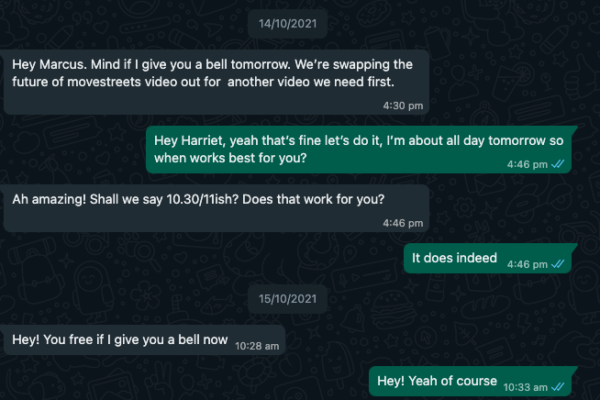
Throughout the project, I was in touch with Harriet, who briefed me on the project and was the single gateway to provide me with the feedback that the entire team (including CEO Adam Kamani) had for the video.
She initiated contact over Whatsapp, and we had our first meeting was done via call, which was mostly explaining the storyboard that the team came up with.
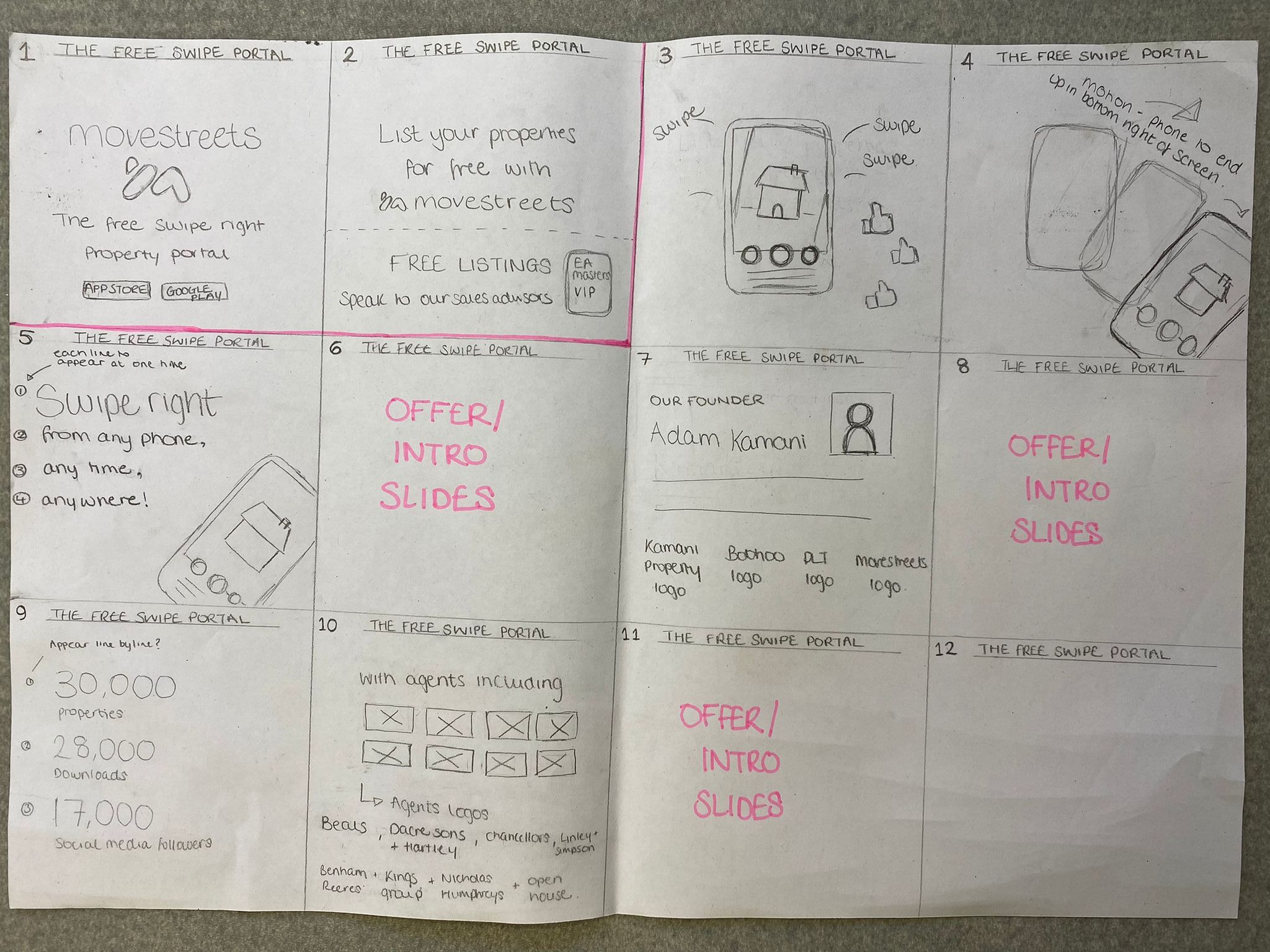
I really liked the storyboard as it was very visually easy to understand the placement of the content. Using this I immediately had ideas for how everything could be animated. My main issue with the document though was that the panels were provided in square, meaning I thought the content was going to be produced in a square aspect ratio. However midway through I realized the screen was actually in a vertical 9:16 ratio. This meant that my first draft of the project had the content mostly condensed within a central square of the frame.
Here is the first draft:
For all the drafts I include a watermark to ensure that the work doesn’t get stolen before payment is made.
This full draft was produced just under a week after the first brief, as this contained all the core animation elements I chose myself. The animation elements were under my full creative control and remained mostly unchanged from the first draft.
The main change I implemented since this was changing the branding/colours, as I had based the colouring off the older project being all orange with white text. I was sent imagery that better showcased what they were after, but luckily colour swapping in After Effects was simple for me to do.
My next draft was mostly a simple style change, along with moving around assets to fill the space better.
I also implemented a background scaling trick to transition the Movestreets to be bigger in the following frames where necessary. This was done by having the Movestreets logo parented to the Background, making the background a 3D layer, and moving backward in the Z direction to add some form of 3D depth to the composition. After this first test of it, it was well-received and therefore kept in the final product. It wasn’t amazing in this draft but the concept definitely worked.
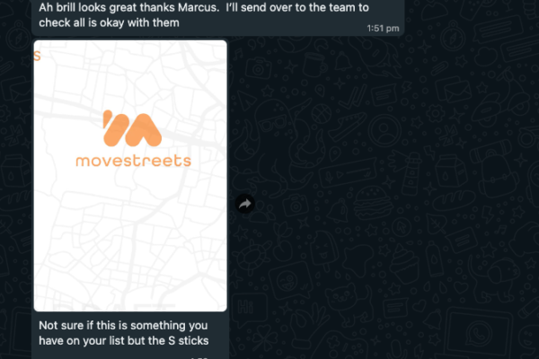
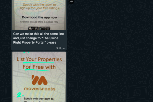
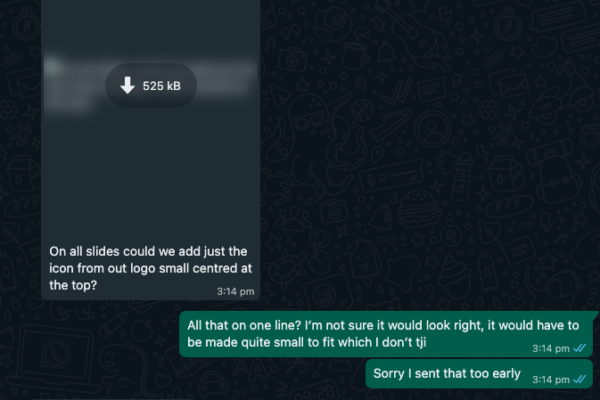
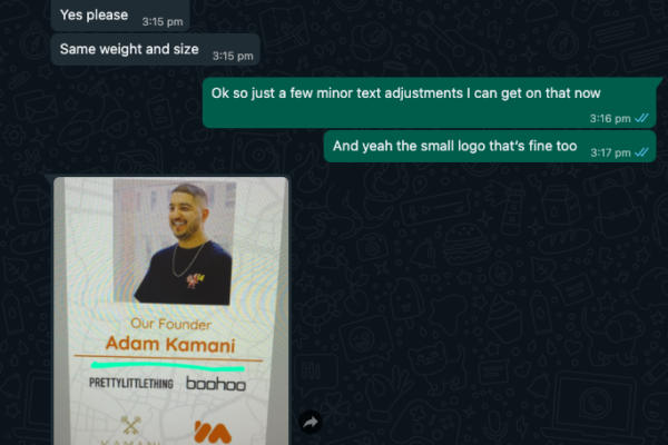
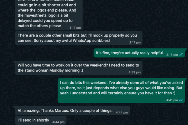
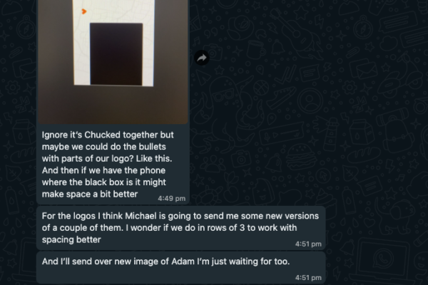
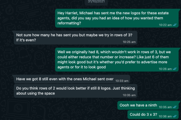
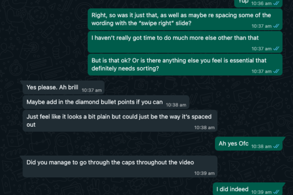
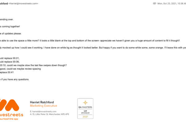
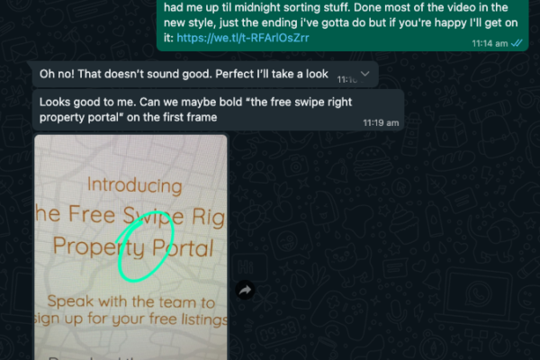
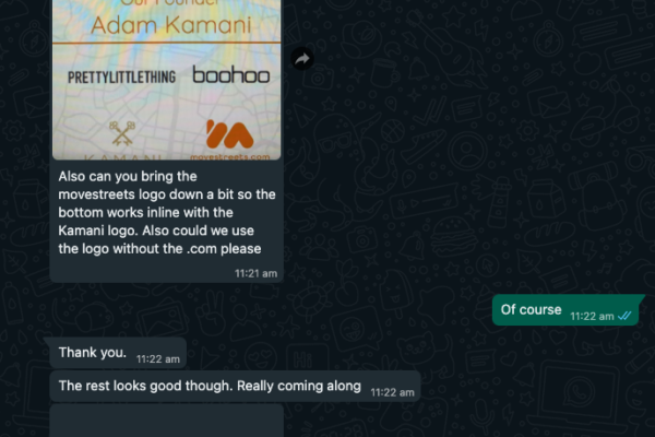
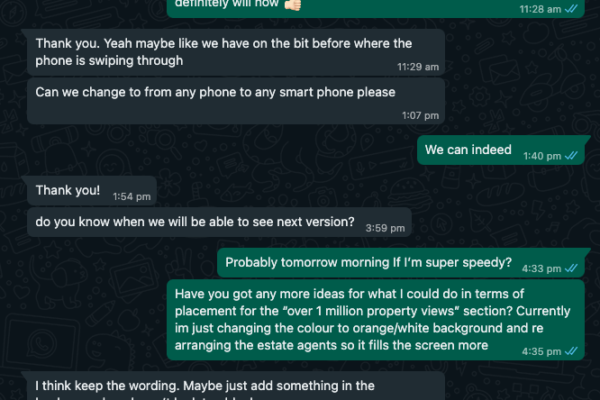
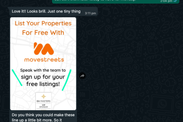
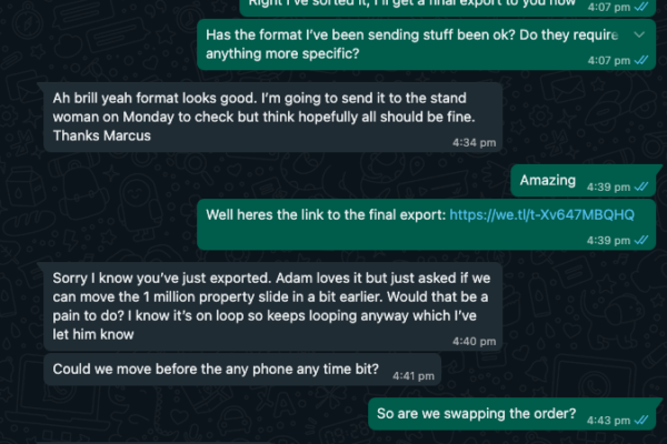
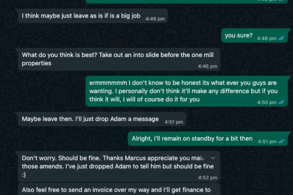
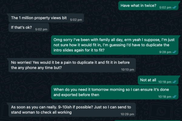
After this, I received many little changes which were shown through conversation with Harriet.
After this, I received many little changes which were shown through conversation with Harriet.
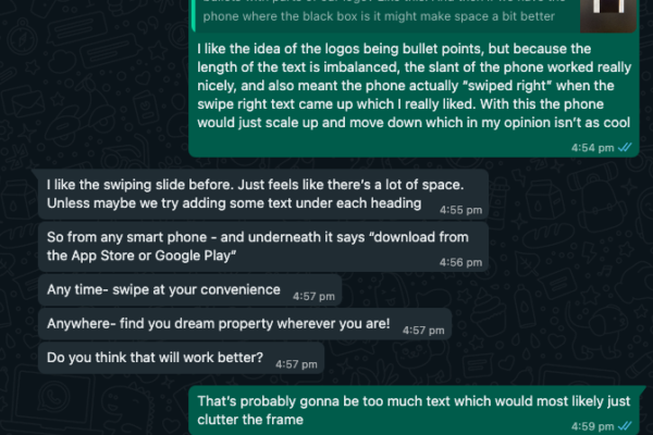
After sending this draft, a lot more feedback came about. Mostly small changes but also stylistic suggestions. There was one in which I had to dispute as I creatively preferred the phone being angled on the “Swipe Right” frame, and Harriet agreed to keep it (images 6 & 7). Although originally disagreeing with adding “download from the app store” to the frame, I ended up trying it and preferred how it filled the frame.
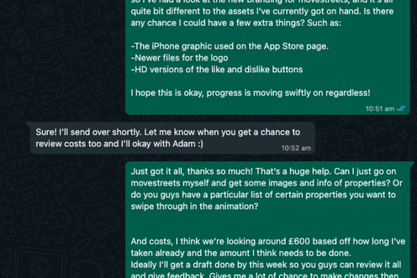
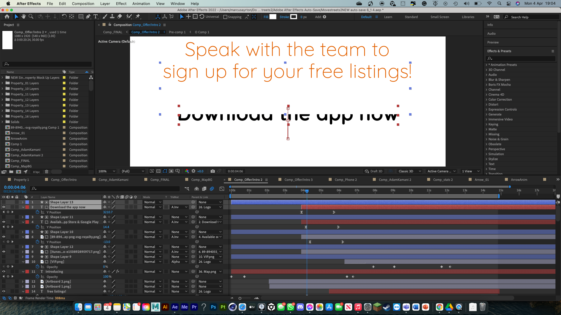
I was also sent over new assets which by using the asset swap feature (holding alt and re dragging in the new image), it wouldn’t affect any of the animations I’ve done. This included a better image of CEO Adam Kamani, as well as higher resolution estate agent logs, and some extra ones.
The next draft was much closer to the final one and addressed all the main feedback points. As it was closer to the deadline, I also removed the watermark and exported in the proper resolution, so they could use it as the final one if things happened.
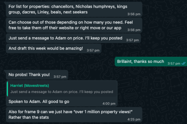
After this, there were some small tiny tweaks requested, including straightening some text and altering the order slightly. Adam also requested a duplicate slide which was a difficult task and quite a difficult last-minute ask to pull off, but I managed to pull off another final export in time for the deadline.
Here is the final export that was used at the conference:
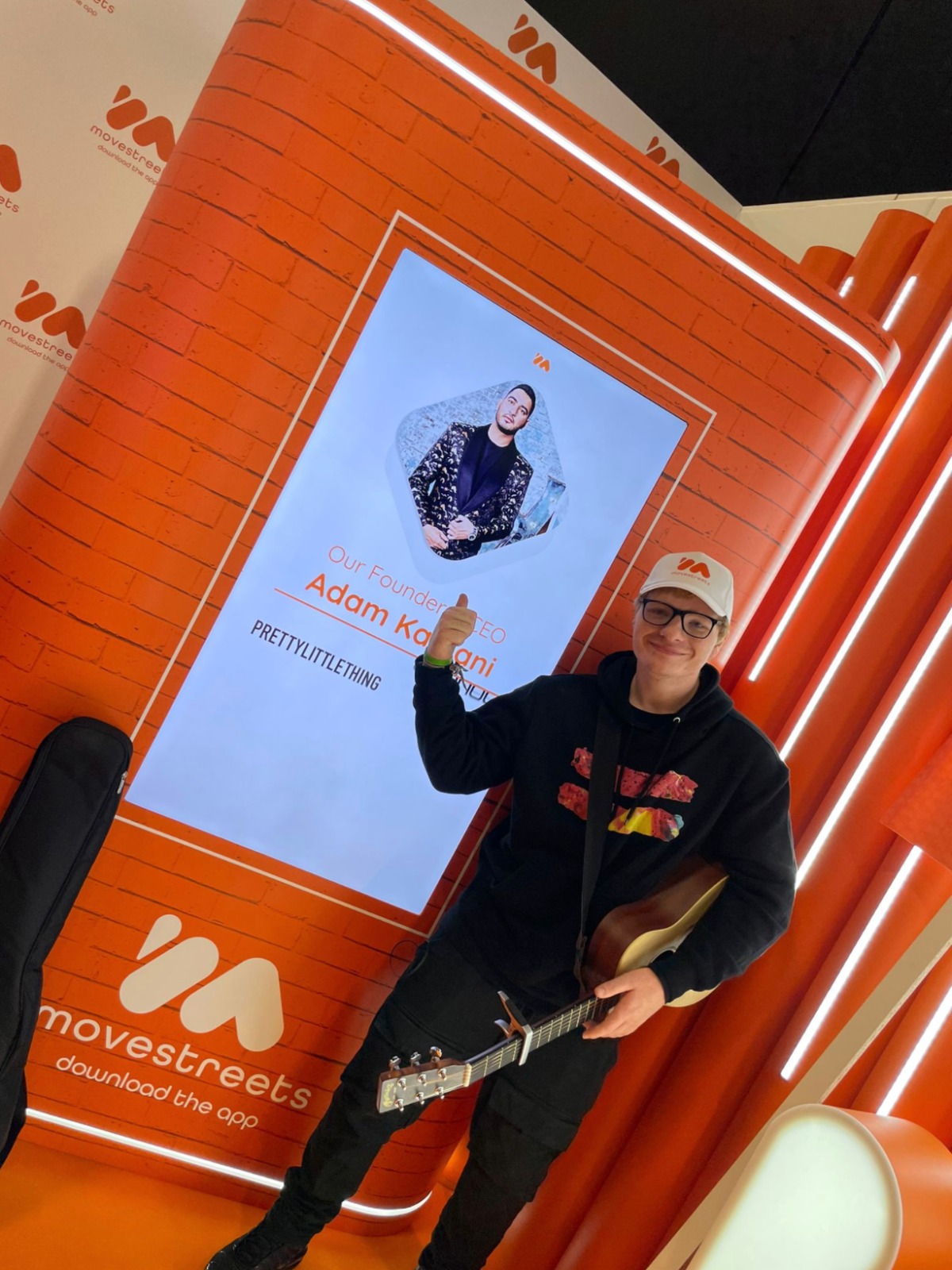
After the conference, I was set some material showing off what the stand looked like, and what my content looked like playing on the screens:
After Effects: Examples of advanced techniques
Here are a few visual examples of the techniques I used on this project:
Track Mattes
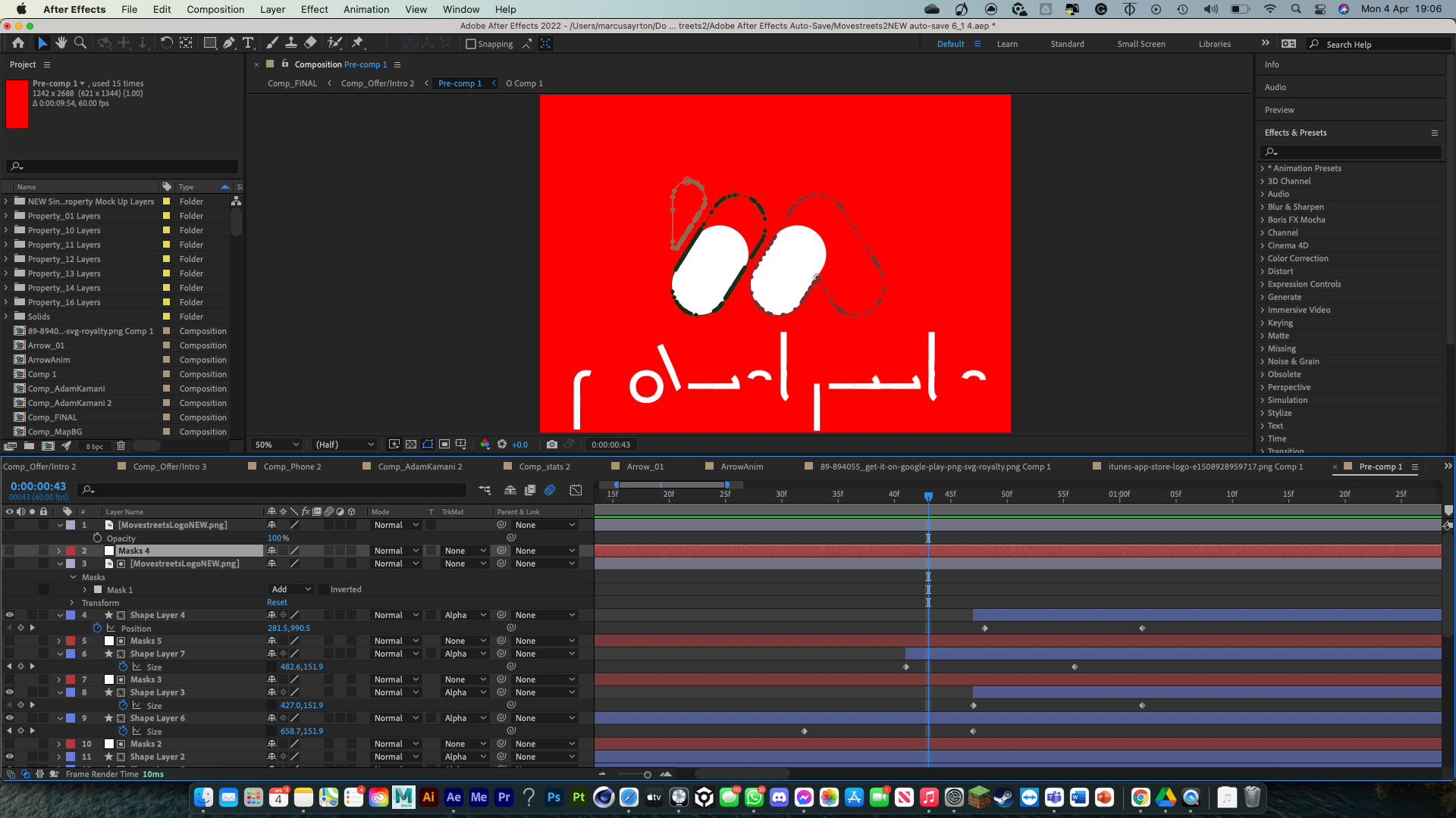
I used track mattes frequently in this project, to create some revealing animations. It involves creating a shape layer to represent almost an invisible later for something to hide underneath, so you can move objects out of hiding. I did it for a lot of text animations to feel like they were coming from underneath each other.
Accent lines
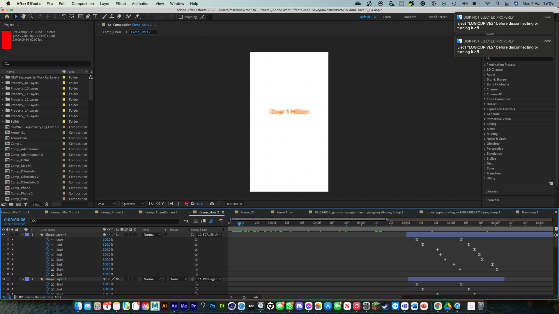
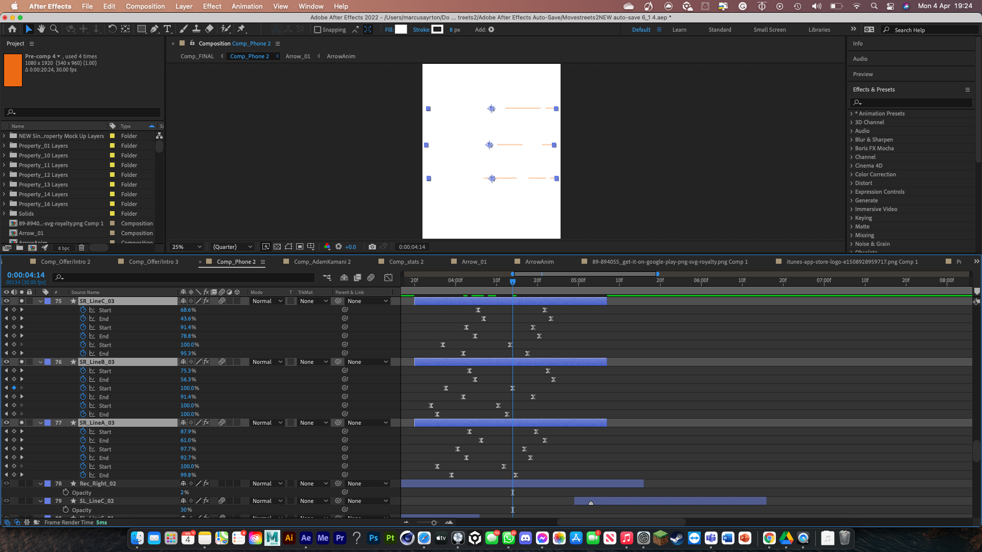
For most sideways transitions, mostly involving swiping, I added accent lines in the background that move from one direction to the other but are split up in different ways to add interest to the frame. This is done using multiple iterations of the “trim paths” function, which mean you can simply draw a shape (in this case straight lines) and animate them to look as though something is quickly travelling across the screen.
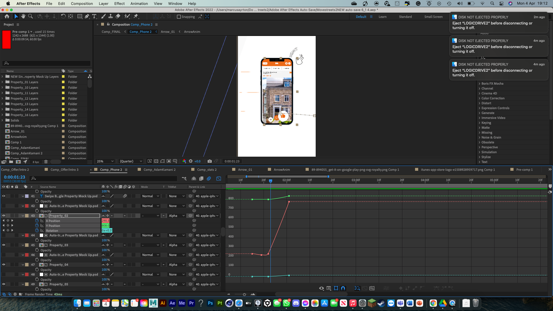
Property swiping animations
The most complex animated section in the video is the iPhone swiping animations. Alot of different techniques were done here. The properties swiping involved track mattes again, and the actual animations were done using the graph editor to add fluidity. I also added a the thumbs up and thumbs down icons from the interface, which scale up and almost float away as the swiping occurs. This was done using animated scaling, opactity and rotation, again using the graph editor for fluidity.
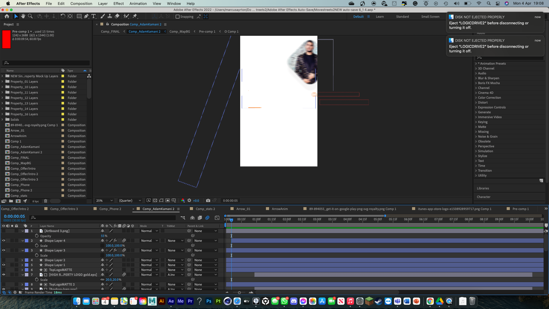
I added the moving accent lines, so the swiping movement is really emphasised throughout the entire frame. I frequenlty included very faint diagonal rectangles moving across the screen to add to this emphasis.
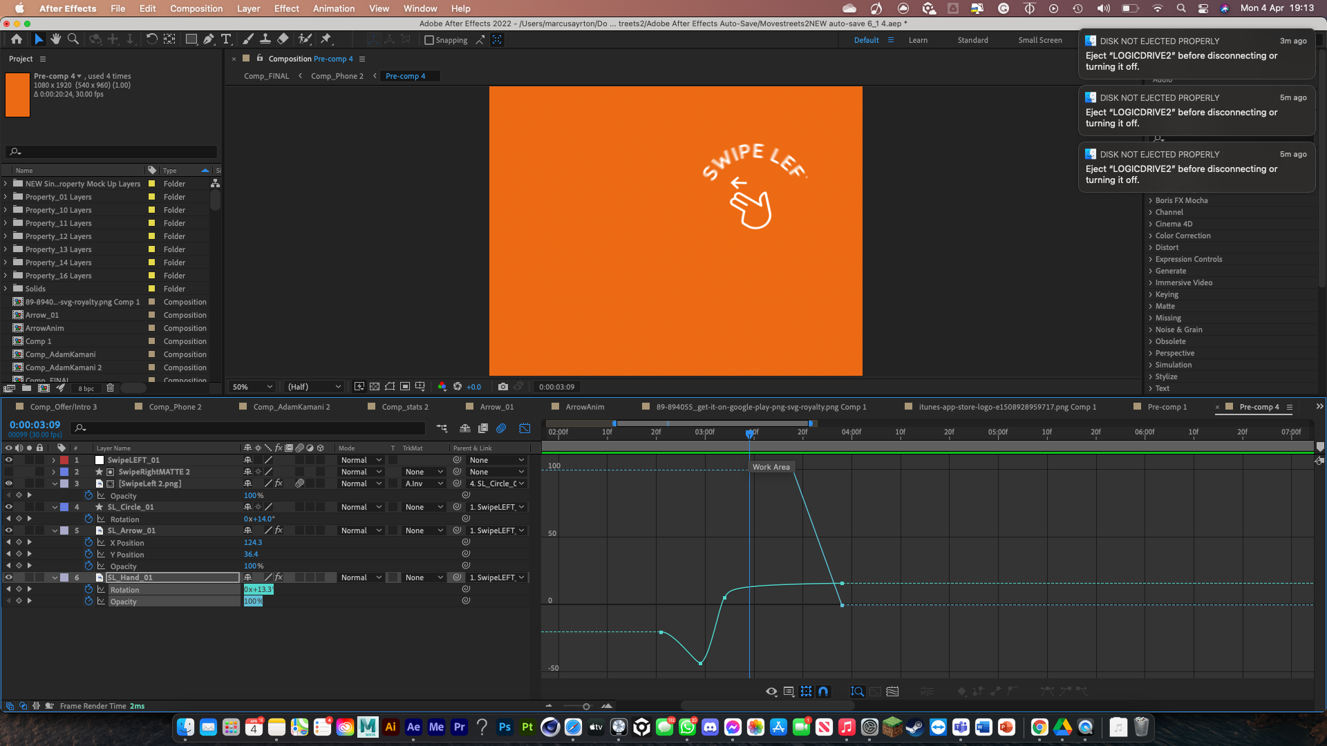
I was given assets from the original product which meant I could indicate swiping right by rotating it. I moved the anchor points of the rounded “swipe right” text, and the thumb, and using an anticipated reverse rotation, it makes the swiping feel that much more emphasized and empowering. This matches perfectly up with the timing of the actual swiping of the properties.
