
Experimentation / R&D
Pre Production
After first contact with Mason, we came in for an initial meeting to throw out ideas. As the idea was initially is, we started by writing it down, and then creating storybeats. After a really good 5 hour of rough brainstorming/writing stage, we developed a solid enough storyline, with different potential paths to take the story.
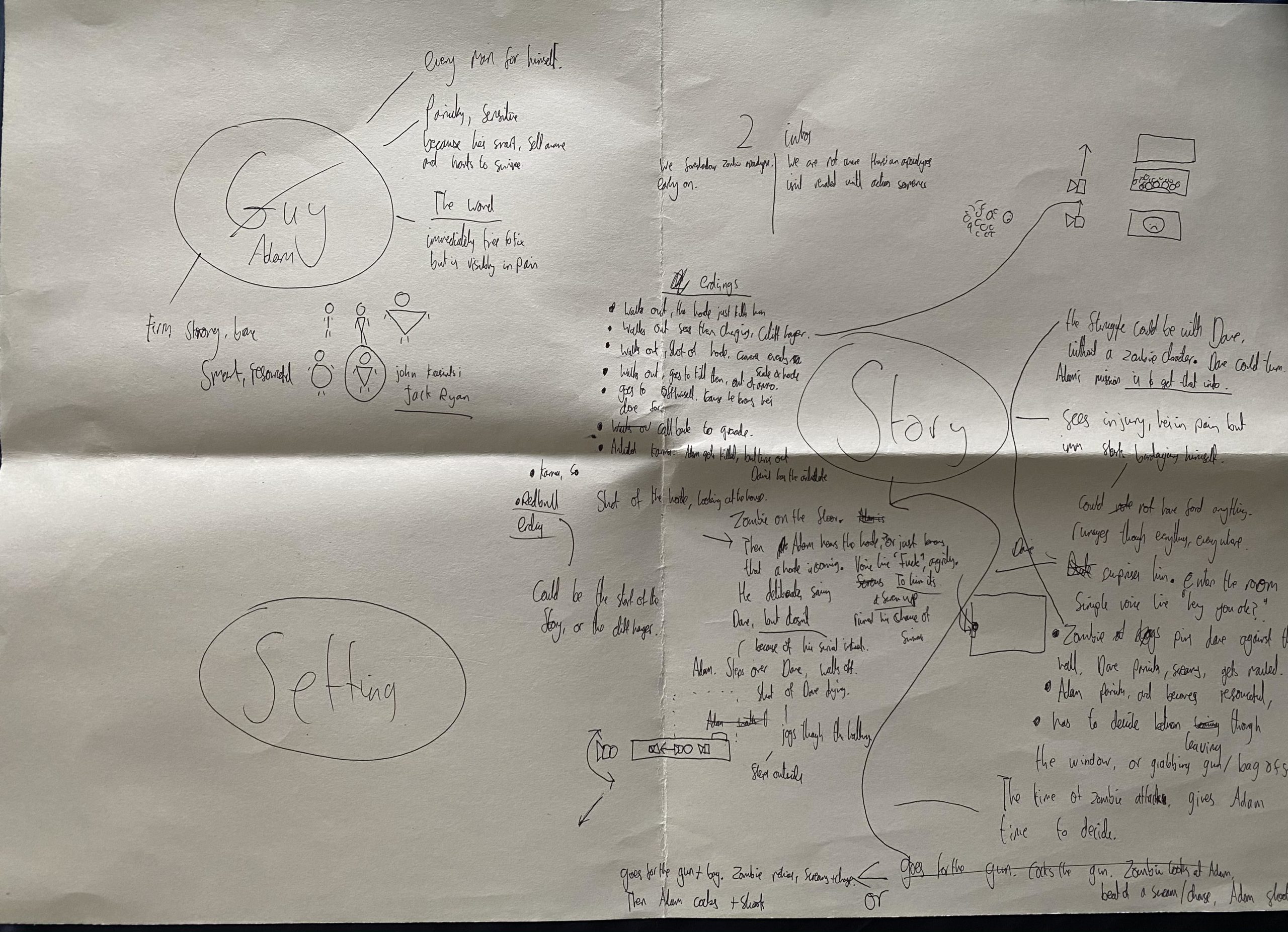
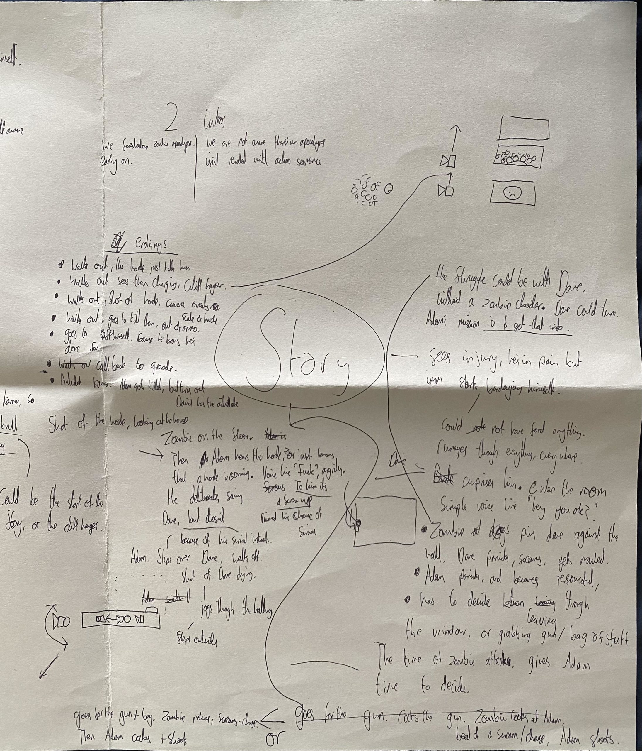
(Highlighted in Yellow is the storyline we went with)
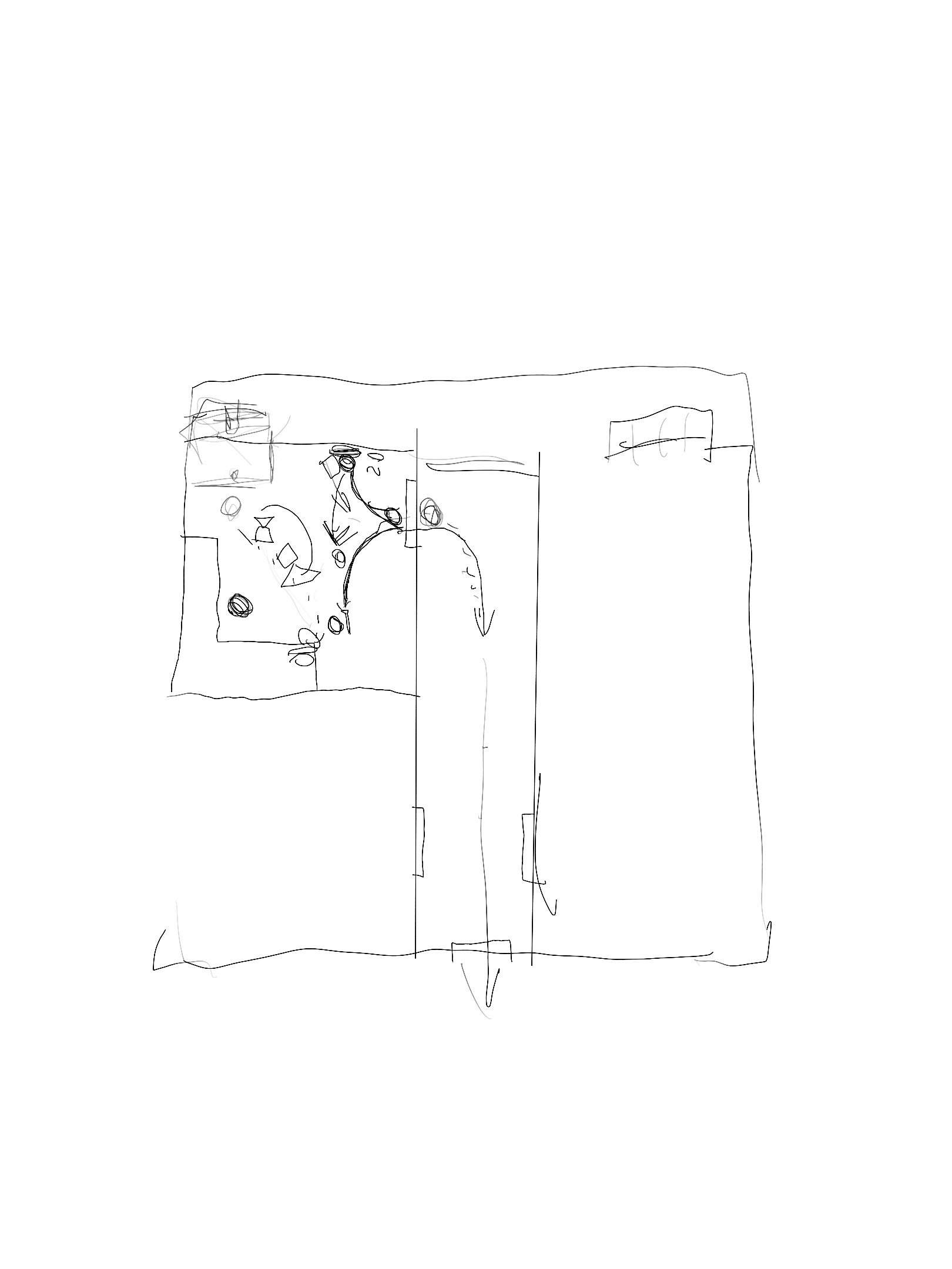
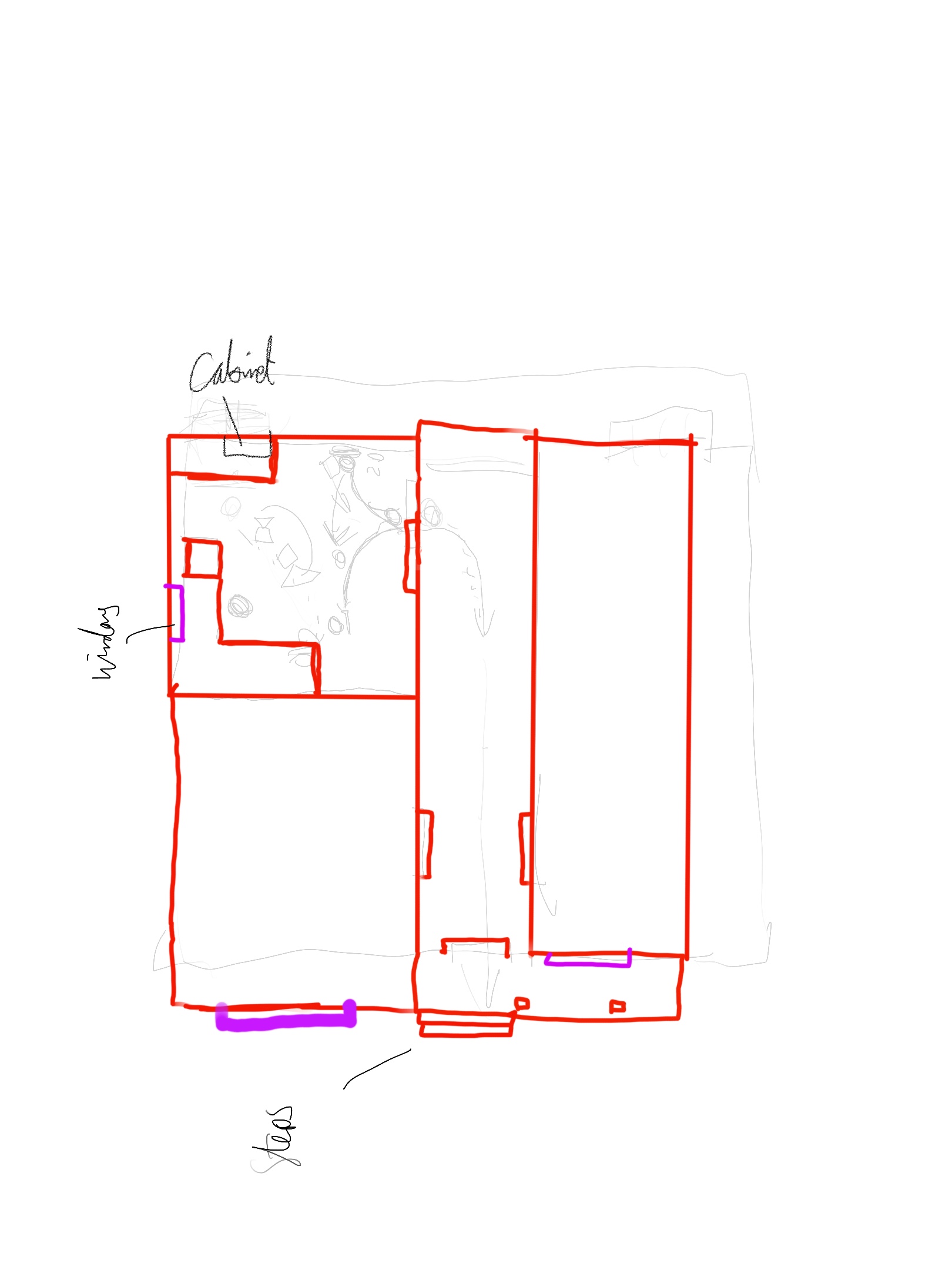
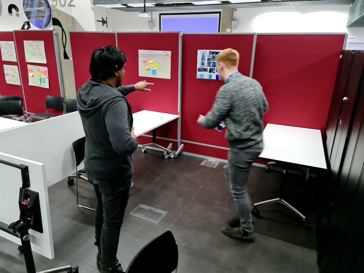
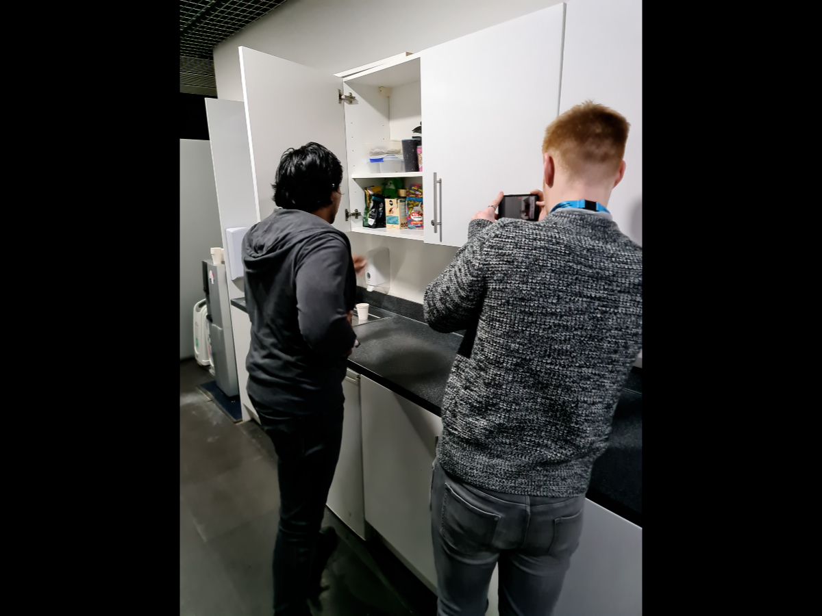
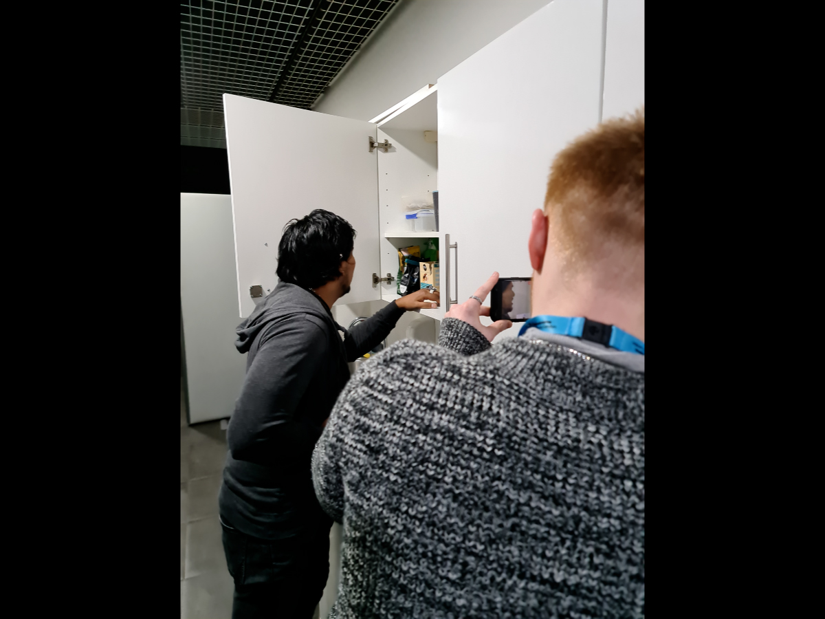
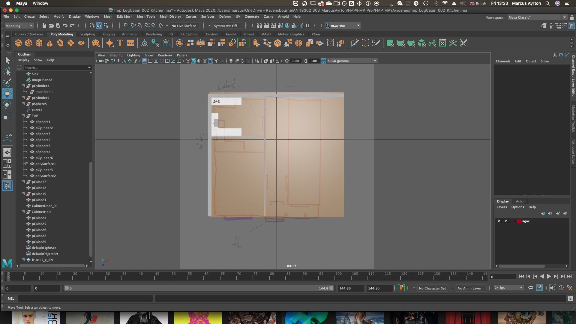
During this process, I also figured out where the characters were going to move, and the space they are going to be in. I used my Ipad to create a floor plan and added key storytelling aspects of the scenery. Key aspects for example were the cabinets, the hallway, where the windows should be etc. This was heavily influenced by some reference images from Pinterest, but one image I followed quite strongly, felt too cramped, so I expanded the size of the floorplan and I ensured that the space had enough space for the characters to effectively move.
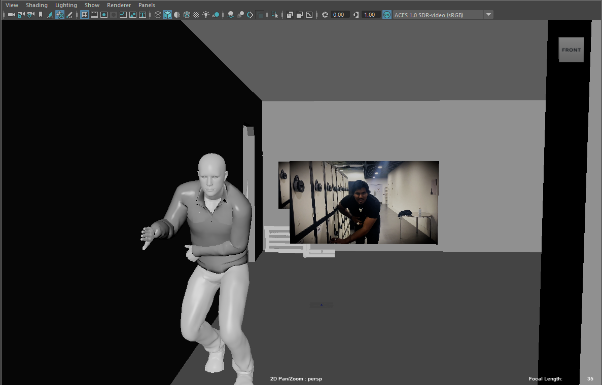
As neither me or Mason were the most talented sketch or storyboard artists, we wanted to be able to visually communicate the ideas very quickly. The most effective way for most of the scenes was to use a live-action film communicating most of the key aspects. As someone wanting to enter the pre-vis, the best way to communicate these ideas is through a visual medium. Not all shots could be done so, so this is where the power of the camera work in Unreal would come in later.
From looking at real industry workflow’s also, they can normally combine the two by using a virtual camera setup in an open space, and then effectively film inside that CGI space quite quickly. However as the technology was not available to us, and the floorplan at this time was only a 2D floorplan, we felt live action to be quicker.
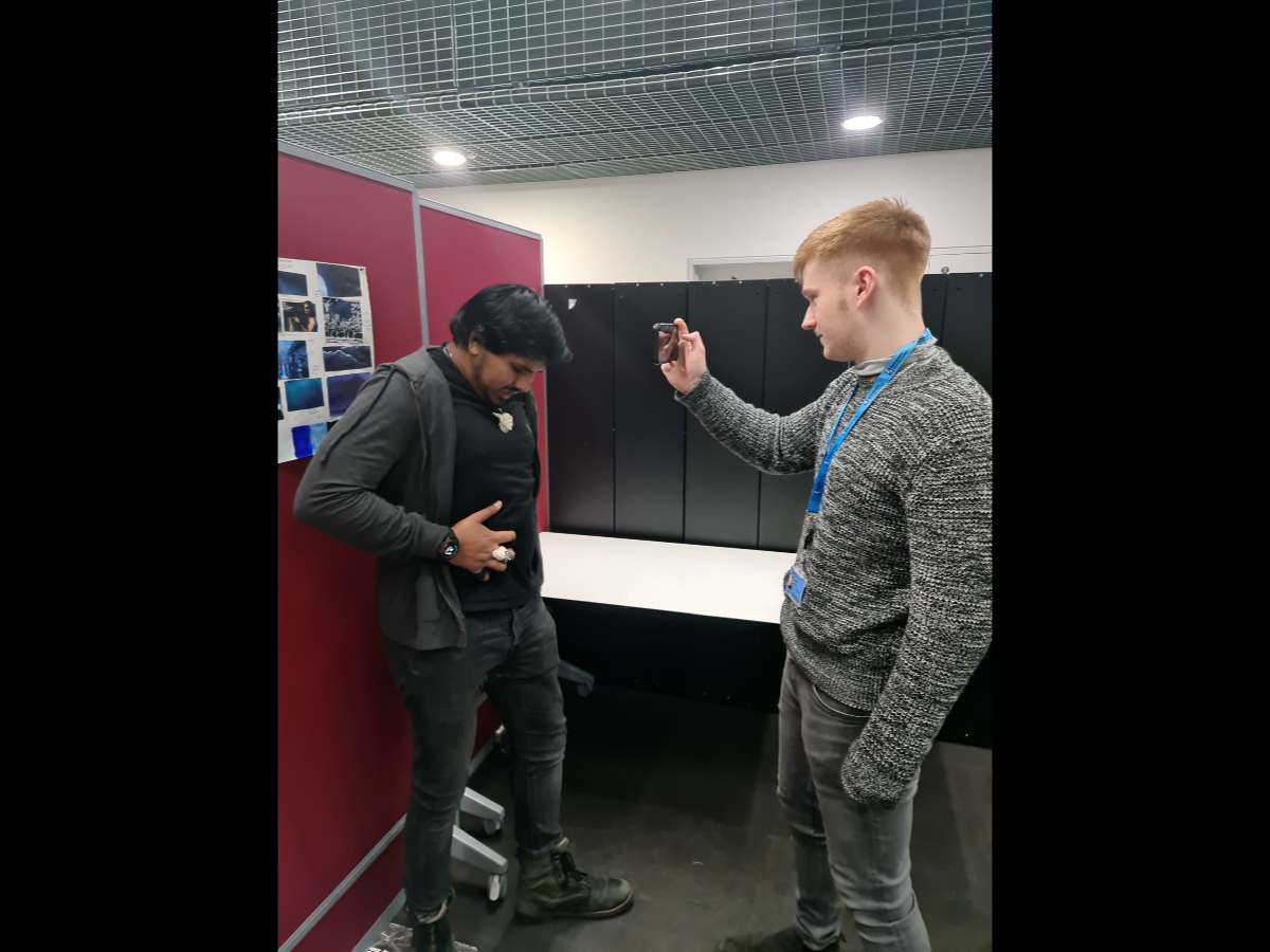
I was the camera operator as well as the main creative director for shot sizes, camera angles, and lens choices. whereas Mason took direction for where the actor, David, would be positioned to help us. I used my IPhone 11 Pro Max which has 3 choices of lenses, and I ended up using shots with a combination of the 3, although the exact lens size won’t be used, indicating wide-angle, ultra-wide, or telephoto was still a solid enough indication. Using the floorplan, I built a makeshift film set using tables and chairs to indicate key aspects of the room, which were great for David to work and interact with. After filming the shots, I edited everything together afterwards in Premiere Pro.
It wasn’t by any means perfect, it’s intention was to be rough. Considering it was created and edited 24 hours after the first pre production meeting, I’m very happy with the turnout.


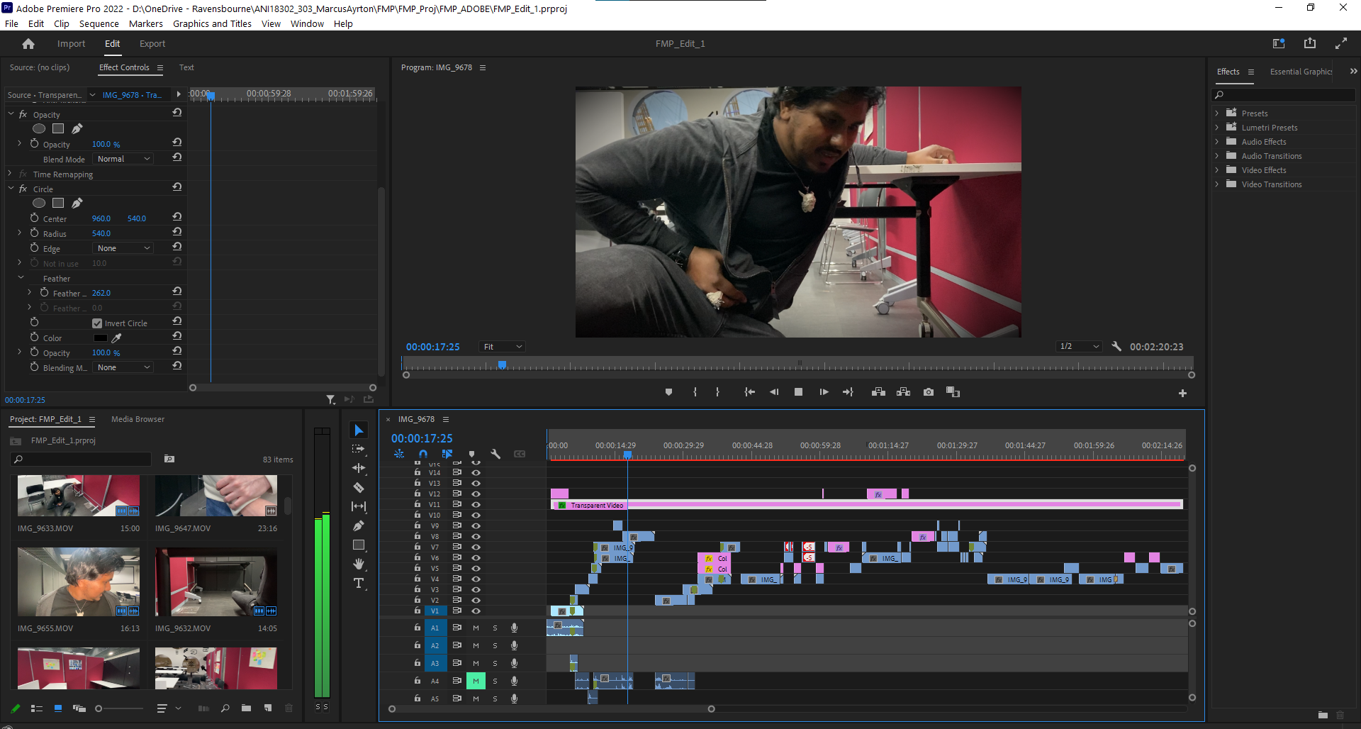
The editing window in Premiere Pro. 78 clips were put in and edited together. Not all of the clips were used, and this pre-pre vis edit was a chance to realise what can only be done in CG, and which shots to go with. In this, I also used a transparent video, and a black inverted circle to create a vignette.
Production
Layout / World build
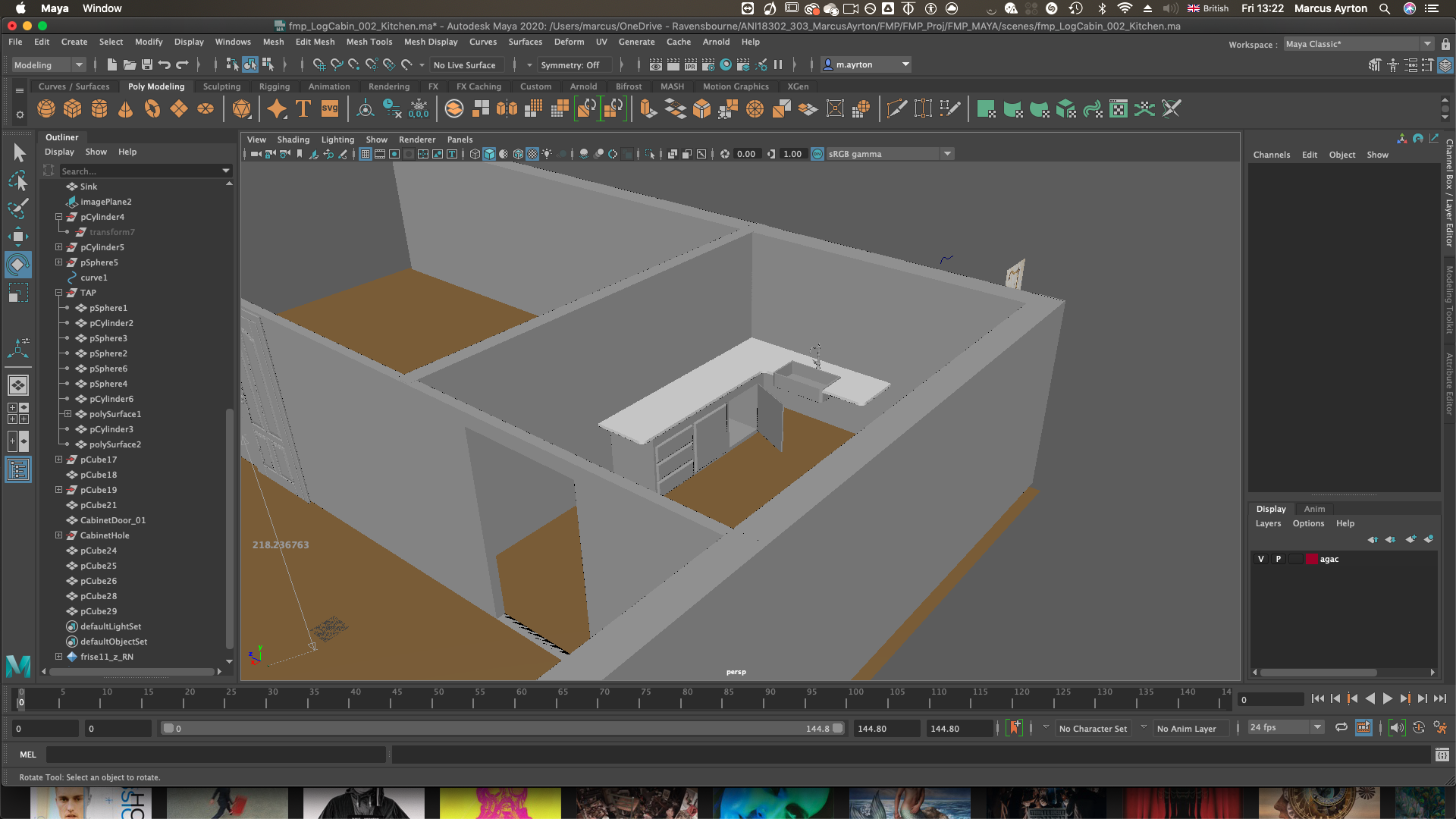
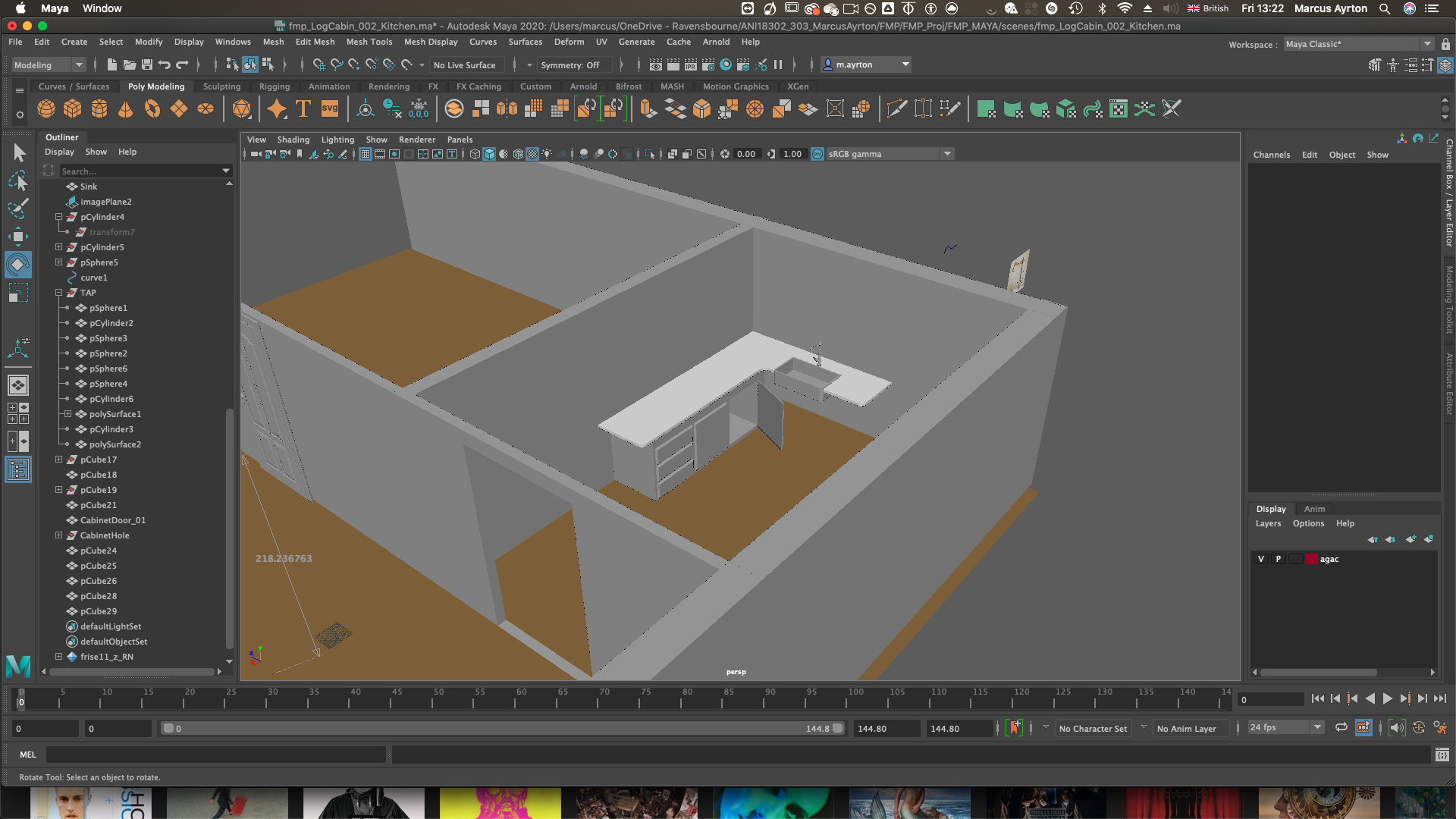
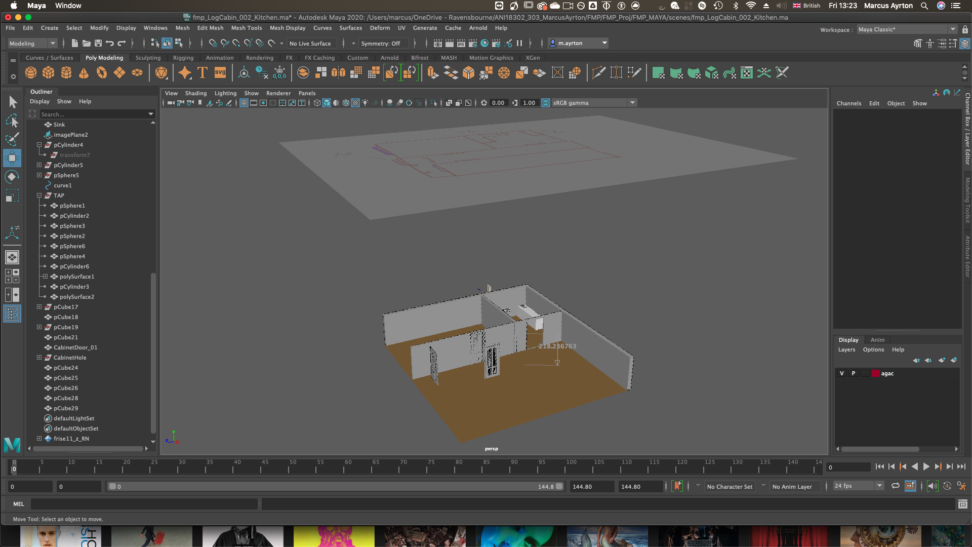
After this, my next step was the layout in Maya. I brought the floorplan I created into Maya, and then modelled some basic proxy models to indicate the main key areas of the scenery. After the first designs, I exported out as a .ma file into the shared project folder for Mason to be able to open to then begin his motion capture / animating process. I used a specific “Ref” file for him to use, and all my work I saved myself to work on. This very quickly developed into me adding detail to the scenery but regardless as long as Mason had something to work with throughout, it prevents him from waiting for me to complete layout.
")
")
")
")
")
")
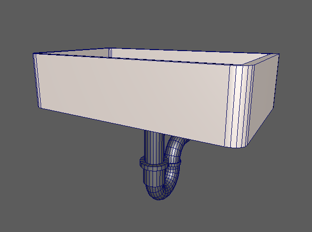
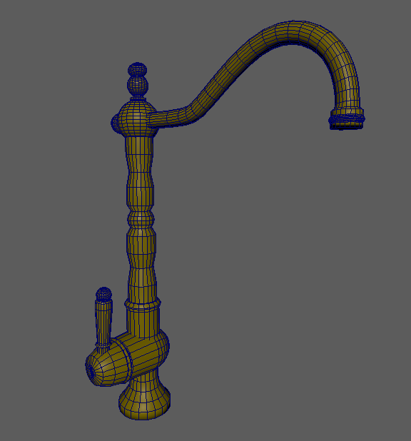
First few days of layout, with basic proxy models, plus modelling of sink and tap.
")
")
")
")
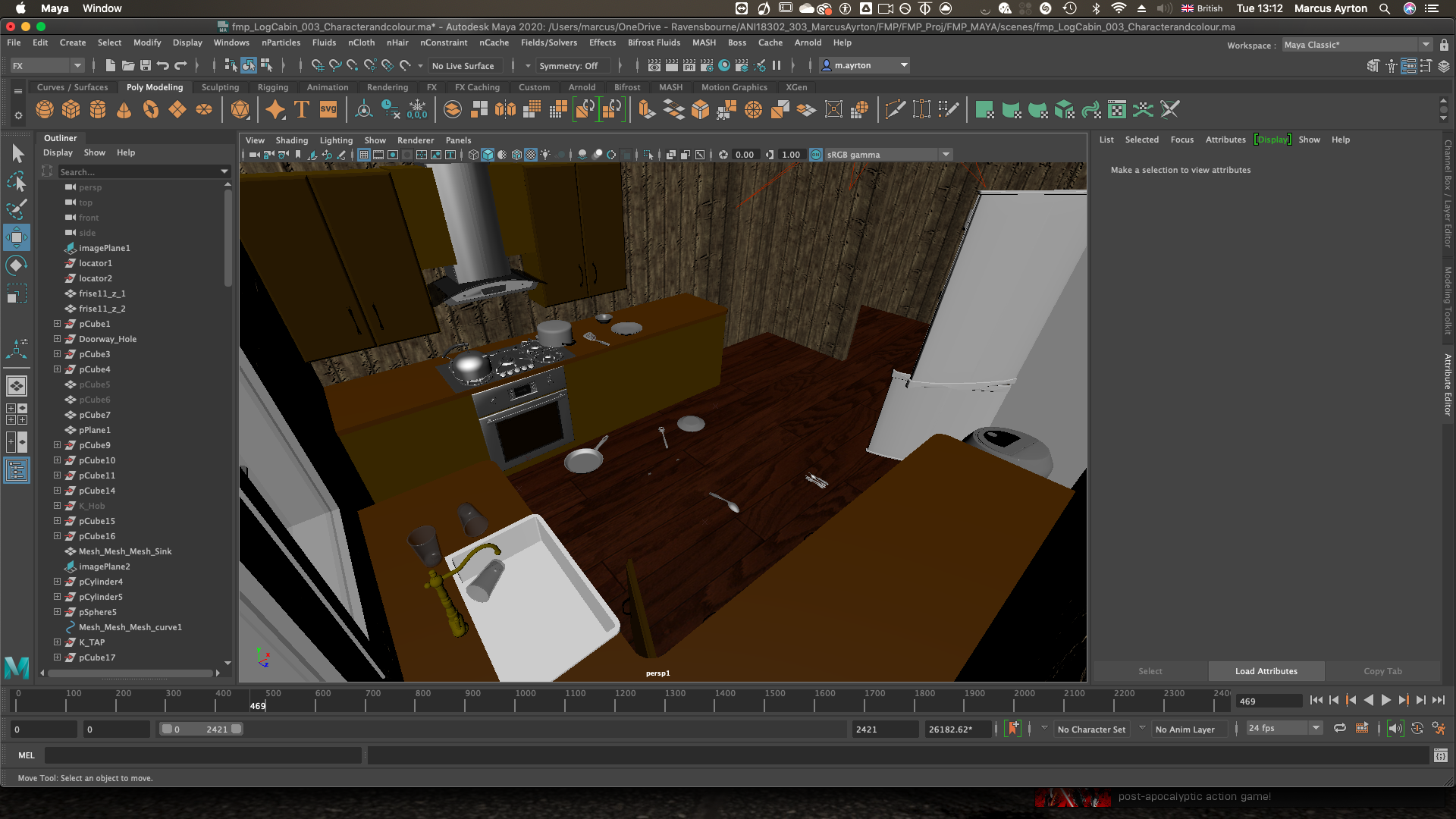
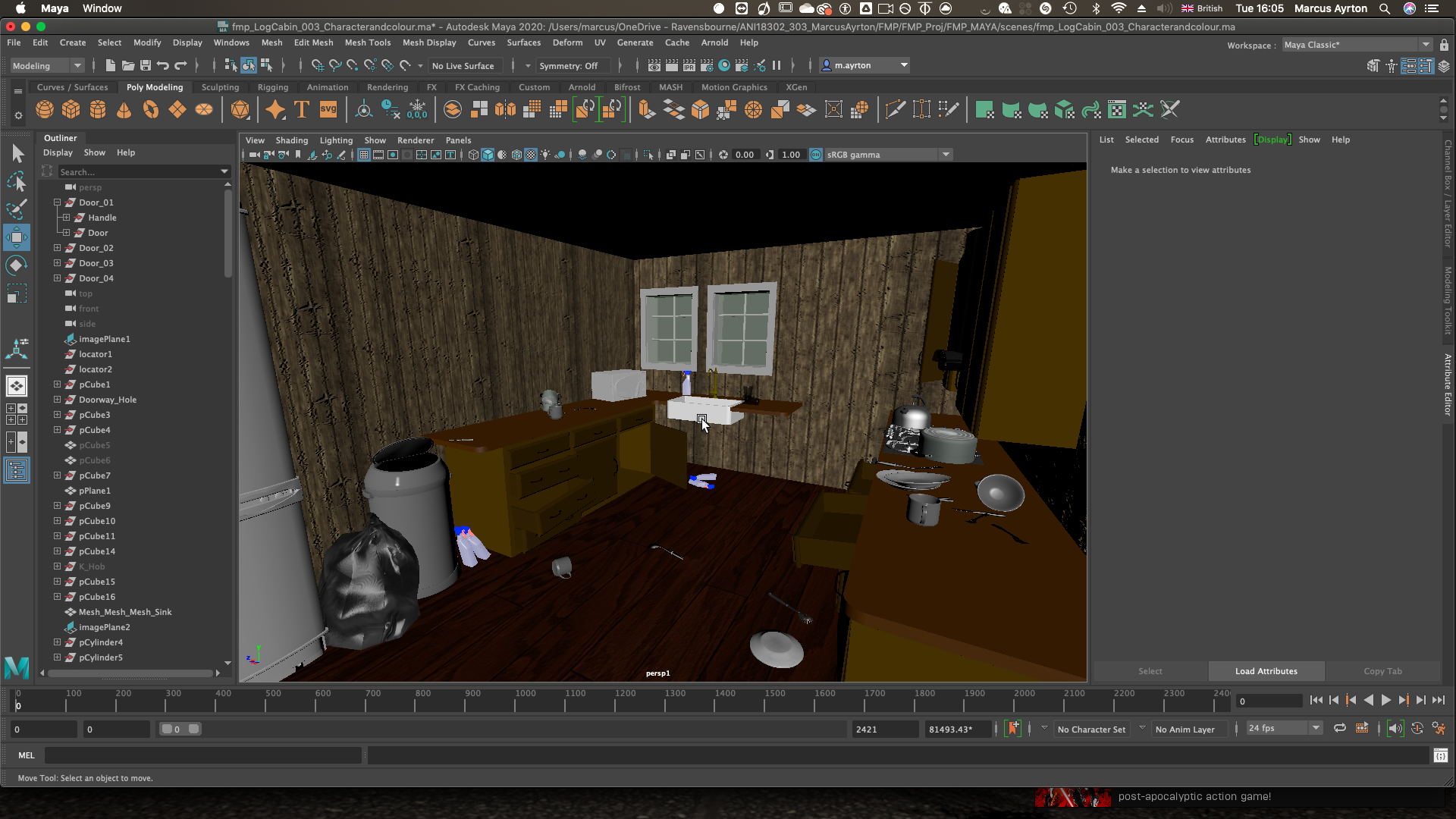
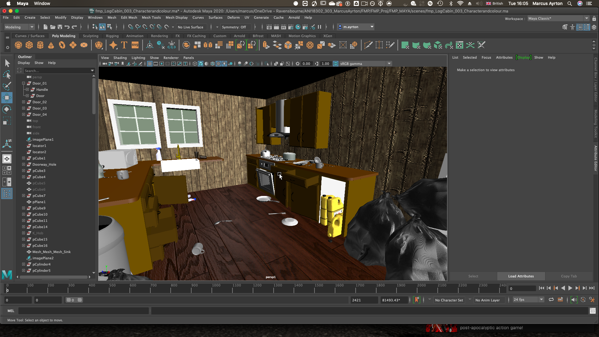
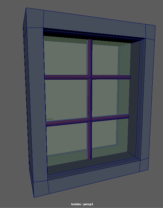
Gradually starting to add sourced assets for detail. Here I added bins, bin bags, a cutlery asset pack I found, a fridge, microwave, etc. Also textured some of my models like the floor and walls. Added window models too.
")
")
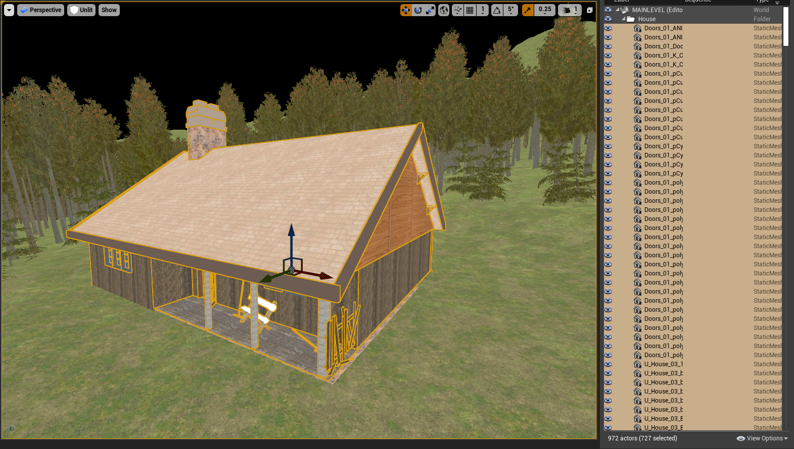
A more accurate final look at the interior. Same coloured cleaner bottles, rug, radiator, chandeliers, more filler assets to make it look messier.
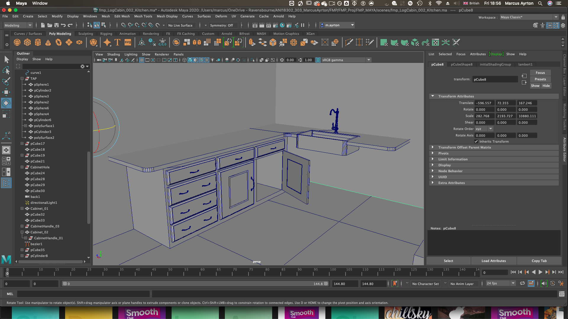
I modelled anything specific to space, such as the units, cupboards, walls, and the exterior house, but any other very detailed not plot specific assets I sourced from a combination of TurboSquid and CGTrader. This was to fill the scene as quickly as possible without spending hours modelling intricate details.
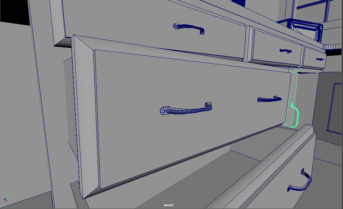
To create cupboards, I used rectangles, then used the edge loop tool to add edges, and then extruded them in side the model to create the indents typical of cupboards
To create the handles, I created a prisim shape, and then extruded along a handle shaped curve. To bring in the handles to mimic the curved shape which I saw from references online, I used a sculpt tool. I then modelled the screw area using a rectangle and vertex manipulation, and then a cylindrical shape, and a boolean difference to create the hole.
I did model some specific assets which I felt I found from visual reference would work better than some I found. This includes the Tap, and the sink.
To create the tap, I used a cylinder, and then vertex manipulation to create the round shapes, and then a Nurb Curve and a Cylindrical extrusion to create the curved tap shape.
To create the sink. I used a bevel to round off the just the corner edges to create a rounded rectangle, and then to create the hole, I used another rectangle and then a booleans difference.
(For a more in depth look, see video breakdown)


I actively did not enjoy texturing. During this process, I learned and understood the workflow of texturing assets, including investigating the software “Adobe Substance Painter”, but I actively tried to avoid it, as my main focus for this project was not on making models look super detailed. Most of the assets I sourced were already textured, and for the rest of the house, I used textures I already had which included all the necessary files, and just tiled them to fit.
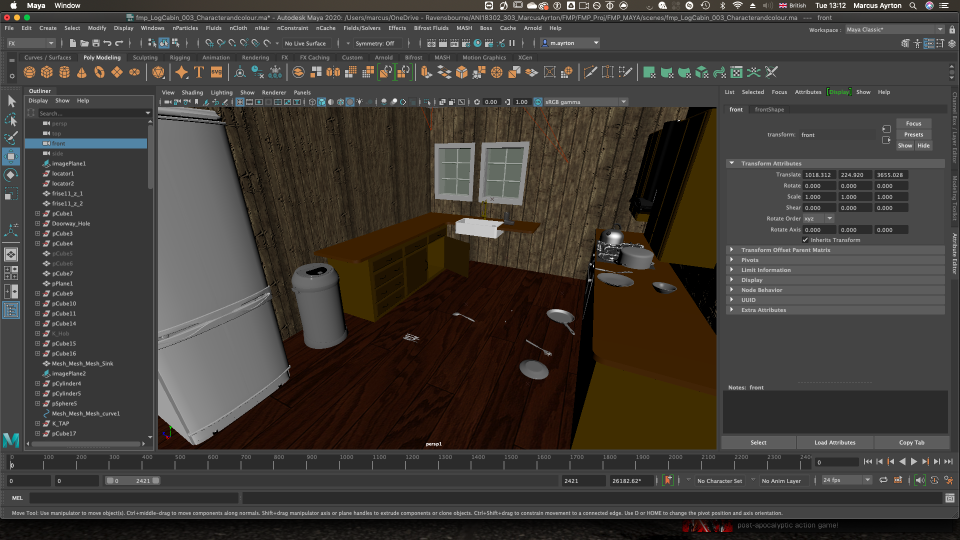
During the process, I had to adjust my plans for where the window would go when Adam, the main character, looks out in shock. This is because I wanted realistic space, including fridge, extra units, chairs etc. A challenging aspect of the maya layout phase was incorporating the abandoned and ransacked nature. So for this, I kept some doors open as if there were broken, and threw cutlery and pans around. I even used gravity using plane solvers, to give objects that more natural, thrown on the ground feel.
Layout in Unreal
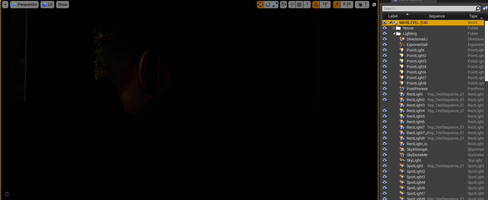
To bring the house into Unreal Engine, I exported all the scenery as an FBX file, which when read by Unreal, split all the house into its own models, so if needed I could manipulate them. This means however that my outliner was filled with every single asset, which isn’t fun to work with. I put them all In a group so I could move them all at once, but groups work differently In Unreal, so instead, I put them all inside a folder to keep it organised. From my experience with the portfolio unit, importing the assets was a much easier task, and only took a few hours to get it all inside, as it was such a large file.

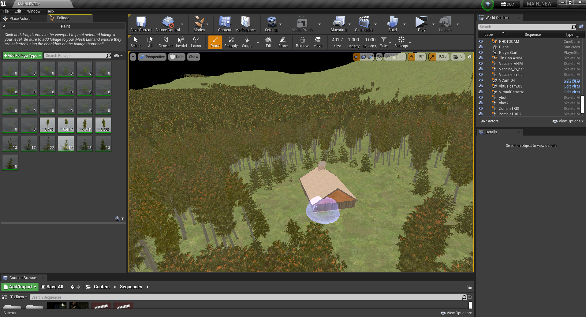
To create the exterior environment, I used assets from Quixel Mega scans from Epic Games. These free assets are exceptional in quality and really easy to add into the Unreal project file.
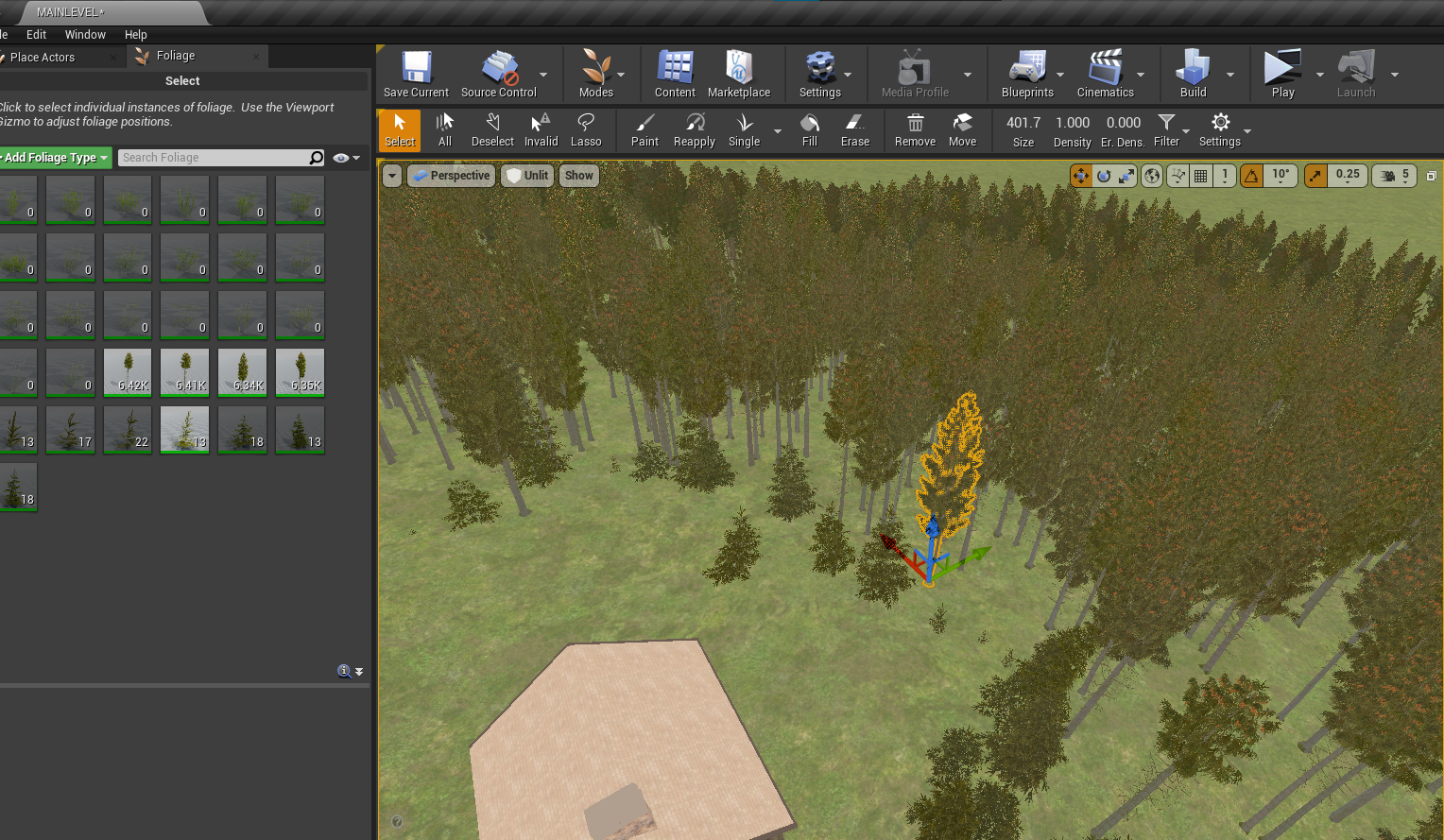
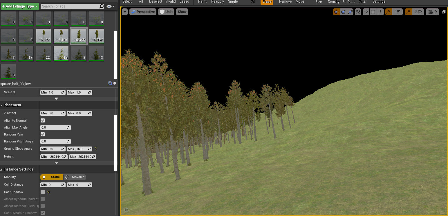
I found a high-quality spruce tree pack on the site, which naturally blows In the wind, and has LOD’s Integrated to save on performance when filling the environment with around 25,000 of them. I used the foliage painter to paint on the trees, which was supposed to make the process easy, but was difficult to get the hang of, and took multiple attempts to paint different trees. Using lots of variations of the big spruce models means that the forest looks much more life like and realistic. Overall the ability to paint these trees in such a large scale is a brilliant tool. For some shots, the trees actually clustered in a nasty way, but luckily I can individually manipulate the position, which to tailor to the few exterior shots I have, was a great plus.
Another problem I had was painting the trees onto the mountainous terrain with different angles, as the trees would sit on the angle which didn’t look amazing. I sorted this by altering the “ground slope angle”, which meant the trees couldn’t tilt more than 50 degrees.


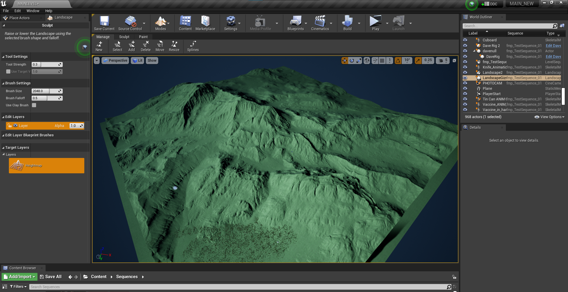
For the ground, I discovered the existence of heightmaps to help create realistic-looking terrain without using manual sculpting Inside Unreal. Heightmaps are black and white images, which determine height, with the whiter ends being higher, and black being lower.
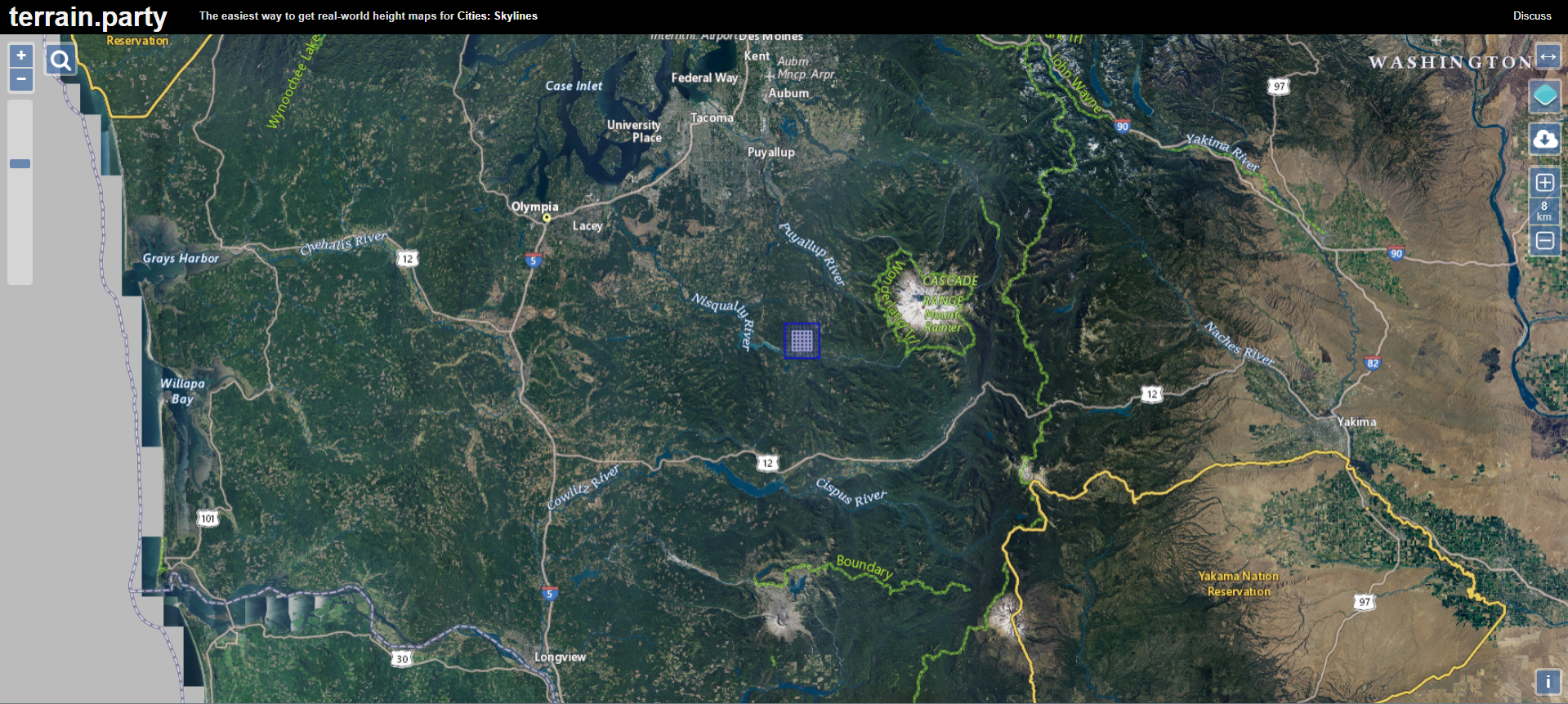
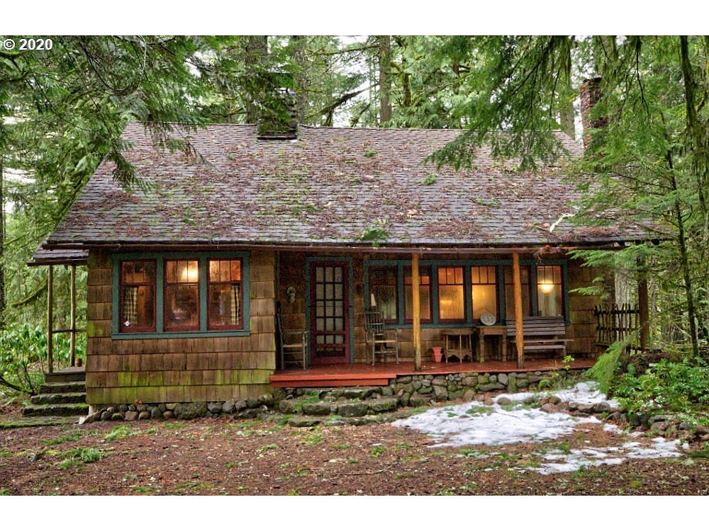
A tool I wanted to use was Terrain Party, which is an online map tool where you can download real world height map or terrain data. From research of a reference image we used, we determined that the area where the film was set was most likely in a forest in oregon, so ideally it would’ve been awesome to use a real life heightmap from the mountains there.
The way Terrain party works, is by navigating the earth, then placing a determined square on the area you want to download a heightmap, as heightmaps work in a square format. Terrain party has sizes from 60KM, to 8KM. 8KM is actually the largest size heightmap that Unreal supports, (Epic Games Guide), so you could only use this option.
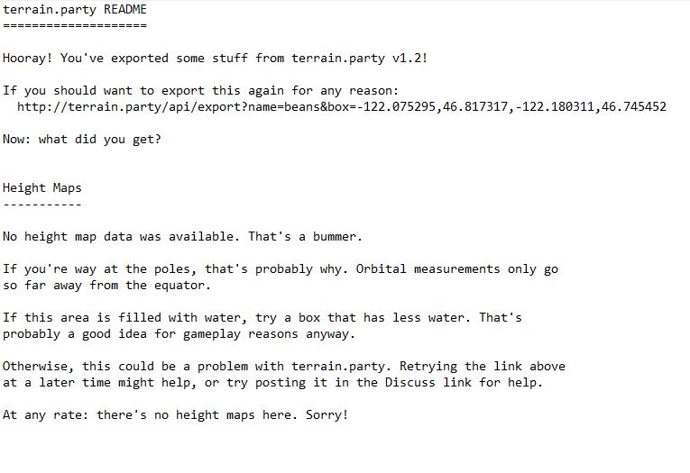
Nevertheless, when attempting to download, you are given a .txt file stating that no map data exists, which is due to the tool actually currently no longer in service.

Lighting & Rendering in Unreal (bracketing)
Lighting inside Unreal is quite advanced compared to what I’ve had experience with, so understanding everything the software has to offer was a tough challenge. It required a few sessions with technical tutor Reke to help my understanding of the entire workflow.
The main points from it were that it has a very realistic outdoor environment system built in, with directional light, atmospheric lights, and sky lights. Each has their own advanced settings, so I’d often get mixed up with everything.
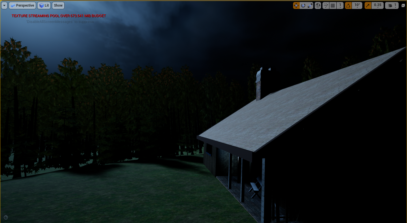
I was going for a very gloomy moonlight outdoor look that was dark, but everything was kind of lit up by the moon. To gain this, I treated the directional light as if it was moonlight as opposed to sunlight. To do this, I lowered the intensity, and then changed the atmospheric colour to be darker.
Unreal engine also has a cloud system built-in, so I filled the sky with clouds to cover where the light would be to create a gloomy look.
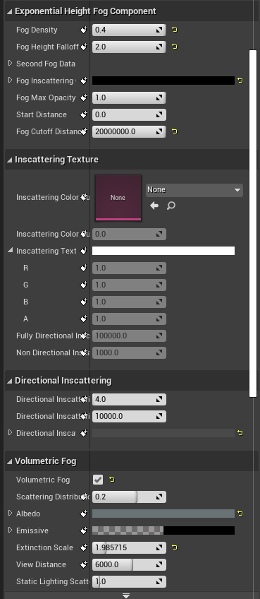
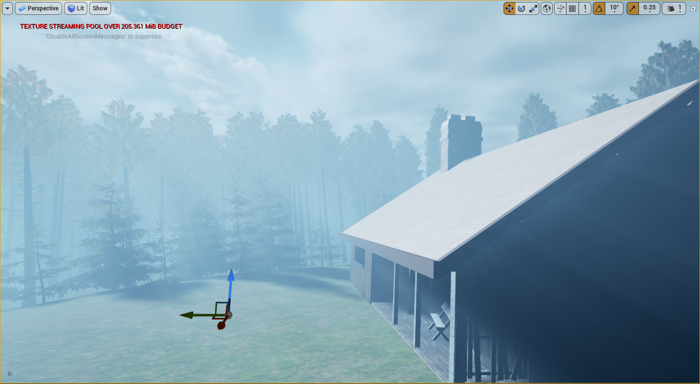
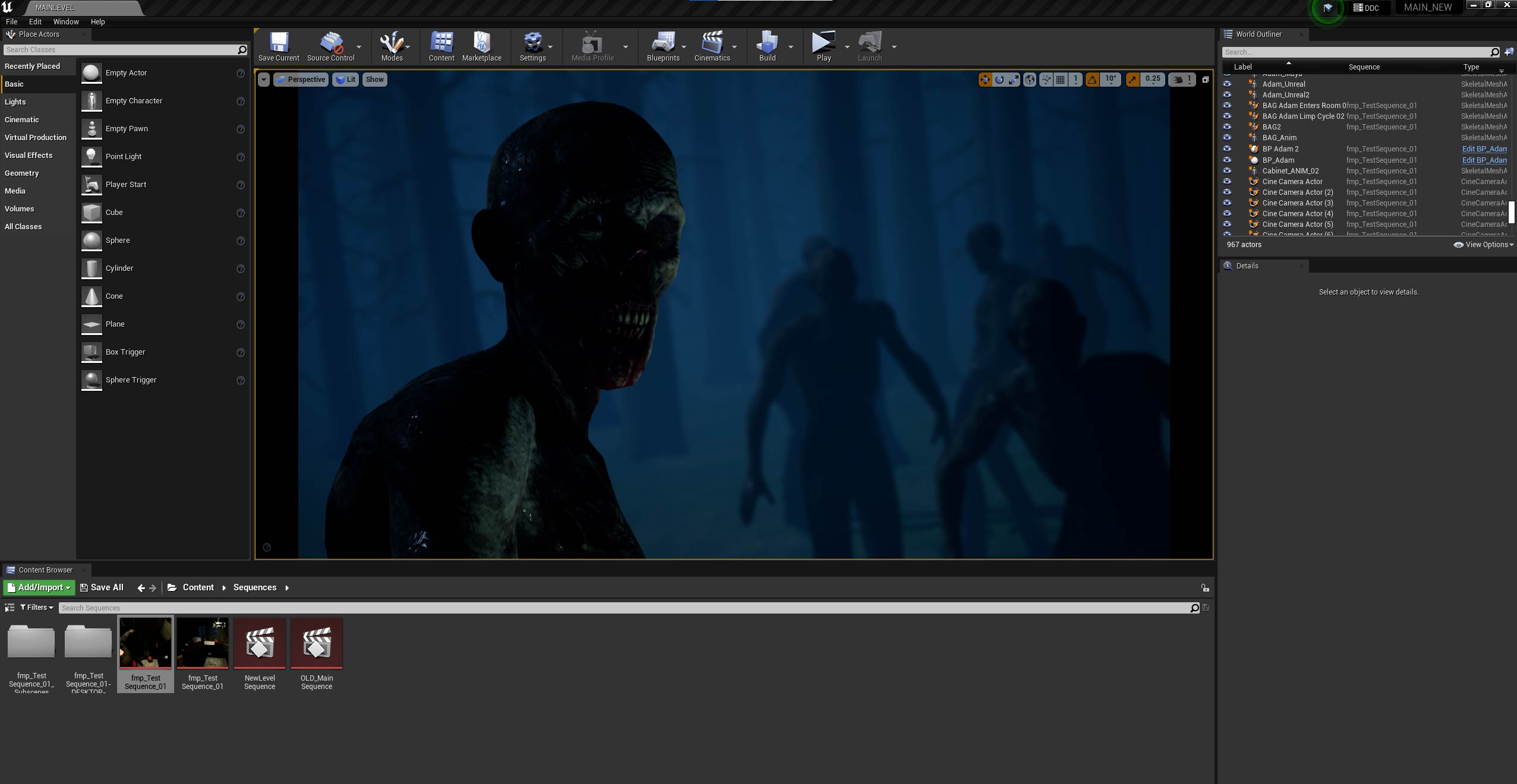
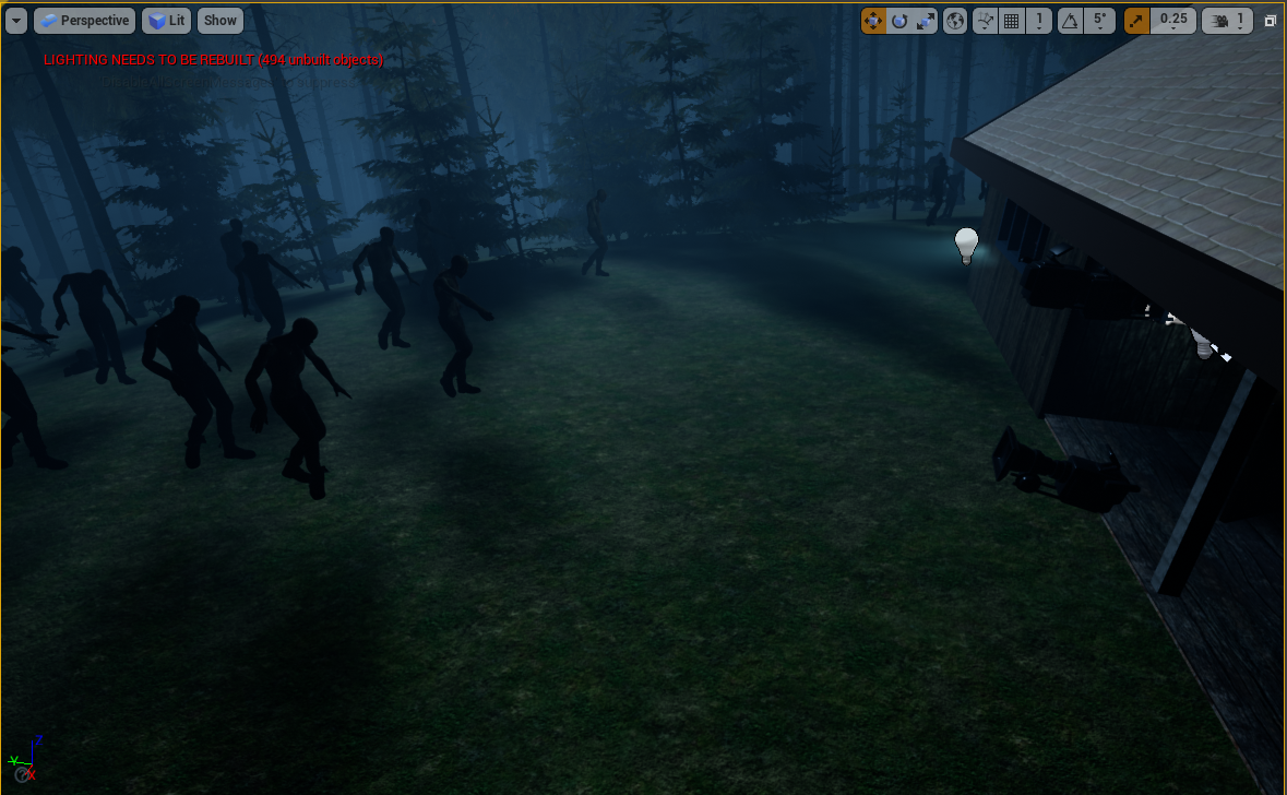
Unreal engine also has an atmospheric fog system. I think it’s a bit limiting as you can’t really specify where you want the fog to be, but its simplicity is easy to work with. I added quite a high amount of fog, but I think it works really well in providing gloom to the scene and is great in particular for when the camera needs to fly through the trees, to help reveal the zombies in the distance, which is a key shot in the short film.
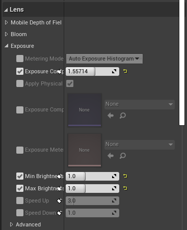
Finally, I used a post-process layer, which is basically colour correcting in 3D. It has all the main settings like brightness/contrast, exposure, temperature, and even bloom, but it changes the overall lightign across the scenery. You can change overall camera settings in here too but I decided to leave them alone in favour of manually changing them in the individual camera settings themselves. I used this post process to bring up some of the exposure, as the natural lighting was very dark. I also removed saturation to match the darker undertones of the film.
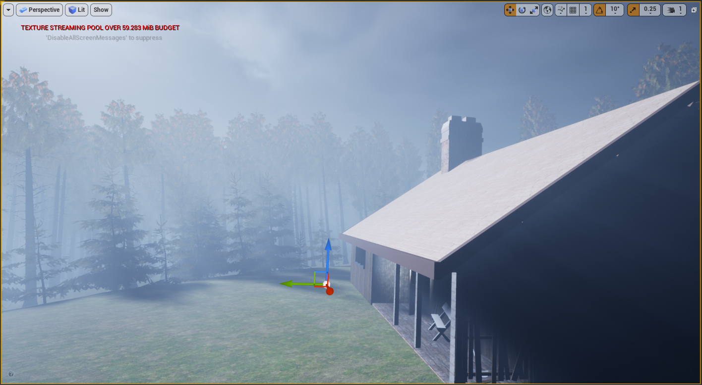
Scenery with fog removed
The main settings I adjusted were the fog density,and the Albedo. The density by default usually doesn’t go beyond 0.1, so I had to manually set it much higher to give off the chosen effect. The albedo is the colour of the actual fog. I set it to be a darker grey/blue to match the darker tone. It was originally white which didn’t look bad, but with some adjustments and testing, I massively prefer the darker grey colour.
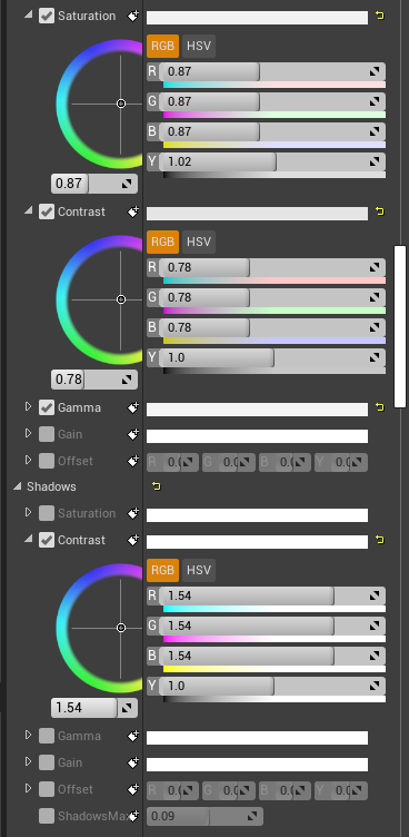
Scenery without Post Processing (colour correction)
The main settings I used were Exposure Compensation, Saturation, Temperature and contrast. The aim was to bring the exposure down, which I did so massively. This keeps the fog very visible and all the cool atmospheric effects in use, but just lowers the bright output they produced. The overall colour correction was to keep the tone quite tense and down to earth, rather than bright and colourful.
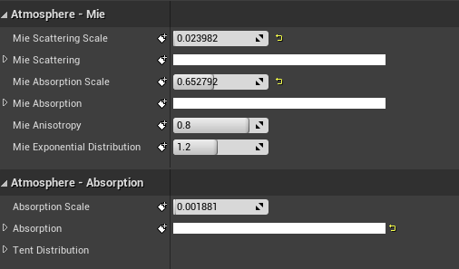
Scenery without Sky Atmosphere
The main role of the atmosphere layer was changing the sky from daylight to nightime, as visible from the image. I changed the mie scattering scale which changes how much light scatters, therefore lowering how much light is let through. It essentially changed the sky from being a very light blue to a much darker blue. I played with the absorption scale which also adjusted the colour of the atomsphere. I essentially adjusted the settings until I got the much darker blue I was after.
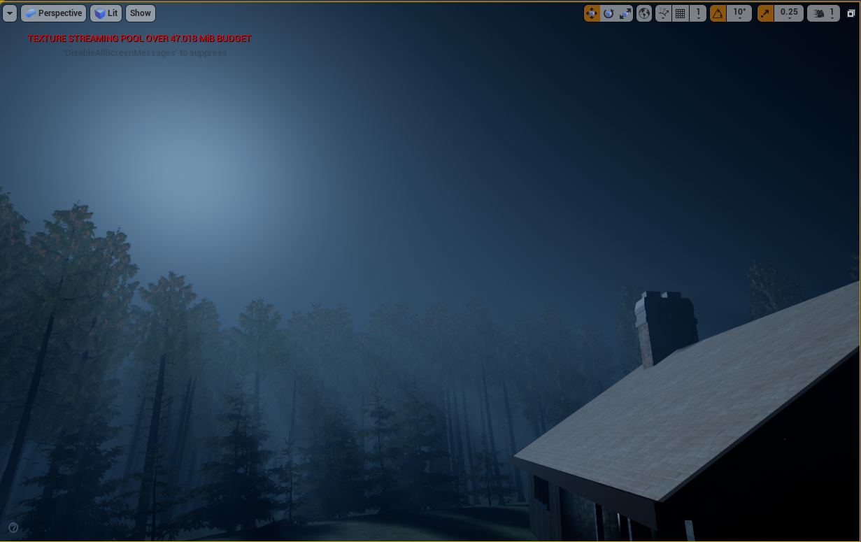
Scenery without clouds
I also looked at using LUT maps to colour correct, which you can do inside another piece of software using screenshots of a scene and then apply the settings to the LUT map, and then bringing it in. It’s a brilliant way for colour artists to work in their own chosen software without interfering with the main unreal project, but for ease and as I was leading all the lighting, I opted to just use the colour correcting built in.
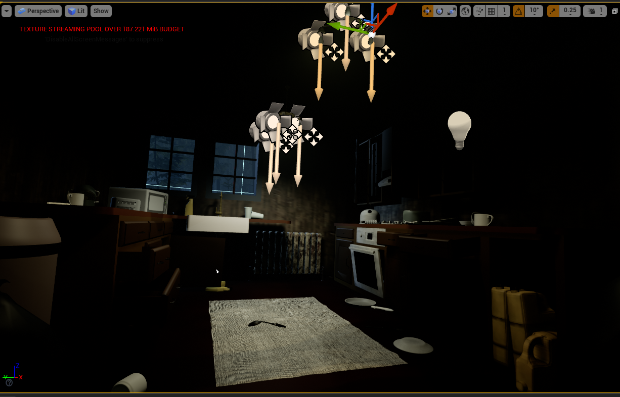
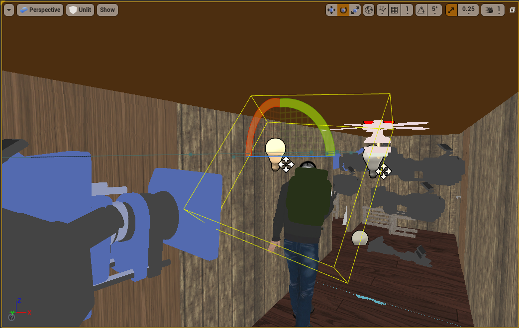
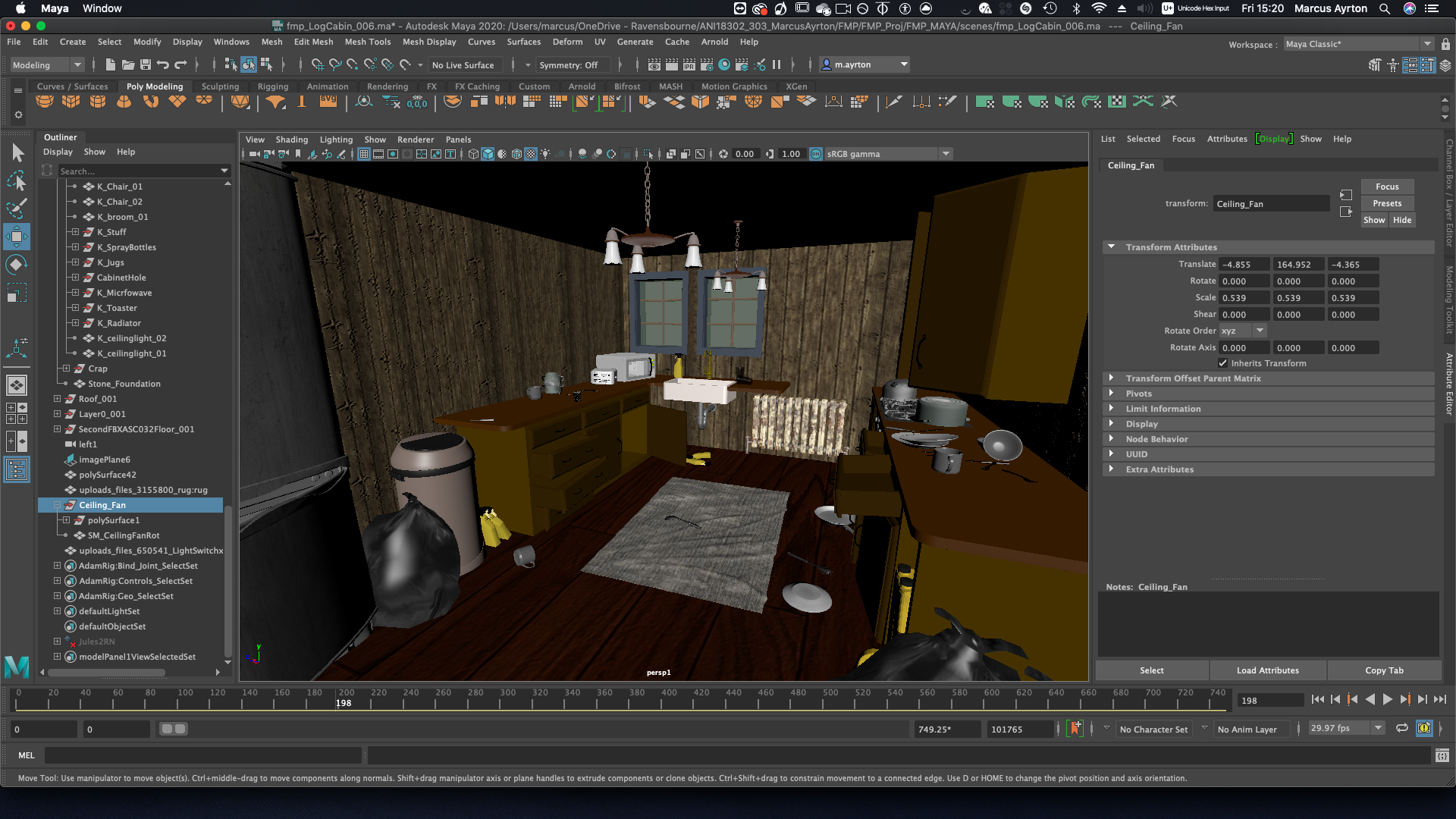
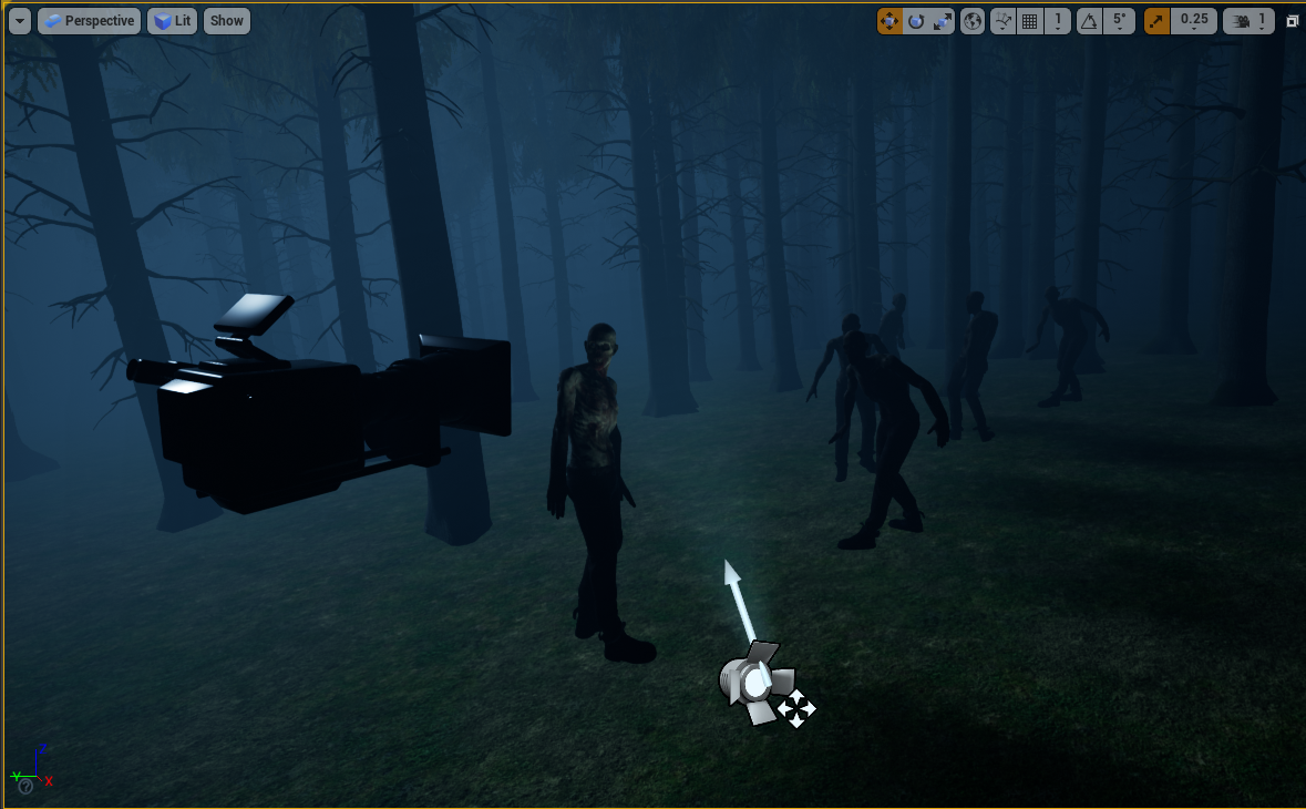
For interior lights, I used spot lights in the light bulbs, plus faint point lights to ensure the rest of the room was lit up. For some shots, it wasn’t enough to be able to see the subjects, so I used ‘rect lights’ which replicate real-life area lights which are just big rectangular LED’s, to better light the subject. This works really well when the character approaches the cabinet, and for when the characters stand in the hallway.
All lights in the scene use more of a warm colour, so the lighting isn’t too harsh to look at and everything in the scene blends, while the characters still stand out. Getting lighting right is a very hard process, and I know I could very well spend weeks perfecting just the lighting of the scene. For this project though, the lighting is just to compliment the animations.
The interior lights were a later addition, after realsing that night time natural lighting wasn’t enough. I changed the scenery to include chandeliers to light up the room, but ensured that the lighting was still quite dim and warm, to create a moody lighting inside the kitchen. I did this with all the lights having quite a low intensity, and then a very light orange to create a warmer light.
I originally had kitchen lights originally just use point lights, which emit from all different directions, but there were annoying reflections appearing on the celings. I found that the effect of the spotlights emitting at a downward angle just looked much nicer, but then the lack of lighting on the ceiling didn’t look right. Eventually after testing I settled with a combination of spot lights, and dim point lights to fill the room, much more the bottom 3/4 of the room rather than the ceiling, almost like a dark to light gradient.
Kitchen with just the dimmer point lights.
Kitchen with just the downward spotlights
As I wanted to keep the lighting dim, and I liked the look of the interior scenery with just the chandelier lights, I didn’t have any more lights to fill up the scene. However, there were a lot of scenes where the characters are just too dark and can’t be seen.
To solve this, I added fill lights for shots where the key aspects (primarily the face) were just not visible.
I used “rect lights” which simulate real-life area lights, which is a rectangular emission of light. You can change the width and height of the emission which is a brilliantly easy feature, and the ones inside Unreal have barn doors as well to block out emission on either side, which I used frequently to block out light appearing unessecerily appearing on the sides.
Here’s an essential shot where it’s evident that the fill light was needed.
As the lighting of the kitchen is quite warm, I wanted the fill lights to not be immediately noticeable for the audience. So as well as keeping them quite dim and sublte, I changed all the colours to be the same warmer colour. Here’s a comparison image with the light being set to the default white.
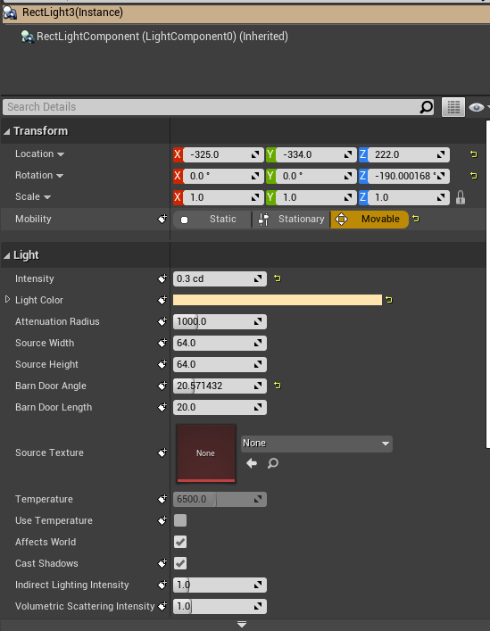
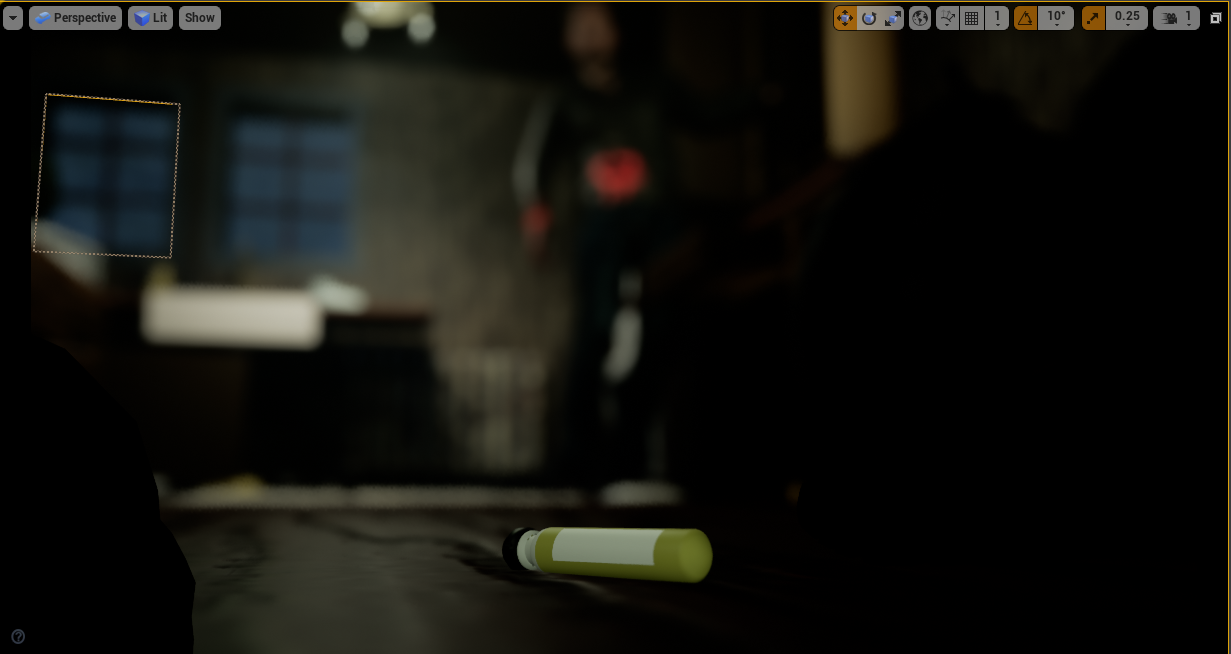
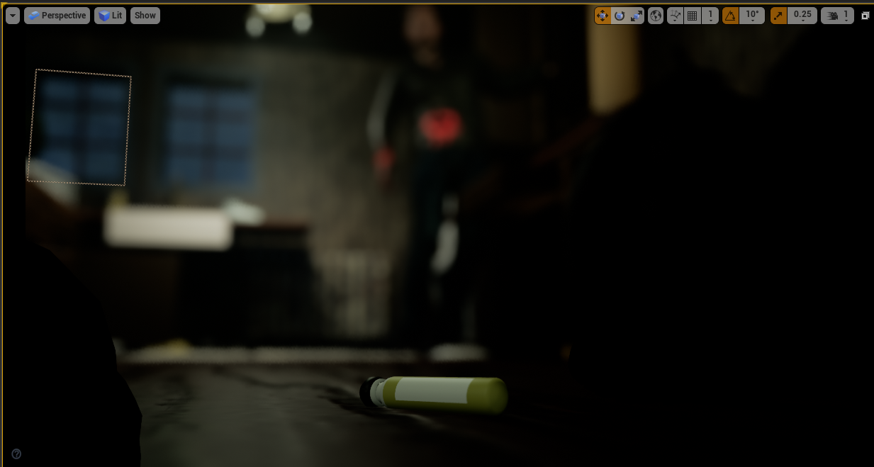
A particular shot to test the power of the subtle lighting, was the shot of the landing antidote on the floor. Initially I thought there wasn’t enough light natrually on it for it to stand out (picture 1), so I gave it it’s own fill light to brighten it (picture 3). Initially it looked pretty good, but after reviewing it a while later, I realised I kind of liked the shadow underneath the antidote on the floor, and the flat lighting I created made it look almost fake. So I spent some time adjusting the brightness of the light, which ended up being quite dim. The end result (picture 3), I feel has a nice combination of standing out just enough, but not too much that it almost looks fake.

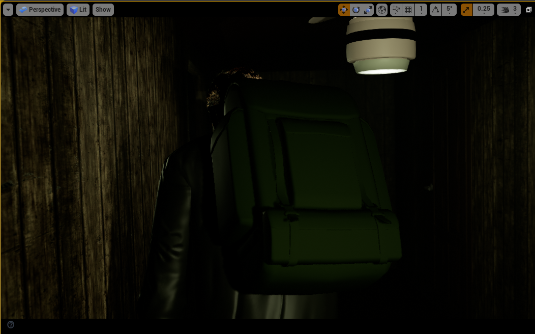
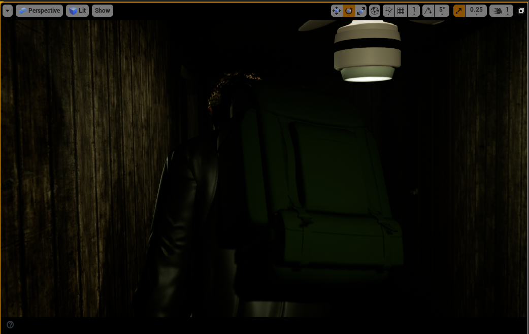
Another shot I spent time on the keylighting for was the introductory backpack shot. Without any lights it was too dark, but too much light and it looked obvious that there was extra lighting. For this, I decided on another rect light, with a very sharp barn door angle meaning there was limited side fall off. I then later adjusted this light to have a downward angle, creating a sort of light ombre across the bag, which looked much less flat, and a bit more tense.
One thing I did want to try and do for the final export, was a proper ray traced render. As Unreal is a game engine, it doesn’t by default use ray tracing lighting to optimise in favour of real time. Normal animation renderes like Arnold do use ray tracing on the other hand. As this was a film, and University have RTX graphics cards in their PC’s, I thought it might be a great oppurtunity to turn ray tracing on, and optimise the lighting and rendering for that instead.
After initially turning it on, here’s what it looked like:
It didn’t really add anything to the exterior shots, but the interior looked drastically different. It looks much darker, foggier and gloomier, and arguably better than the default look.
However, working within this environment was extremeley difficult. It was very very laggy to use and I couldn’t really change any settings. Trying to do a preview export resulted in the entire PC crashing.
From this experience, I agreed with Mason not to attempt to go down this path for the project, and stick with the look we have, which is already fantastic.
Cameras + Editing
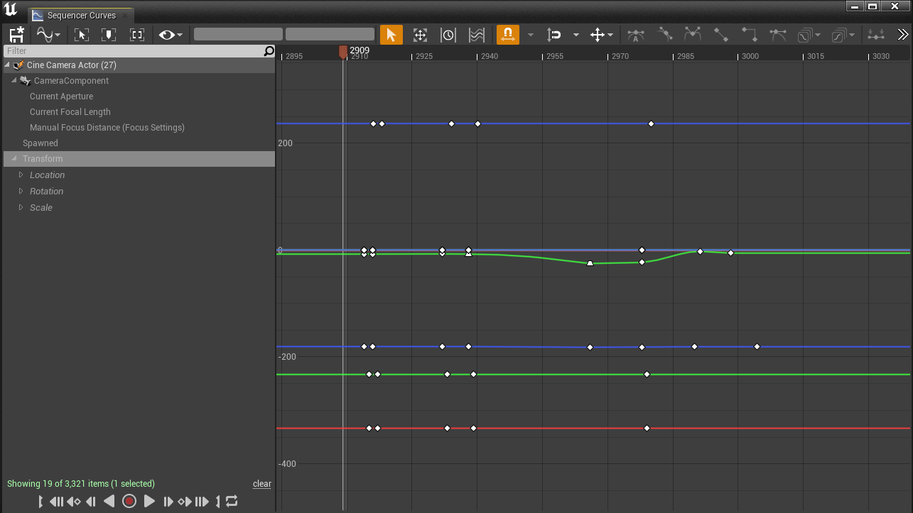
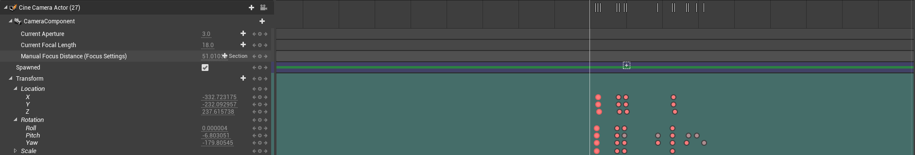
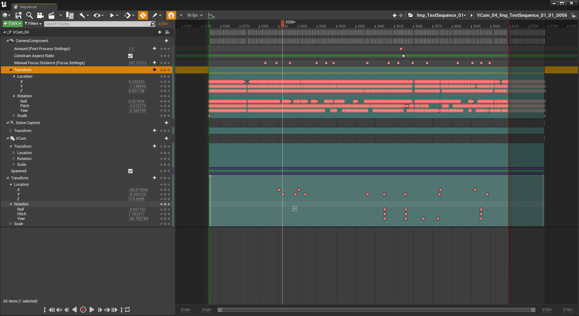
By far, the best part of the project, as this was the main role I intended to carry out. To create cameras I used the camera button in the sequence editor, and then moved in the space using WASD keys to where I wanted it. As depth of field is automatically enabled, it always looked very blurry, which I fixed by adjusting the ‘manual focus distance’.
A lot of the initial shots I did were based on the live-action stuff we did, as was Mason’s initial motion capture. So it was quite easy to build up a sequence. From doing this, I realised how some of the shots could drastically be improved inside the 3D space, so I spent time adjusting the framing, as well as the lens sizes, and depth of field.
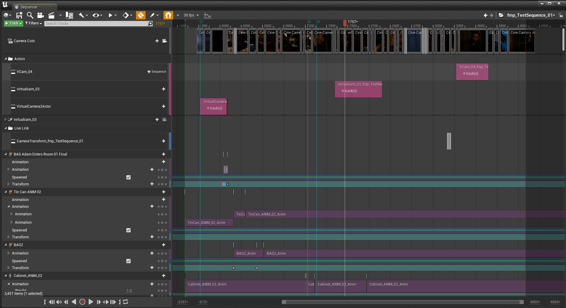
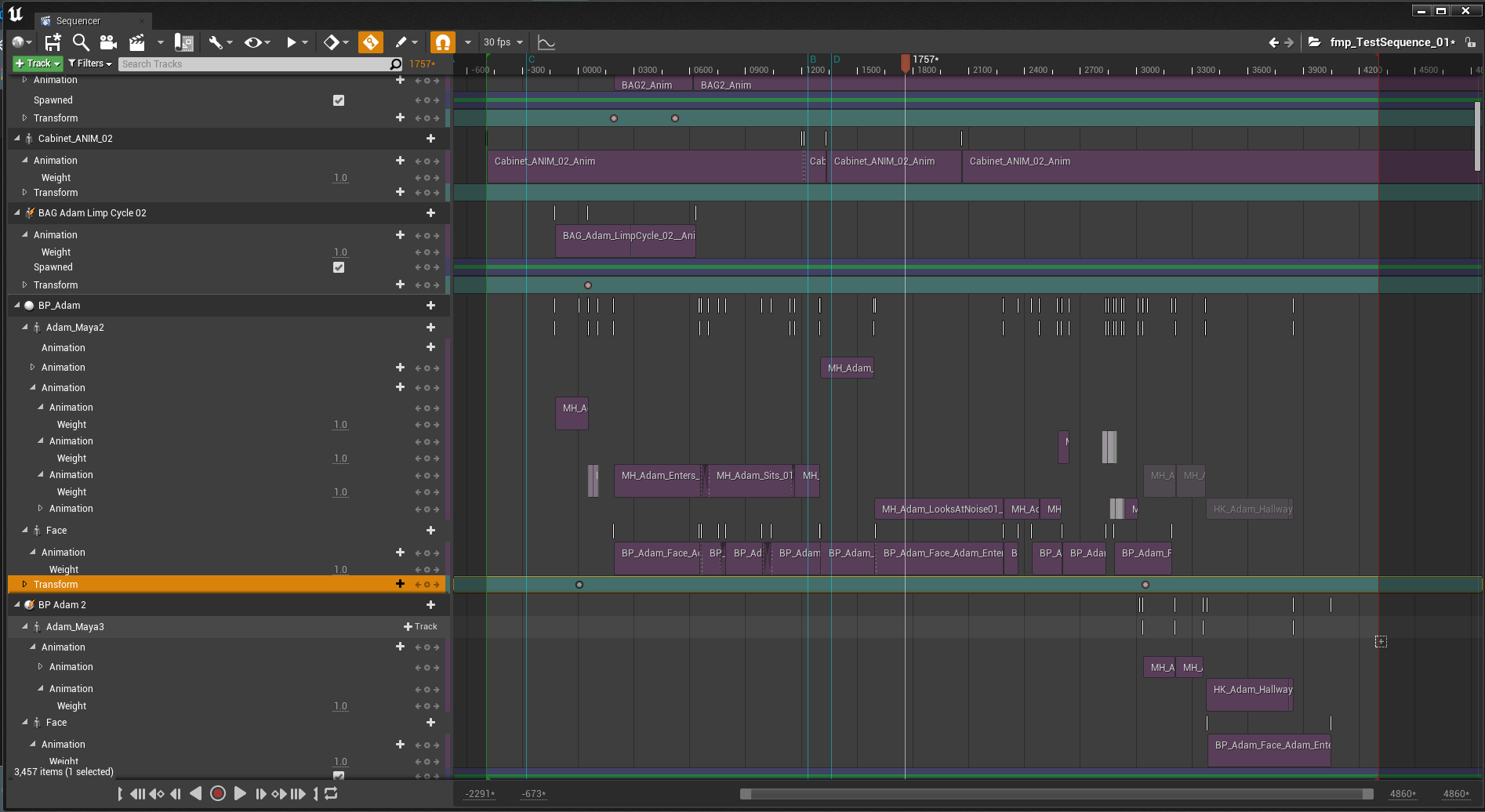
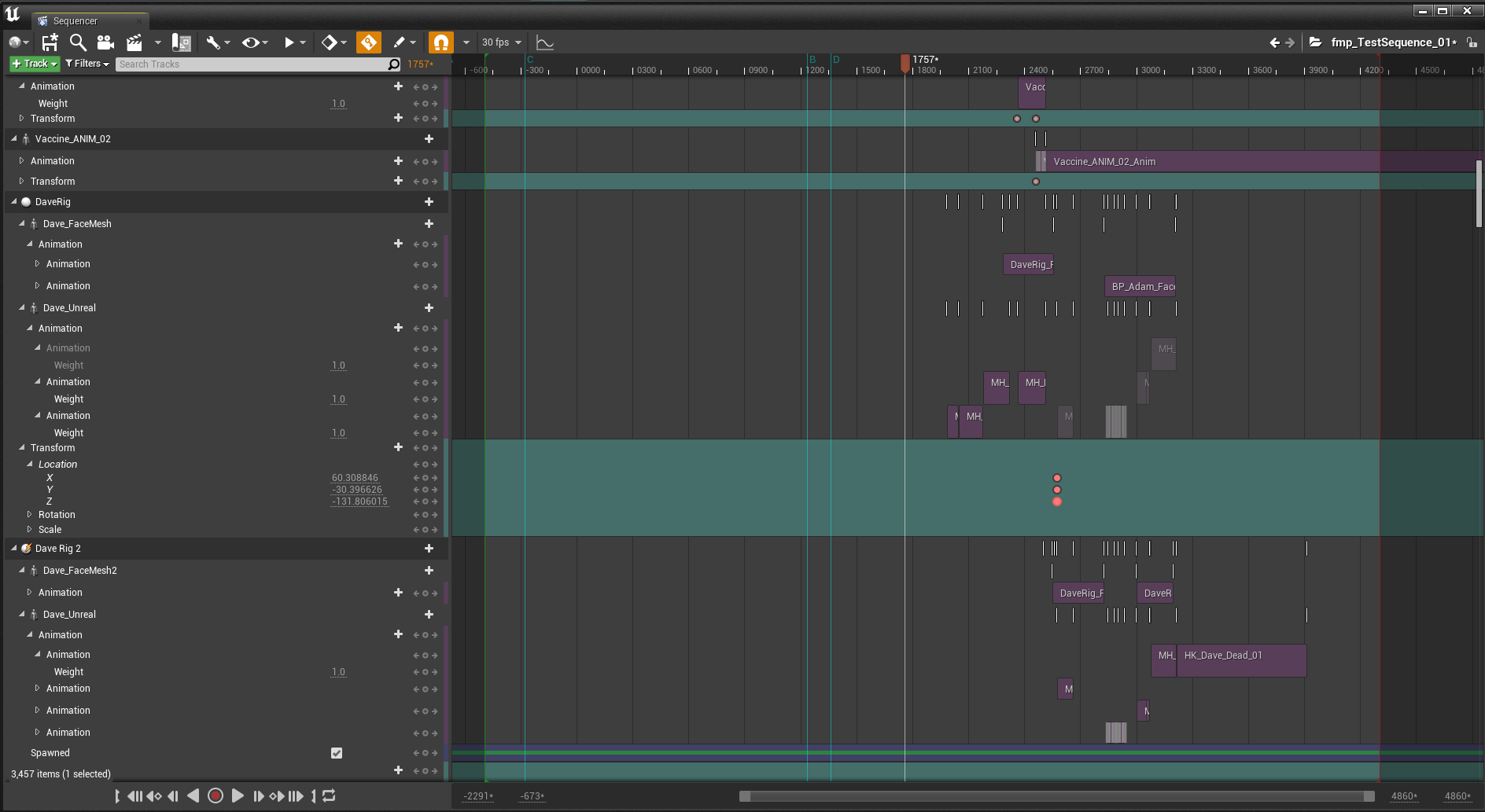
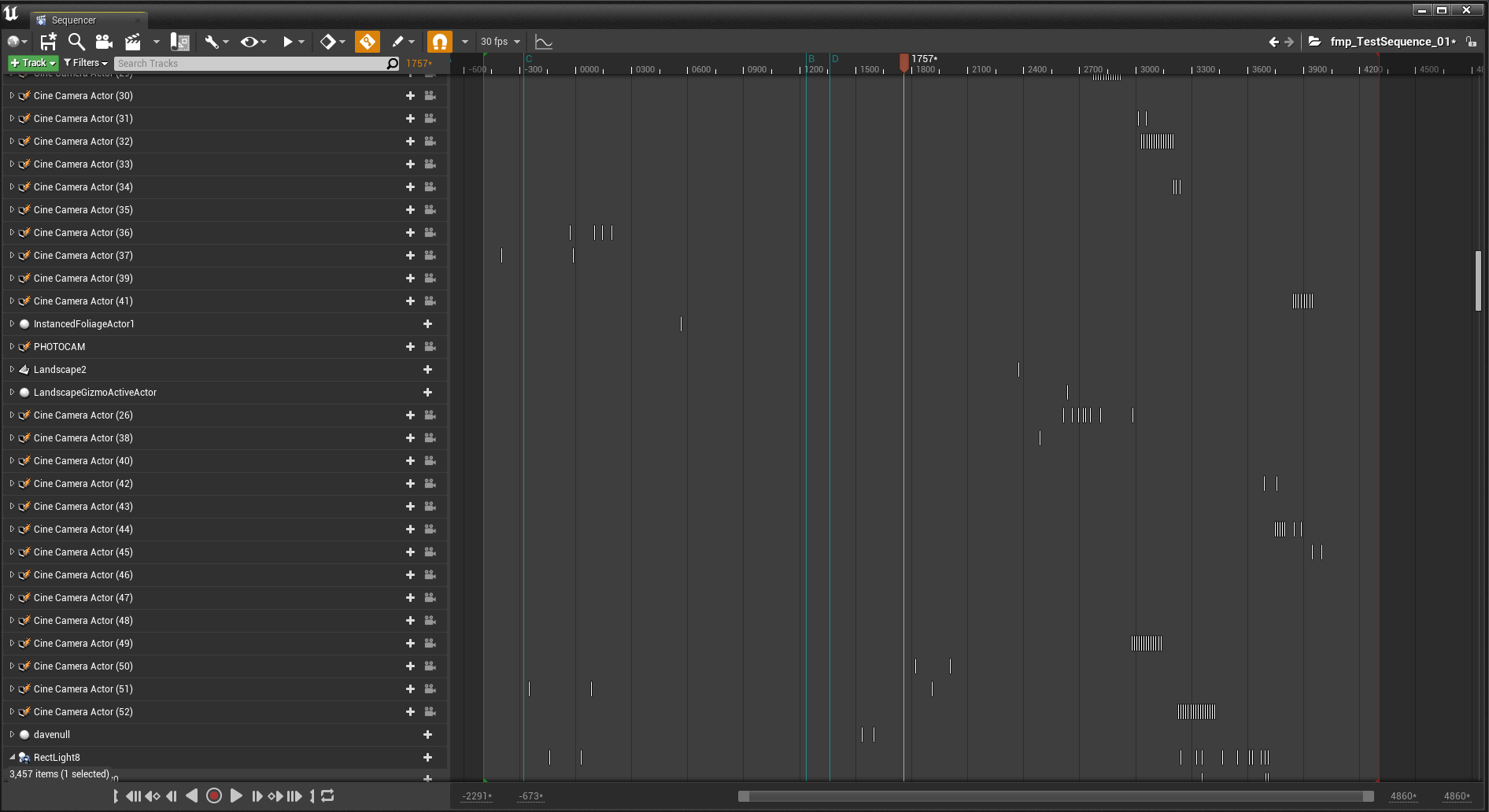
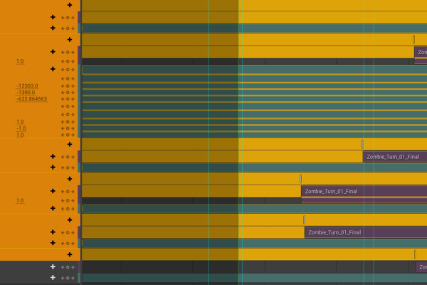
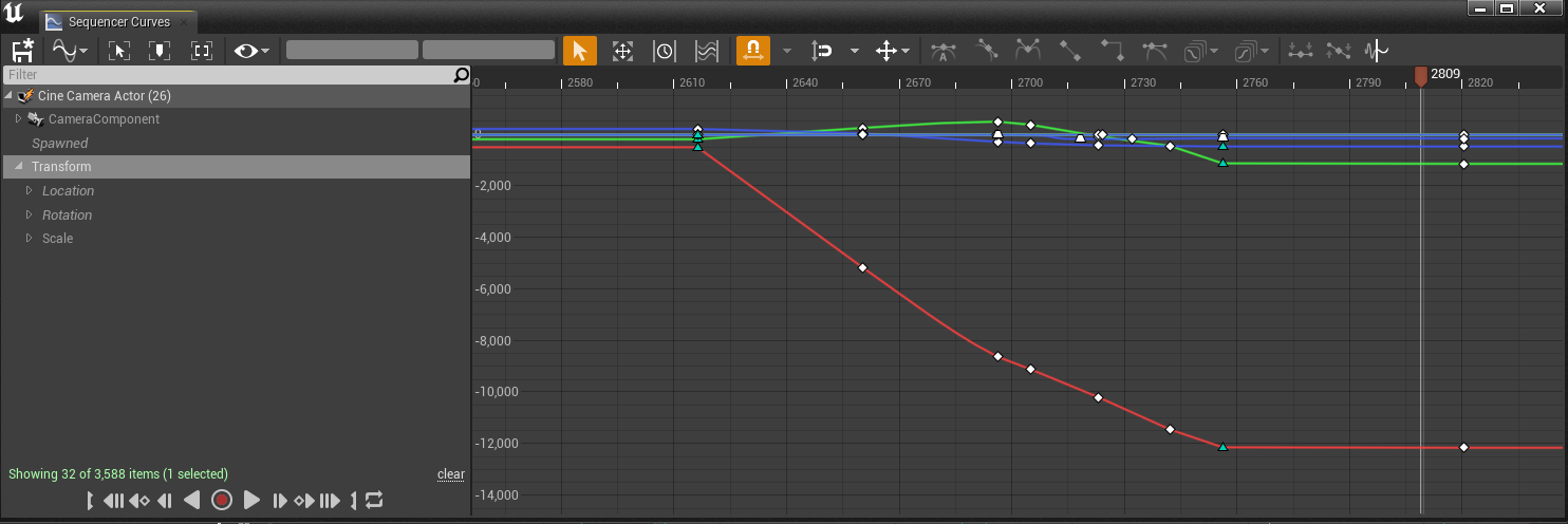
Here’s what my camera sequencer looked like when editing these shots together.
The ‘Camera Cuts’ at the very top is the actual editing of the shots together, and you can freely swap out each of these cameras which is brilliant. The purple blocks are all animations for each character or object. Below that, are all the cameras in a list, where they can be animated either via editing the keyframe which is similar to After Effects or by opening a graph editor window to have a Maya like window of altering keys and curves. In my opinion, Maya’s is better to use and you have much more control, but it’s still pretty good inside unreal. As it’s only for cameras, it’s not too problematic.
As well as editing shots together, I was actually editing the animations together also, as Mason had sent them over as seperate FBX’s, which meant editing was convenient.
Most of the animations imported fine, and were usually offsetted in relation to the scenery correctly, as Mason had been using my scenery in his animation files. Some of them however did not import fine and were rotated incorrectly. Luckily in Unreal you have the ability to offset just the animations using the properties tab. Typically it was a simple 90 degree rotation, but sometimes the offset would be completely out. In one instance the animation was in the floor. In this same tab you can also change the play rate of the animations to slow them down or speed them up. I did this in the early stages of editing when the mocap was still raw, and I had not given feedback to Mason on how to adjust it.
The problem with this is that it doesn’t live update as you change the offset, so the only way to be able to see live updates was to show the skeleton, and even then this wasn’t perfectly indicative, but it helped more when offsetting in a more specific way.
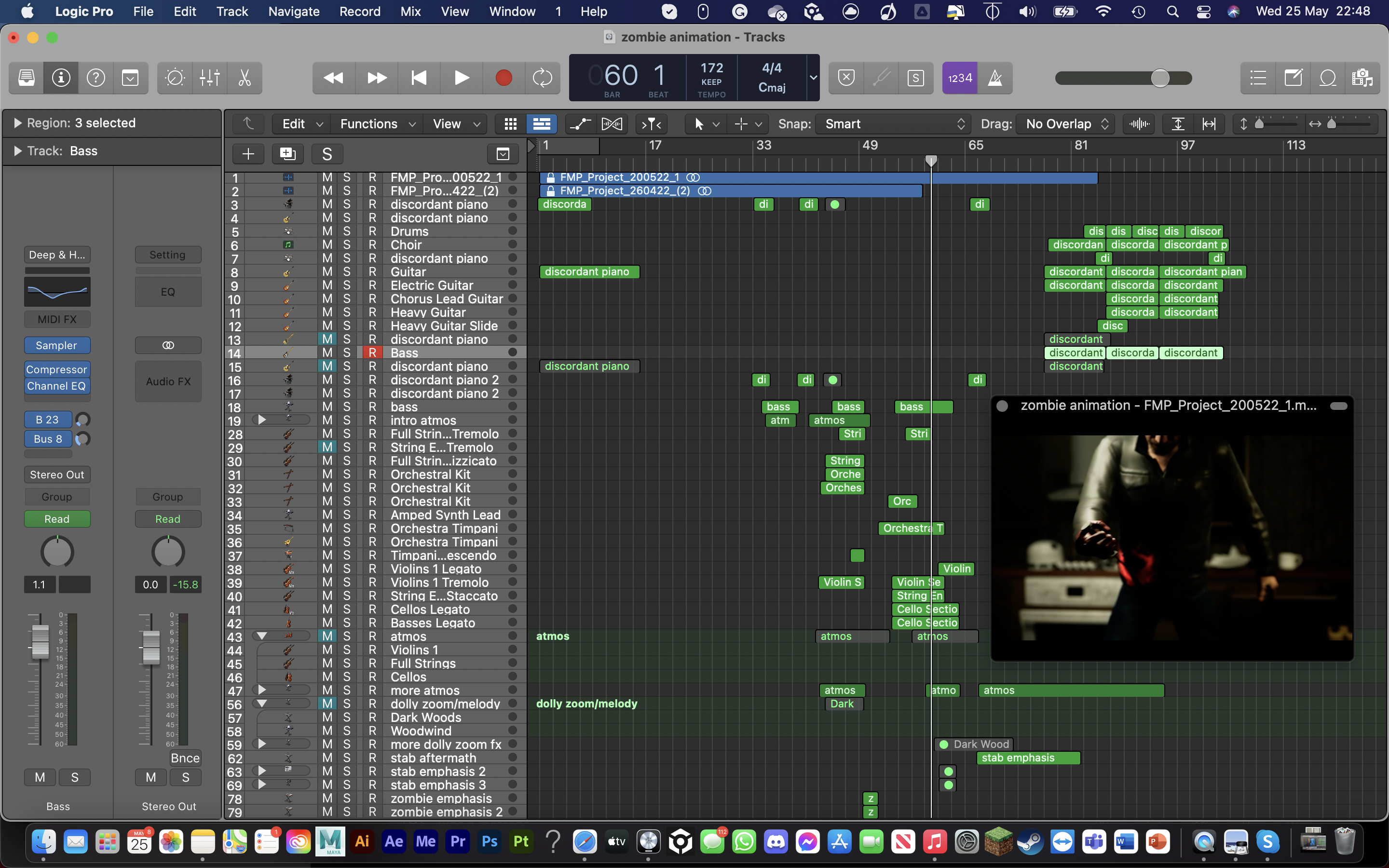
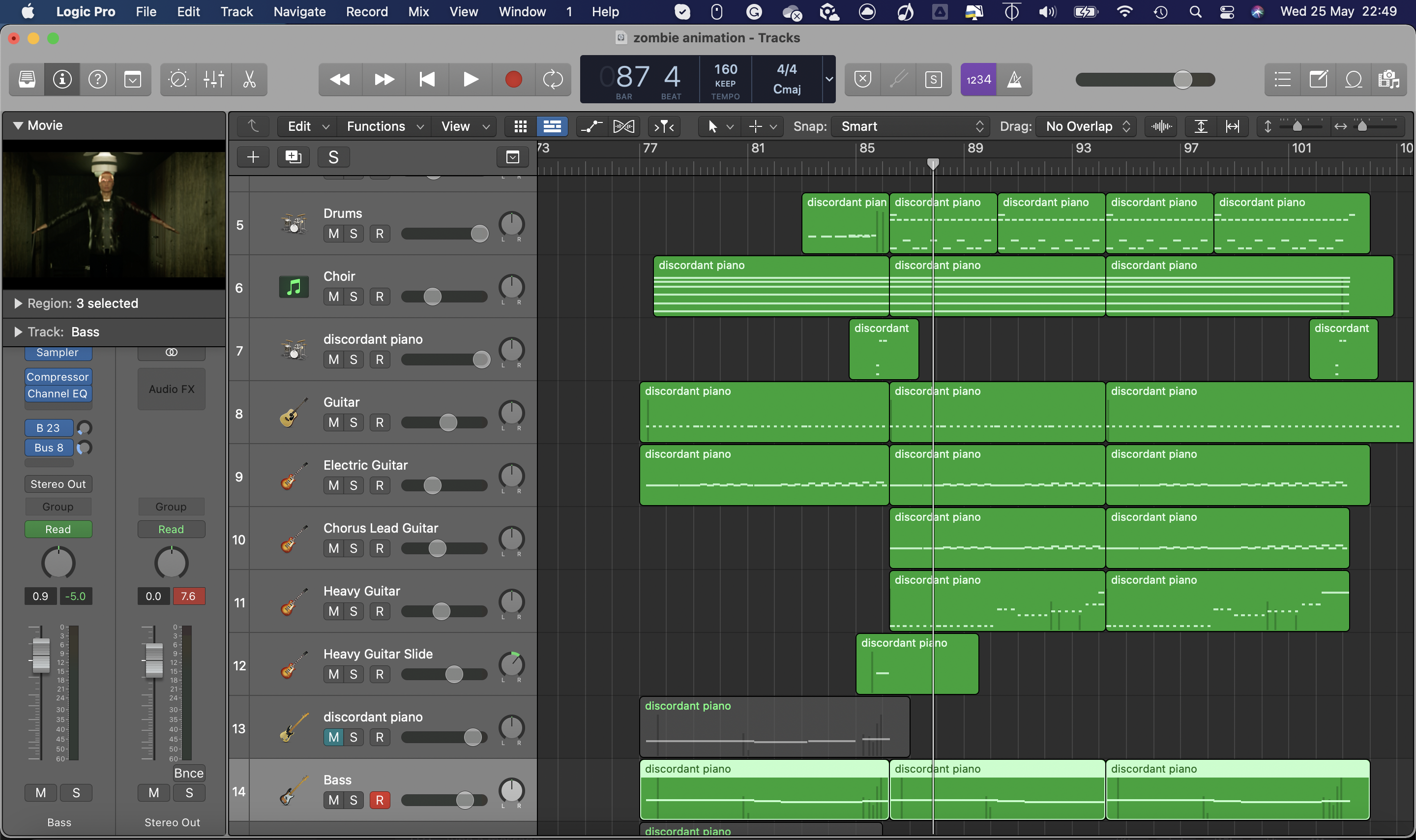
Passes of shots / edits
My first draft of the sequence incorporated the scene design I’d already imported, as well as gradually over time the motion capture that Mason carried out. His method’s involved doing raw motion capture on a blue “Ybot” rig, to eventually help indicate which is raw and cleanup. Again, this meant that I could carry out testing camera moves and shots without having to wait for the cleaned-up animation.
Here is the first pass of the edited sequence:
8/03/22
In this edit, none of the exteriors was finalised but I had a small go at lighting the interior, as at this point I realised exterior lighting wasn’t enough. The cameras are mostly pretty steady at this point other than the nice pan down when he looks at his knife and a small truck. This test was primarily to establish framing, as well as showcase the power of cinematic depth of field, which I feel I did very effectively, especially in the shots toward the end of the sequence. One shot which I added was the rear over the shoulder to reveal the secondary character walking in. It helps to add importance to the role the character provides, and adds suspense before eventually revealing his face. An early test of trying out different shots which I really felt worked effectively.
14/03/22
The next draft I added a couple more shots, as well as added the exterior environment. The interior lighting is very bright, and not influenced very strongly by the moody moonlighting coming through the window. Shot wise, there was a fast drone style shot through the window, but at this stage there were no zombies to add, so I chose not to perfect this shot until a later time.
This particular export is a bit broken however, and some of the camera shots got removed.
The draft completed next is so far determined the final look of the film the most. I fixed a lot of visual issues and finalised some camera angles. The lighting, although much more accurate to the final look, is still too dark.
April Presentation Update
Notable additions:
-Tilt dolly zoom: To dramatise the build-up to the zombie transformation, and to indicate reaction from the character, I decided on this really intense and drawn out tilt dolly zoom. This technique is commonly used in films to establish a realisation, or huge plot change, which is I why I felt this shot necessary. The immediate cut to the zombie being transformed is something that works really effectively, as well as saving animating the actual transformation. This was a decision I had already decided on during planning.
-Tracking the Knife: one of my favourite shots, even before properly adding handheld movement. The very quick movement down the body to reveal the action of pulling out the knife, and then following it as it leaves the body was something I could only really properly experiment within 3D space. It really helps to provide importance to the action, and somewhat indicates the stakes of pulling a knife out your body.
-Body fall to reveal the main character: Something I played with in live action, but really solidified in 3D space was this shot. The camera stays still but the body dropping reveals the end pose of the heroic action done by the main character, and the low angle establishes this power that he has gained. I spent a chunk of time perfecting the positioning of the camera, based off how it made me feel, and how well it was framed, and am very pleased the results look and feel really great and powerful, even with just y bots and no facial expressions.
A notable part about these shots its that as of yet there were no handheld movements. At this stage I knew I wanted to have them, but as I had not yet mastered virtual camera, they were not present.
26/04/22
For this next export, we started to bring in the cleaned-up human shots, a few at a time. This process led to having to reframe a lot of shots as the size of the characters is different, plus it allowed me to frame things like the eyes and torso to better match the point.

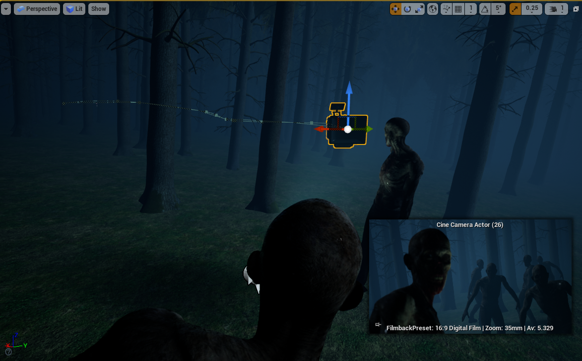
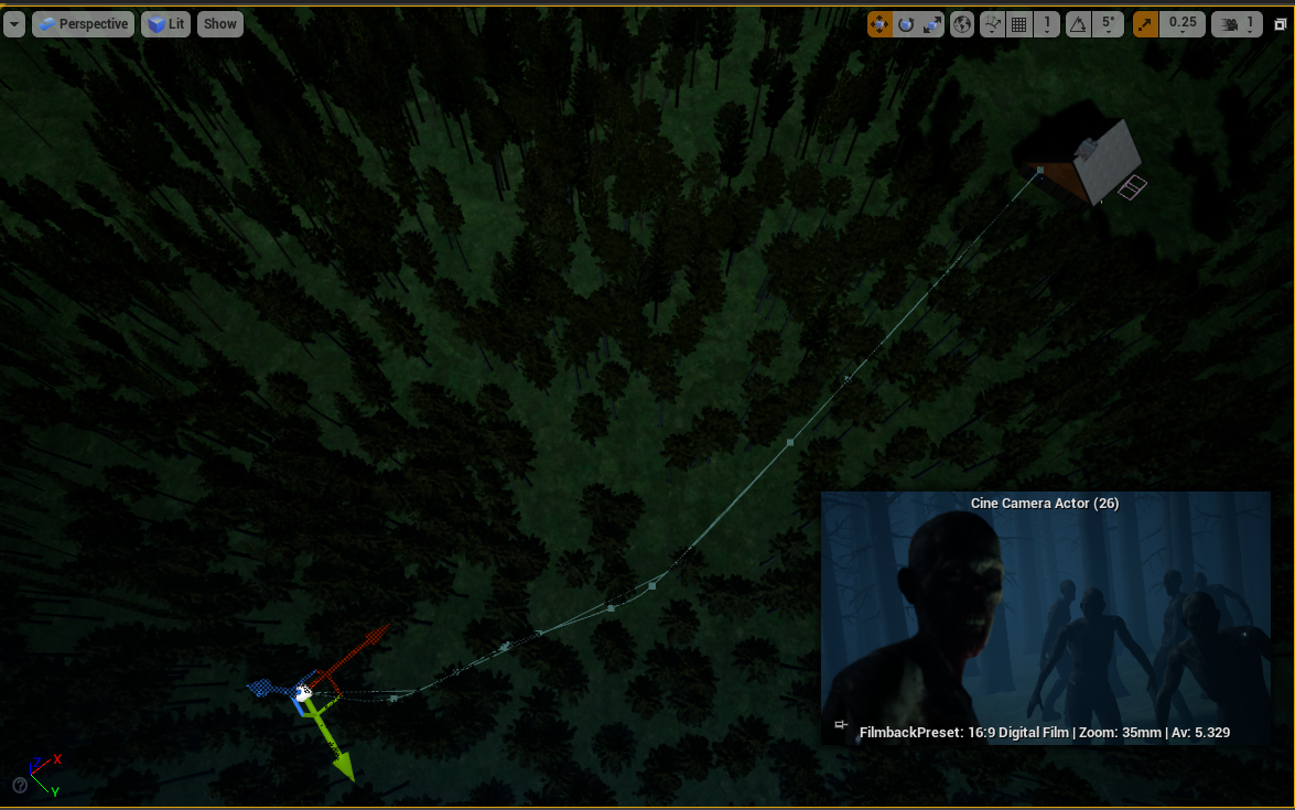
This export also brought in the zombies, which is my favourite shot of the whole film. To get to the zombies, I knew from the very start I wanted the camera to fly through the window to a clearing in the forest where they are present, to represent the travelling of the very crucial David scream which causes everything to go wrong. I had to fly through the scenery in Unreal to find where I wanted the zombies to be situated. After finding a half-decent spot, animating the camera to fly through was actually quite difficult. It took me multiple times to ensure the speed was the same, and it was a lot of trial and error. The end result from this export was pretty good. I added a backwards tilt with the camera which I later changed, but it was experimental.
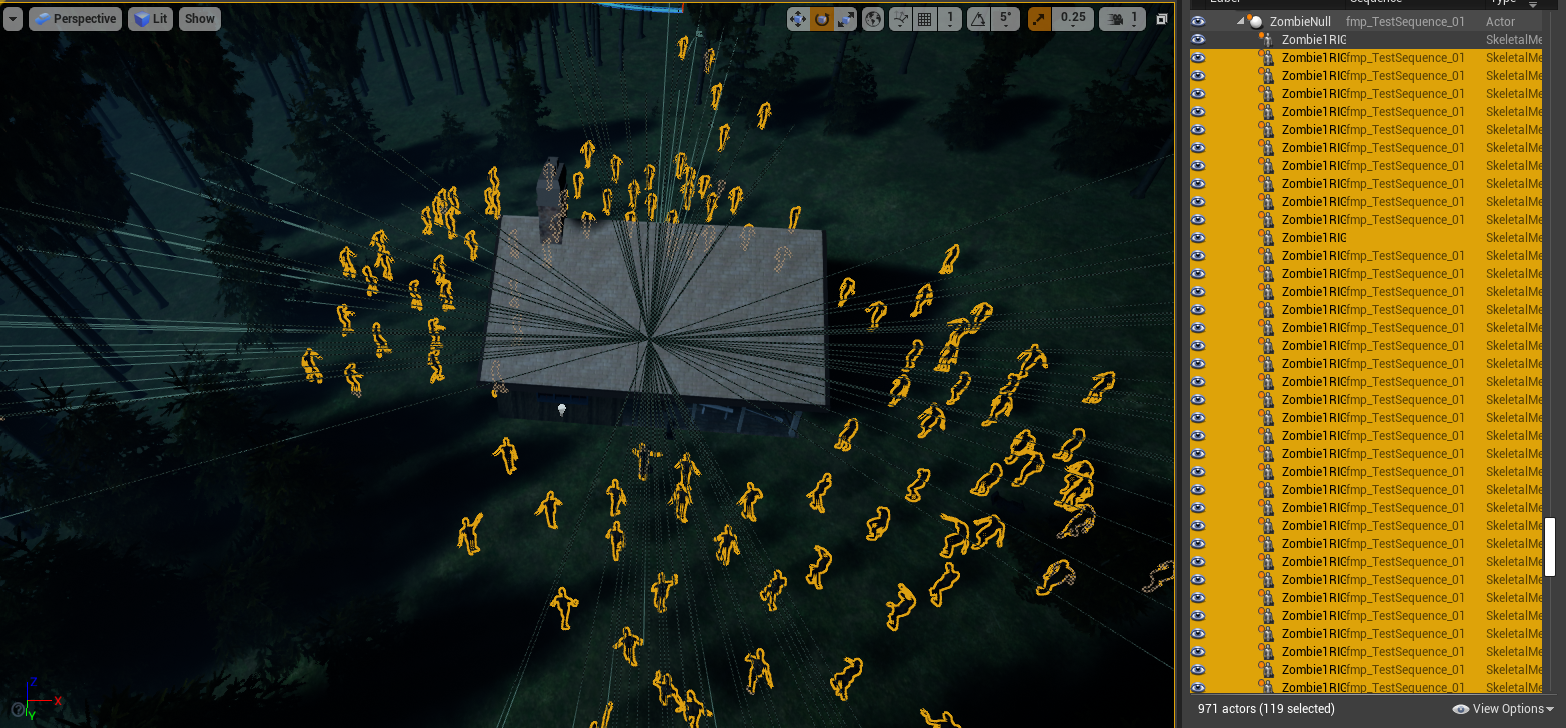
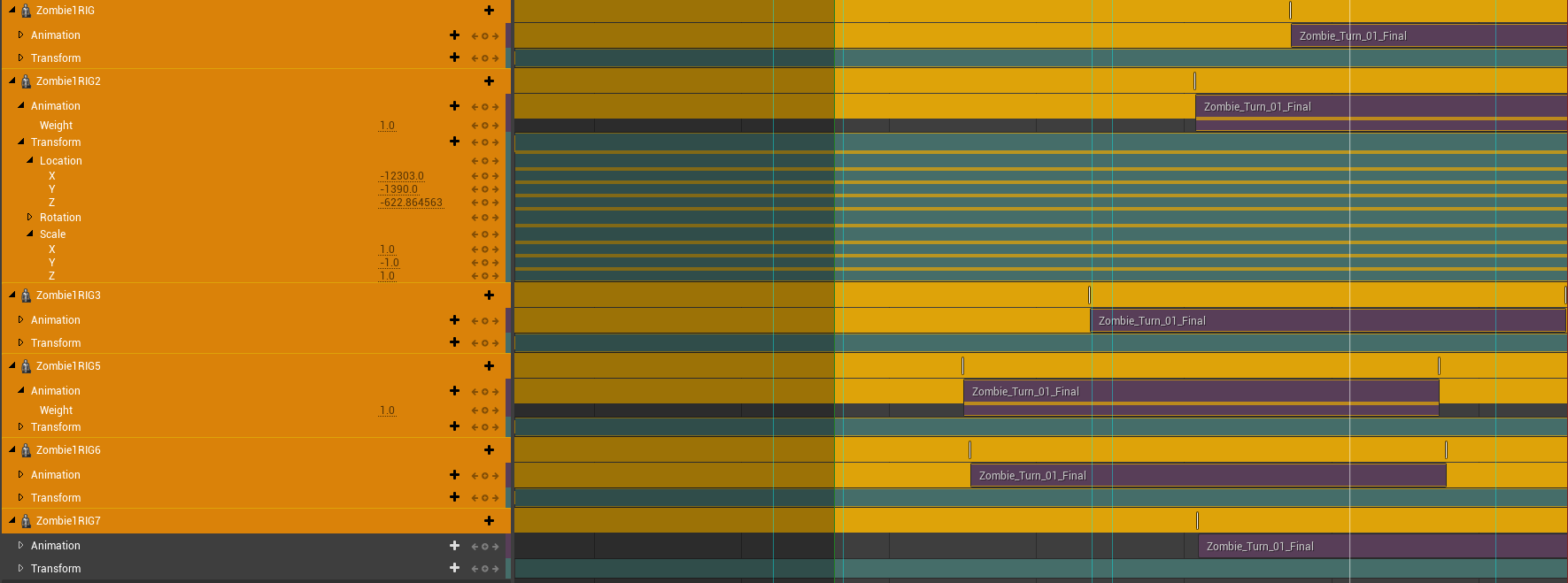
For the zombies themselves, I was given one single animation of Mason’s mocap which was a lot of zombie look takes all in one animation file. After bringing them in, and offsetting a few of the zombies, I then offset the animations to create a sense of randomness, so it wasn’t obvious it was all the same character. The timing of the looks was also offset to create a look ripple effect, so the zombie in the front looks, then the one behind and so on, to add to really emphasise the sound rippling through to them.
By accident, I then found a movement Mason did where the zombie looked up much slower, which didn’t quite match the rest of them, but it gave me the idea to have this zombie at the very front, and then have the camera pull focus to him as the other zombies look quicker. This shot allows the camera to really see the detail of a single zombie, to emphasise the zombified state. After watching, it almost gives off the sense that the zombie is the leader, but this wasn’t the intention.
04/05/22
The next export, everything becomes much more substantial.
I finally added an introduction, along with the walking hallway shot. The introduction shot is just a downwards truck with a pan from where the moon is supposed to be, to a well-framed angled shot of the house. I think it’s too long in this export, but I spend some time changing it later on.
The hallway shot is the first successful instance of a virtual camera also (see below), along with the handheld tilt when Adam looks towards the hallway which is also done virtually. Both really nice handheld steady shots, the first which replicates the pain in walking, and the second which shows uncertainty in his emotions respectfully.
We also got more of Adam’s character imported, but we had an issue with the hair looking awful because of a physics bug, so we temporarily removed it. For the future, we just turned off hair physics altogether as it wasn’t necessary and looked better without it.
I also drastically changed the shot flying through the forest shot. I scrapped the backwards tilt, as I wanted the house to still be visible as it slowly fades away into the fog, to help show distance, and stick with the theme of isolation. To make the speed of the camera seem faster without actually changing the position of anything, I also lowered the focal length to a much wider lens size, which creates a really nice side motion blur also. I did actually change the positions of some of the trees, as evidently there was a problem where they were placed in a very clustered manner which looked visually horrible.
We started bringing in object animations also. Mason attempted to animate the cupboard which he had in his proxy scene when animating, but evidently, it was an old model that was untextured, and there was also a weird visual glitch present which is unexplained. I fixed this in later exports by using a newer model but copying keyframes from mason’s animation here. I animated the antidote falling out of Dave’s hand (see below), however, Mason had not yet incorporated him in the animations, as at this stage we were still unsure if we were going to add Dave holding the antidote up as a whole separate plot point. We later scrapped this.
Finally, I improved the POV shot, and the downward tilt when Adam looks down at his knife, to have some form of handheld shake without going back and doing the whole thing virtually (it was at this point it proved too problematic to start using on every shot). I also used a technique which I learned from Pedram Etebar in second year, when the camera quickly moves, overshoot the movement, and then bring the camera back to proper framing, which I used in both of these shots.
08/05/22
This next export finally brought the addition, of having at least something to represent start to end.
More Adam and Dave animations have been added, with hair physics which have been removed.
I added a tin can animation now, which was key for the sound guys to use, as the sound of the can falling is an essential echoing sound. I also added a camera shot of the can actually landing on the floor to have a better indication. I also improved upon the zoom out from Adam as it falls.
Mason also added the backpack to the character animations, so he actually takes the backpack off his back and puts it on the side. Because of this I also added another showing this in detail, whilst also using a bit of foreground, showing 2 cups falling over. I really liked this shot as it helps to foreshadow that there are 2 guys, and one of them “falls over”, and obviously dies, leaving one standing. This really nice use of foreground indicates the cups whilst keeping the main action the primary focus.
I also did the ending hallway shot, however, this was all hand-animated. As I had previously decided to have the character walk down the hall, stop, get up and carry on moving, this couldn’t really be done with Mason’s facilities, as he only had a small space, and a constant speed treadmill. So after a meeting, I offered to hand animate it (see below). I also did my main virtual camera with this shot, and it was by far the hardest and most annoying shot to execute, but the result looks great.
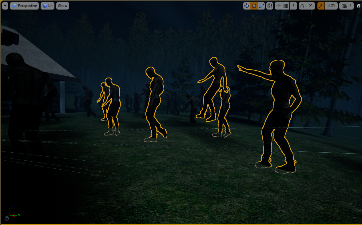
Finally, for the ending, I had a play with the zombies surrounding the house. Mason had not yet done the mocap so I just put the zombies in T pose, and played around with the camera. I did a really nice crash zoom in on them to establish their presence, as this is representing the worst possible situation for Adam.
From the start I also wanted a handheld helicopter-style shot to show the sheer amount of zombies surrounding the house. For this, I actually copied some of the handheld keyframes from some of the virtual camera shots to give it some natural shake and then added in a zoom (focal length change), which is inspired by car chase documentaries at a really high angle and zooming in on the action. It took a while to nail the movement of this shot, but with the graph editor, I spent some time making the animated curve really sharp, fast, and also smooth. I’m really happy with the end result of this shot.
16/05/22
In this export, I incorporated more of the same handheld techniques, by copying handheld keyframes from the already done virtual camera. This made some of the shots look very effective.
As evident from the poor lighting, when Mason added the backpack to the shot of Adam walking through the hallway, the lighting becomes much darker. I spent a lot of time adjusting the distance from the camera, to Adam’s backpack. I later decided to then add fill light to help show the bag. (See above)
The main changes here were with the addition of the much better camera moves after Adam looks back at Dave. I framed the shot immediately after Adam looks, much tighter, and then added handheld movement keyframes from the virtual camera shots, which adds authentic-looking handheld movement, without having to do virtual camera for everything. This really helps create a fast-paced intense environment, and really helps to show how powerful the camera is in indicating intensity.
I decided on an alternate opening shot, which utilizes the foreground a lot better, with the small branches covering the house. I really like both of the shots, and I have tried to combine them both, but I might make them blend a bit better.
I did the same then, for a crash zoom as Dave charges at Adam, which really emphasises the intensity of the attack. This in comparison to the shot before, is miles better and again ramps up the intensity.
I also did the same technique when Adam pulls the knife out and moved the camera to properly follow the knife as he moves it, making it the subject of the shot. This essentially makes the knife the main character of the shot, by using depth of field, and the following movement to make it the key subject. This plus adding the handheld keyframes makes the shot look absolutely incredible.
I also adjusted the cut between this shot and the actual stabbing, the edit is much smoother and the cut is more subtle. I really like how intense this shot is, and the way it made me feel when reviewing it.
Finally, compared to all the other exports, this was exported at 24fps, which is accurate to the film look. Previous exports had been at 30fps, as that was what we had been working with primarily to get more accurate mocap, and animaitons, but 24fps looks much more authentic.
20/05/22
This export adds most of the face animations, as well as the zombies actually moving.
For the sound people, Mason had to animate all the face movements, again using Mocap, as they were making sound design for the facial expression. With most of the expressions added, the film starts to look more real and brought together.
For this export, I also added a shot of David’s dead body, as the animation Mason didn’t actually include it. I created this pose using the rig that Mason set up for me and exported it from Maya. I created a shot to show the dead body just to show continuity, and to let the audience know David has definitely died. It also adds a nice a transition to the really low down low depth of field shot of the antidote.
Mason had also completed the Zombie motion capture at this point. Like the looks, he did it all in one go, so sent one long zombie walk cycle as an FBX. As this was done on a treadmill, the animations didn’t actually move. I debated moving the zombies in Unreal by animating the characters but decided against this after realising rotating the zombies around the house just wouldn’t work. Instead, I went back into Maya, and changed Mason’s mocap to make them walk forward. As the treadmill speed is constant, this was easy to do, with one simple z translate curve. I re-exported and reimported back into Unreal, and then I could rotate the animations as much as possible. To get lots of them, I duplicated the zombies with the animations inside the camera sequencer, moved them in the scene, and then offset the animations to make the movements random. The only issue with this is that the zombies move backwards or forwards when moving the animations, so it became a lot harder to move the characters. Nonetheless, the end result looks brilliant. It resulted in changing the camera moves I had done, however. I changed the offset of the camera on the crash zoom, and then changed some of the focal lengths to better frame the zombie horde in the helicopter shot. This wasn’t too hard, as I used the graph editor and offset all the keys, keeping the animations I’d already worked hard on intact.
23/05/22
This draft finally removes the ybot. Mason at this point had finished cleaning up every shot so there are no longer proxy animations present. This meant I had chance to change up the final shot.
After receiving Dacre’s initial sound design test, and my rendition of the music, I then edited together everything simply using Premiere Pro. I also added a very simple credits sequence:
The ending shot here utilisizes copying keyframes from handheld movement again, coupled with a really fluid movement to show both the wound, then the antidote, and then the reaction shot. I felt the 1 take was a much better approach, and the shake helps to establish his fear.
In premiere pro, I edited together all of Dacre’s sound design, and my music composition (see below). It really provides substance to the entire sequence, and the noises add to the deafening silence of the earlier slower paced shots. I’m really happy with how well the sound integrates.
This edit also features a very basic credit sequence which I added using premiere pro and timed to my music compositon.
24/05/22
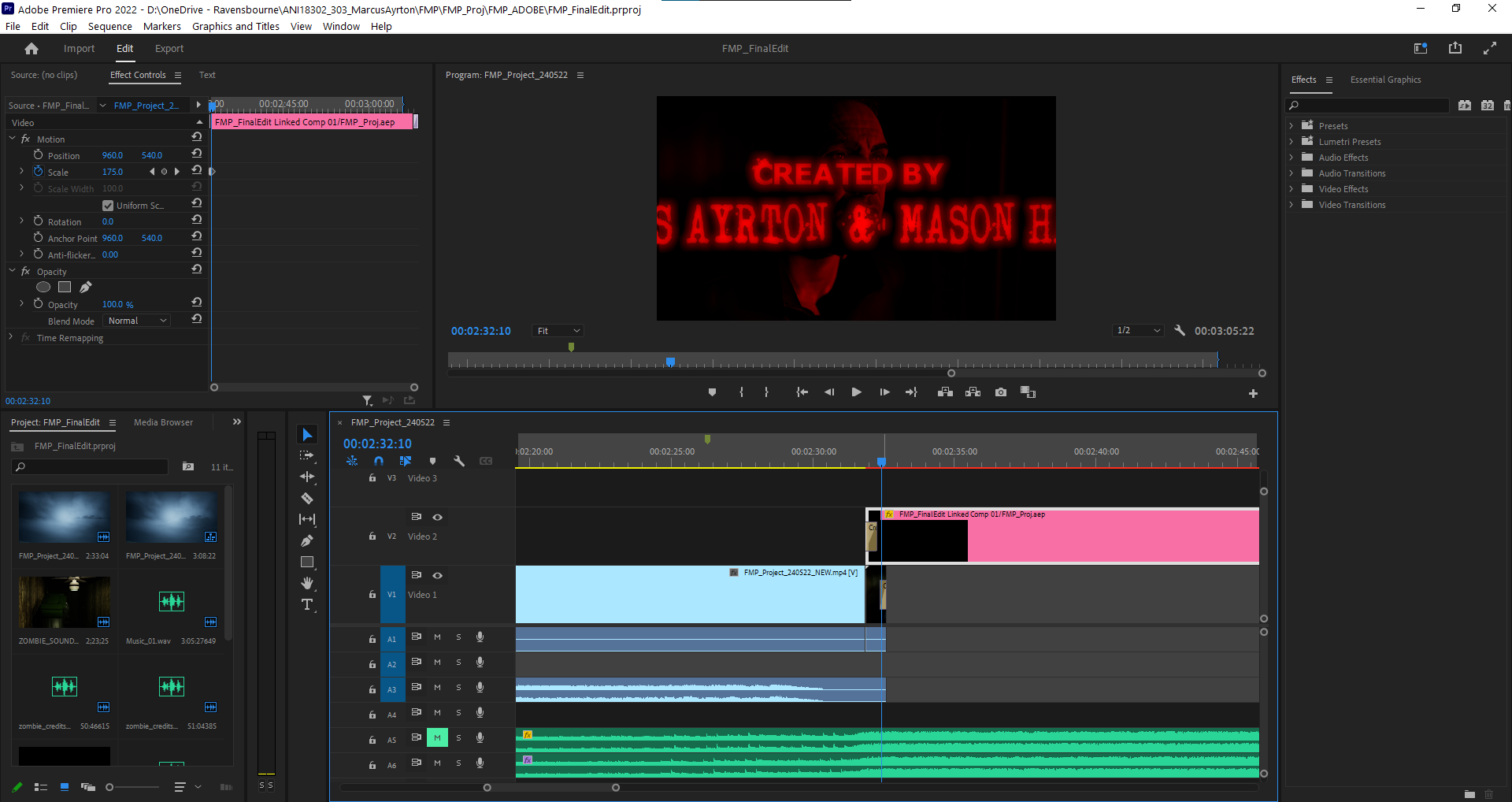
And then quickly, the following day I changed it further. I added a properly edited title sequence now using After Effects (see below), and a brilliant transition from film to titles which really provides the ending with intensity. The music also has been updated, including Dacre’s rendition of the ending titles (see below).
I also made some small lighting adjustments, and fixed a texturing issue with the Antidote bottle.
This particular edit was actually shown to The Third Floor, as my interview came up and it wasn’t quite done. As I had publicised this export, it actually meant I gained feedback. Stewart Ash & Maya Greaves from TTF and Liam Morris from Pixomondo said they all really enjoyed the film.
I also fixed the texturing problem on the antidote (see below).
Dan provided feedback that the establishing shot should probably stick to one of the 2 options, as the first half sort of leads the audience on in movement, which I agree with. He also suggested adding a bright light in the hallway to visually indicatet that someone is in the house.
28/05/22
This was the final export. In this edit, Mason has added idle animations where the characters were originally just holding a pose. I also added another hallway light.
For this final edit, I also realised that ‘Burn in’ exists in the render settings, meaning you can visually see the lens sizes, positions, apeture and focus distance. This is more likely the document that is used in the industry.
NOTE: this edit is not the final edit. The audio mix is not final, the frames are not accurate (starts at negative frames cause of the way I added shots) and the credits are not accurate. (See final work tab)
Virtual Camera (Bracketing)
One of the aims from the start was to have a virtual camera setup, to show my initiative with using new industry virtual production / pre-vis technology. I gained from filming the live-action pre-vis that handheld movement for some shots would be extremely beneficial, for example, mimicking their anxiety and pain with the shakiness of the camera.
Executing this was an extremely difficult task, and required very specific requirements to work properly, for example, it worked better in Unreal 4.27 rather than in older versions.
I followed a lengthy tutorial to set it up, which included changing render settings, the use of the computer’s IP4 address to connect a device wirelessly and ensuring all the plugins work properly.
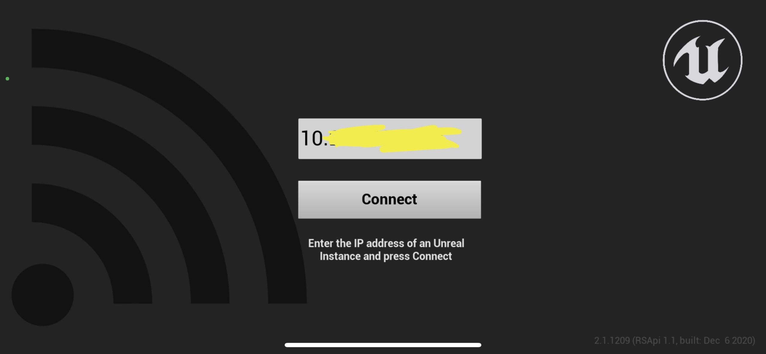
To set up my iPhone and or Ipad, I had to download the Unreal Remote app. The interface for the app is just a window for your IP4 address, and ‘connect’. To get this, I needed to find it in my computer’s settings, and then put this inside the project settings’ UDP messaging tab, with a :0 at the end.
After this, I needed to have the live link, remote session and virtual camera plugins enabled.
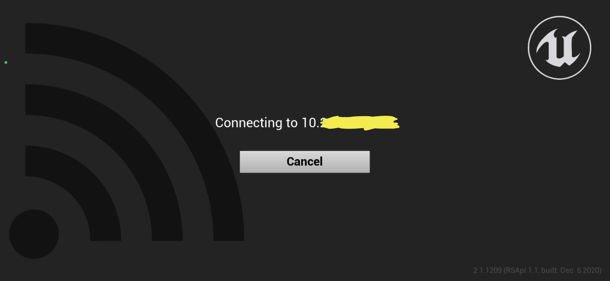
Then in the newly made live link window, after I’ve typed in the ipv4 and pressed connect, my device loads up.
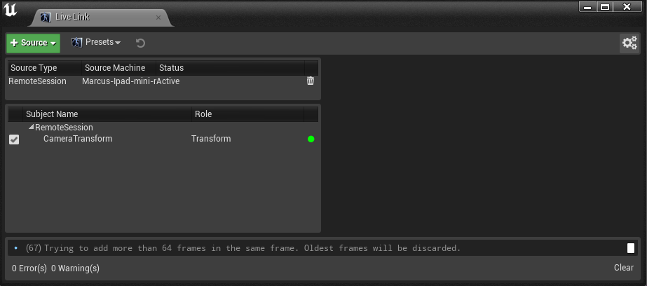
After connecting the device, using the virtual camera was simple enough. I had to create a seperate virtual camera actor, as it’s different to a normal camera. In this, it has the usual camera settings, plus a drop down menu for setting up the virtual cam. This involves specifying that you want the camera transform from live link to be controlled, and then the enable button. After this, the device began to control the virtual camera, with relatively good accuracy. For better live playback I turn off lighting.
Originally during very very early testing, my ipad/iphone actually had an interface, in which you could see the scenery and you’d have a bunch of controls present, but for some reason this never shows up. My guess is consumption issues, as usually with this turned on, the playback becomes much more laggy. Nevertheless, for what I needed it for, having my monitor infront of me, and my device in hand, it worked pretty well.
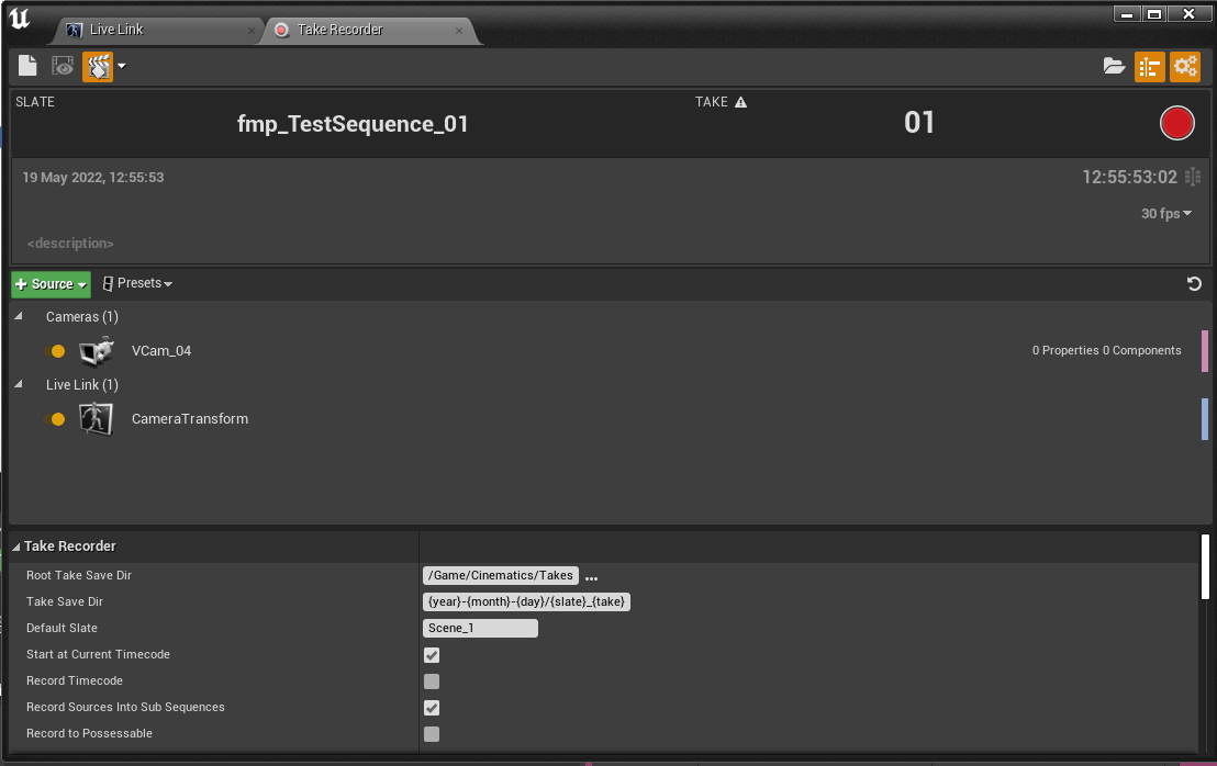
Setting up the camera wasn’t too hard, but actually recording it into the sequence I wanted proved a very difficult task. It uses the ‘take recorder’ window which is very useful for After months of trial and error with solving it, I finally mentally created the steps required to sort it:
- In the ‘take recorder’ window, I had to set the main sequence as the location, and then reassign the virtual camera to be recorded.
- To ensure lag didn’t occur I would change the viewport settings to be unlit, as the lighting wasn’t necessary.
- I changed the initial translation of the camera to be the starting point, and I ensured this wasn’t keyed so my view didn’t fly off anywhere unnecessarily (a frequent problem during initial testing)
- I locked the viewport view to the virtual camera view, as after recording the view would remove itself from the camera because the sequence was overriding it.
- After recording a take, It would actually create a new referenced camera inside a new subsequence. I initially tried bringing the camera out of the subsequence into the main sequence, but this caused more problems. I then realised in the camera cuts timeline you can use cameras in subsequence’s. So I set it as the new camera and it worked. Some playthroughs it would actually glitch out and remove the camera from the edit, but it then fixes itself after some time.
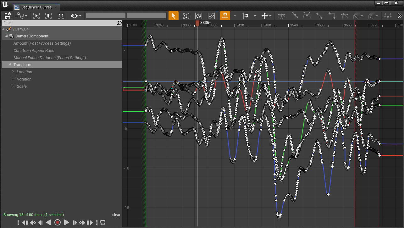
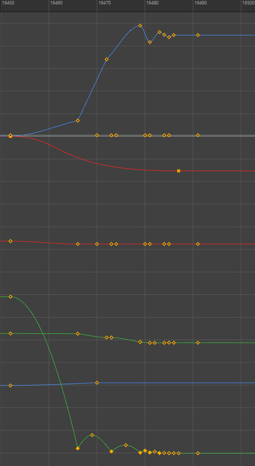
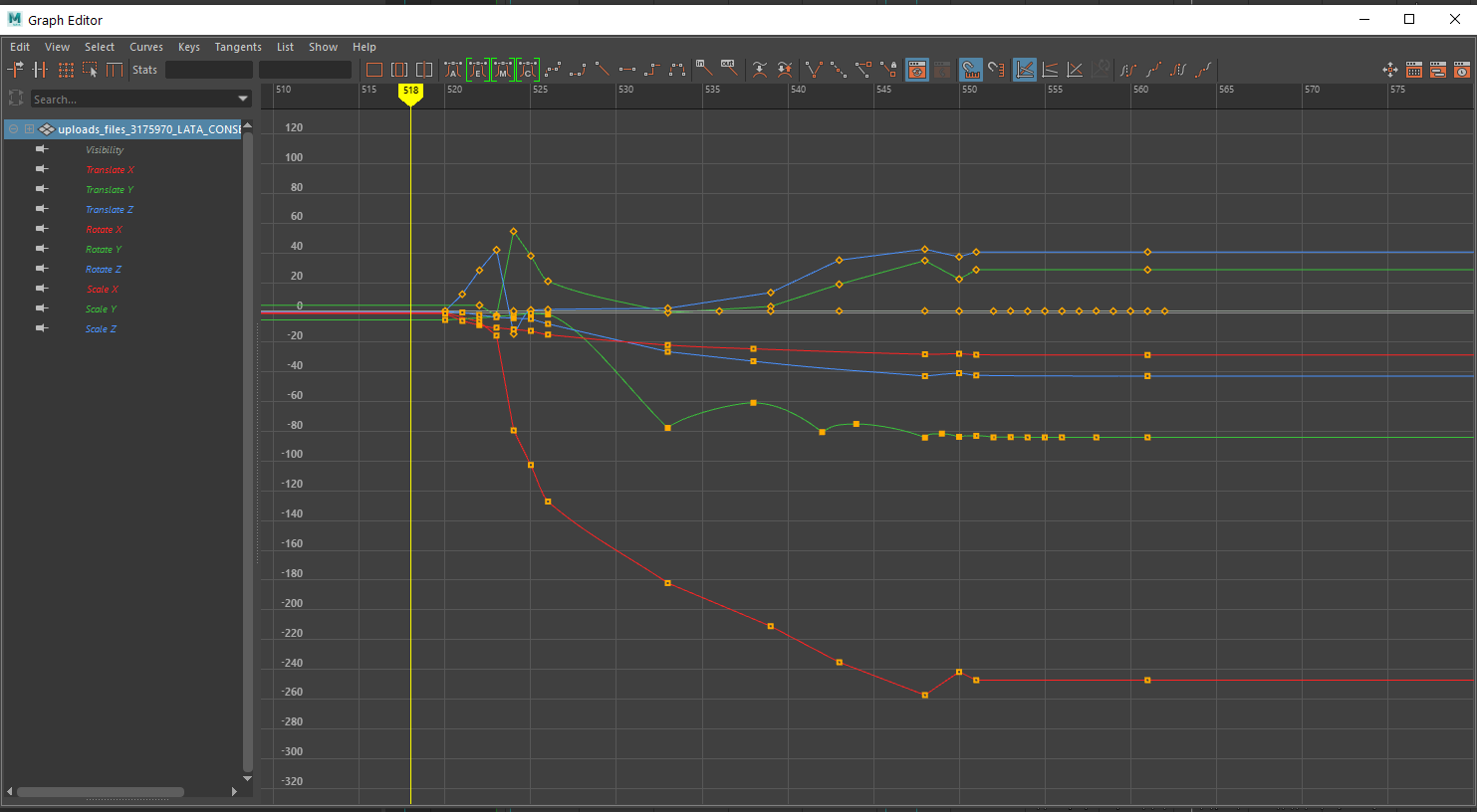
The keyframes for the transforms were then given every frame, and they usually visually represented normal curves, however with some of the shots, there seemed to be a lag problem, and there were keyframes which had big gaps, leaving the graph editor looking like this:
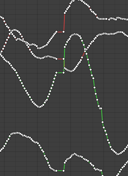
I noticed this when doing a first export of the last virtual camera shot, and how not smooth it was:
So my solution was to clean up the graph editor, by removing those cut out frames, and a few others to smooth the movement overall. I didn’t want to remove too many to keep the handheld movements I was going for, but cleaning up helped make the end results for virtual cam better.
There were a large amount of other problems with using virtual camera as well. When enabling the camera in the main window, the lens actually defaults to 50mm even if you change it. The only way to change it is after you’ve recorded your shot.
Also because of my limited space, and the limited capability of the room scale features, actually moving the camera forwadrds and backwards through the hallway had to be done after wards in the graph editor also.
To ensure the movements were still what I wanted, I set the camera to be nearer the end point of my planned movement (for the last hallway shot, that was near the doorway. I still moved the camera to follow the character down as he tripped and fell, but I had to modify it’s position after.
Overall, with virtual camera, I wanted realistic camera shake and easier control over movements, 2 things I achieved with the final shots. However it is not intuitive at all, and requires a lot of tinkering to actually get the results you want. I’d consider using it again if I were to use it in future projects, but most big studios use their own dedicated virtual camera devices, with sensors with much better accuracy and roomscale. As an entry level artist simply testing out the virtual camera workflow, I can say it was a semi successful feat.
Texture fixing
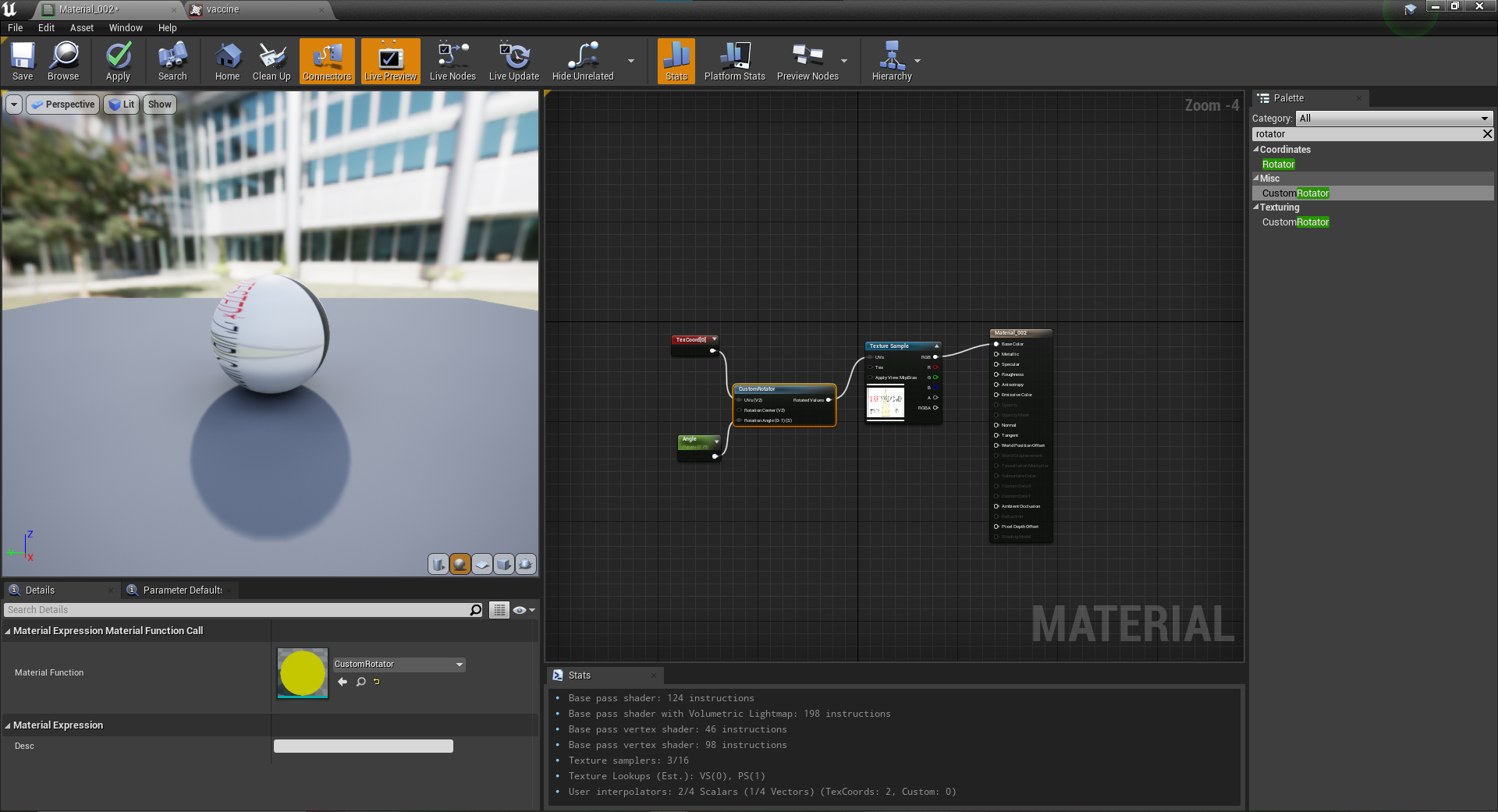
Textures almost always imported fine into unreal. I never really had any problems, except with the antidote model. The label on the model wasnt lined up properly. In Maya you can fix this pretty easily by just changing the UV rotation, but in unreal, textures are node based. Following a simple tutorial (see rearch), I used a custom rotator node to rotate the UV, and then from exports 240522 onward, the texture was fixed.
Extra roles
Music Composition
After the production process became more about tweaking and changing aspects, we then moved on to actually building the film up. The sound designers had sent their stuff to mix together with the video, and music consultant Will had sent over bits of composition elements.
What Will had sent over was very creepy sounds, and uses of some gloomy atmospheric musical elements. Which I activiely really enjoyed, and after then declaring that I’m happy with what he sent, I took charge and did some of my own composition.
We both agreed to use Logic Pro x, as that’s the music software I’m very familar with, and one of Will’s main tools also.
Here’s my window which he originally set up with an export, which I later updated, and then also with my added composition elements.
The composition I added, was a few orchestral elements in the build up, and then the scene with the stabbing, which I got the inspiration for from a clip from World War Z.
The rock song at the end, I got inspiration from the 28 days later theme, something Will suggested as consultant.
The rock song at the end uses a range of different guitar samples, plus drums, and also a really cool choir sound which I thought addded to the intensity. I was really proud of how this particular composition turned out:
The arrangement of the rock song
After sending to the group, Dacre said he thought it sounded amazing, and then asked if he could cover the track using his real guitar, and much more high quality samples.
I was initially blown away by how much better it sounded! The only thing we collectively agreed on was that my choir sample was better. So I sent over the STEM files for the choir sample and he mixed it into his mix.
Here is both of his renditions, with his choir sample, and then mine mixed in, the latter is the one mixed into the final piece.
Object / Character Animation
Although my primary role was as Layout, Camera’s and Editing, I also assisted with some animation elements.
To list them, the animation tasks I completed were:
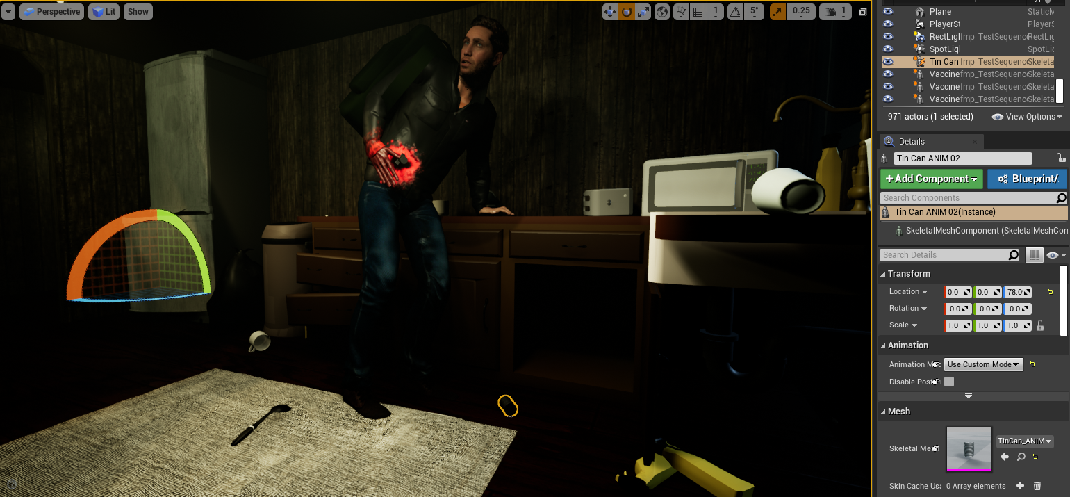
- Tin can being knocked off the side
- Antitode dropping from Dave’s hand
- Adam stumbling through the hallway
- Dead dave’s posing
Animating the objects were simple and small animating tasks that took under an hour each. I applied principles of bouncing ball and spent most of the time moving and adjusting keyframes to ensure the timing of the falls were spot on, and that the weight was correctly identified.
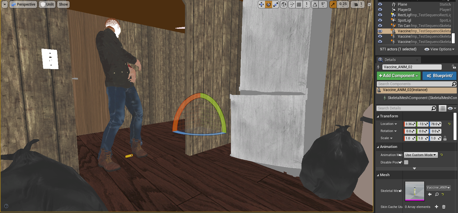
The antidote was the simplest as that was a simple drop animation, which I animated on its own. I referenced in Mason’s animation to get a sense of height as well as the scenery for positioning. The drop actually gets masked by camera trickery so I don’t have to animate it directly falling out of the grabbed hand, in Unreal I jusy cut out the first few frames.
The tin can involved elements of interaction, so referencing both the scenery, and Mason’s animation in Maya was essential. I did spent time adjusting the trajectory of the movement of the tin can, as well as how it would roll off the table. I’m quite satisfied with the results of this animation considering how quickly I completed it. I feel like I could’ve made the ending few frames more realsitic, either with a roll or by a bigger sideways movement, but from the camera angle inside Unreal that I went with, it doesn’t really matter and it isn’t noticeable.
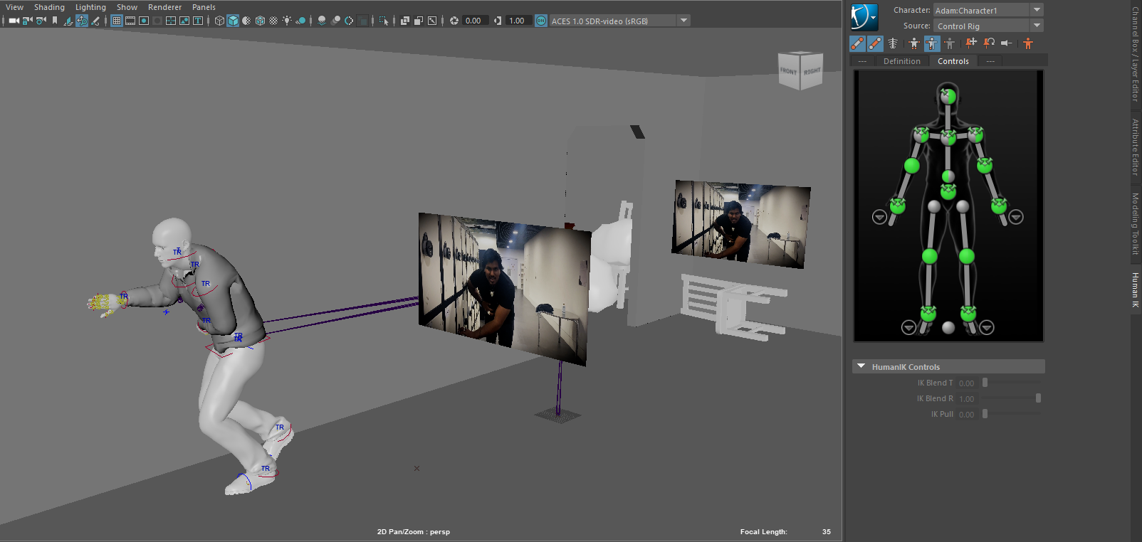
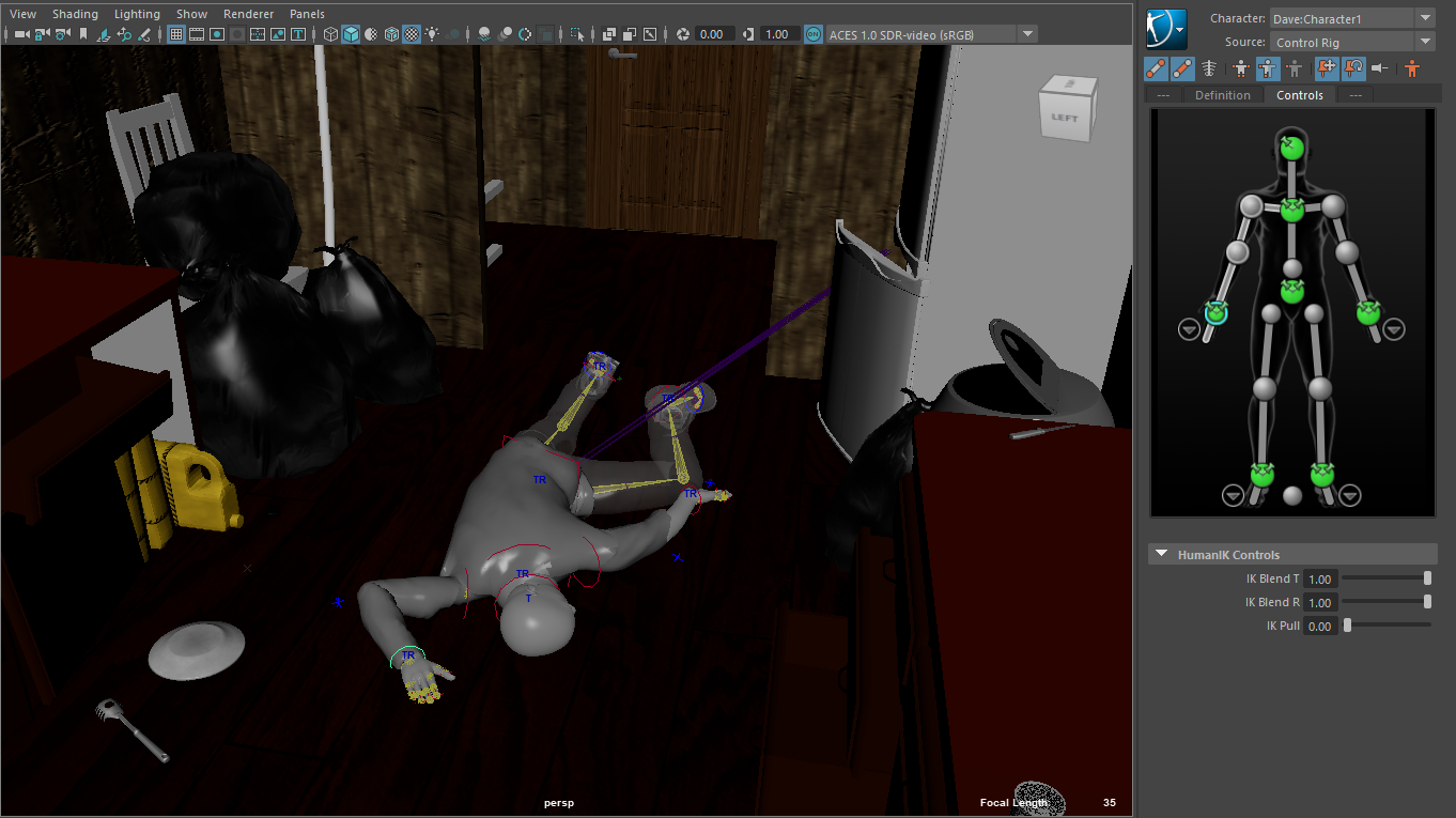
The hallway sequence was quite a difficult one to execute, as it was properly using the Human IK rig that Mason had set up for me. The rig was quite problematic for me to use initially. Mason did explain to me over call how to properly fix and use the Human IK rig, but I was still baffled by it. The controllers were that of a pretty standard IK rig, so I started off doing pose to pose. There were multiple visual glitches throughout the process which required real attention to detail with the keyframes, something I’ve never really experiences to such extent. Nevertheless I did produce a solid enough animation.
The timing was evidently quite slow because I think I imported the live action reference at the wrong frame rate, but luckily I could up the pace of the whole animation inside Unreal, which visually fixed it. The visual glitches present in Maya were also much less noticeable in Unreal, partly down to camera trickery, and the fact it was properly texured.


After Effects Credits Sequence
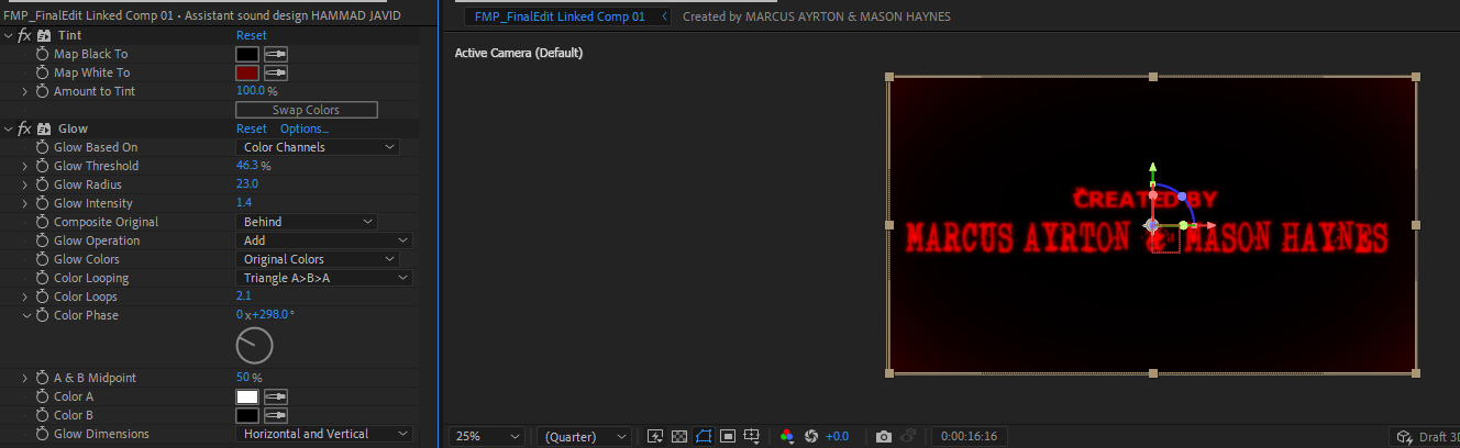
For the ending, I took it upon myself to make a really nice stylised credits sequence. For inspiration I looked up ‘Zombie Film Titles’, and alot of them were black background, with gritty red fonts. Already I had found gritty zombie fonts so I carried them over into After Effects.
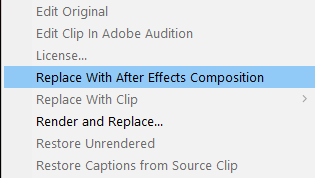
In my Premiere Pro Window I was using, I selected the already made basic titles and clicked ‘Replace with After Effects Composition’. This automatically created a compositon inside After Effects filled with all the titles.
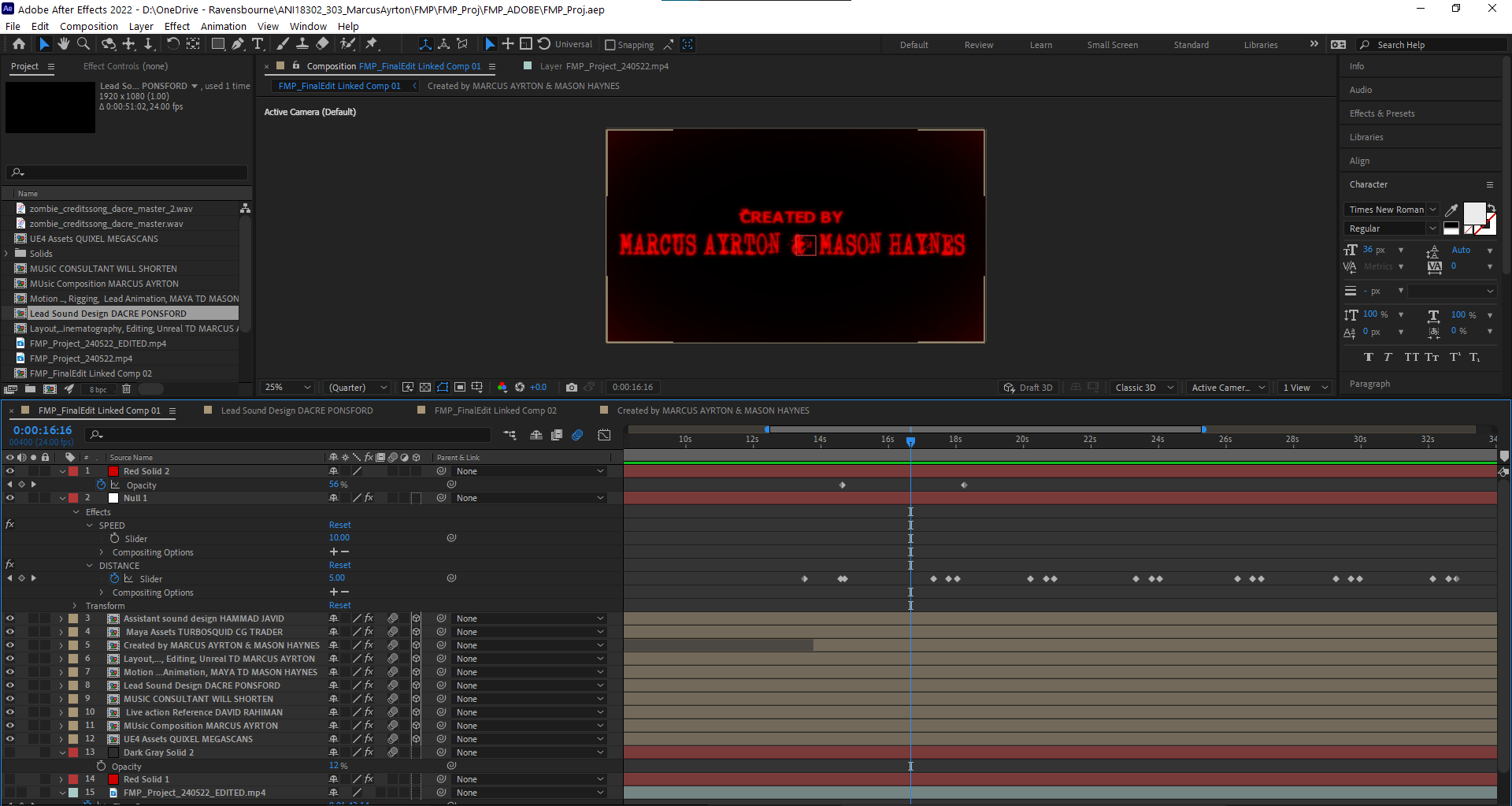
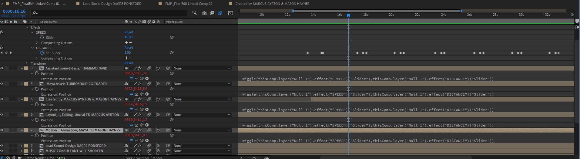
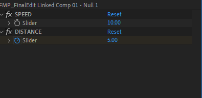
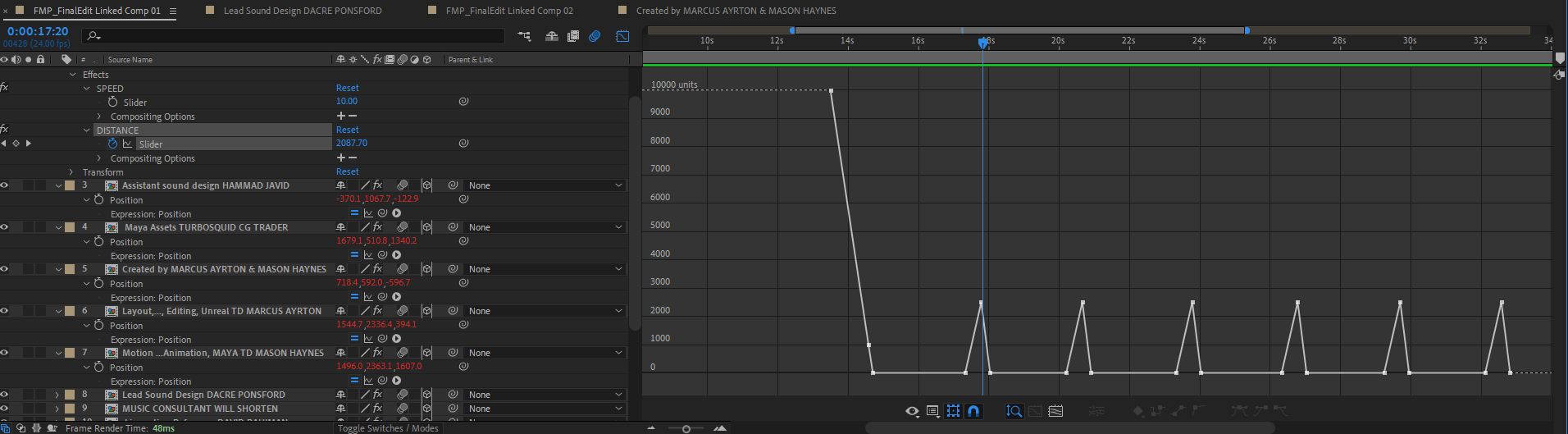
To make them shake as I did, I applied a wiggle expression to the position of each layer (or in this case, each precomp per title). This expression has a speed and a distance value. Using a null object I created 2 slider expressions, which just created values that can be keyframed. I parented this values to that of the wiggle expression, so speed and distance of the wiggle is changed by these sliders instead of the code. I made every layer a 3D layer, so the wiggle expression would make the text move back and fourth also.
Then I keyframed the wiggle distance to be 5 pixels, but during the transition period, it shoots up to around 2500 pixels which creates the cool violent shake. I then applied motion to blur to every layer.
To create the red text like the inspiration I’d seen, I applied a colour tint to each layer to change it to red, and a glow.